Bien-Être Simple is a French-language media platform dedicated to health and wellness. Its mission is simple: to make reliable health information accessible, easy to understand and genuinely useful. When the team approached us, the platform was already established but wanted to evolve into a leading reference within the French-speaking wellness landscape.
Services
Brand Identity
Logo Design
Social Media Design
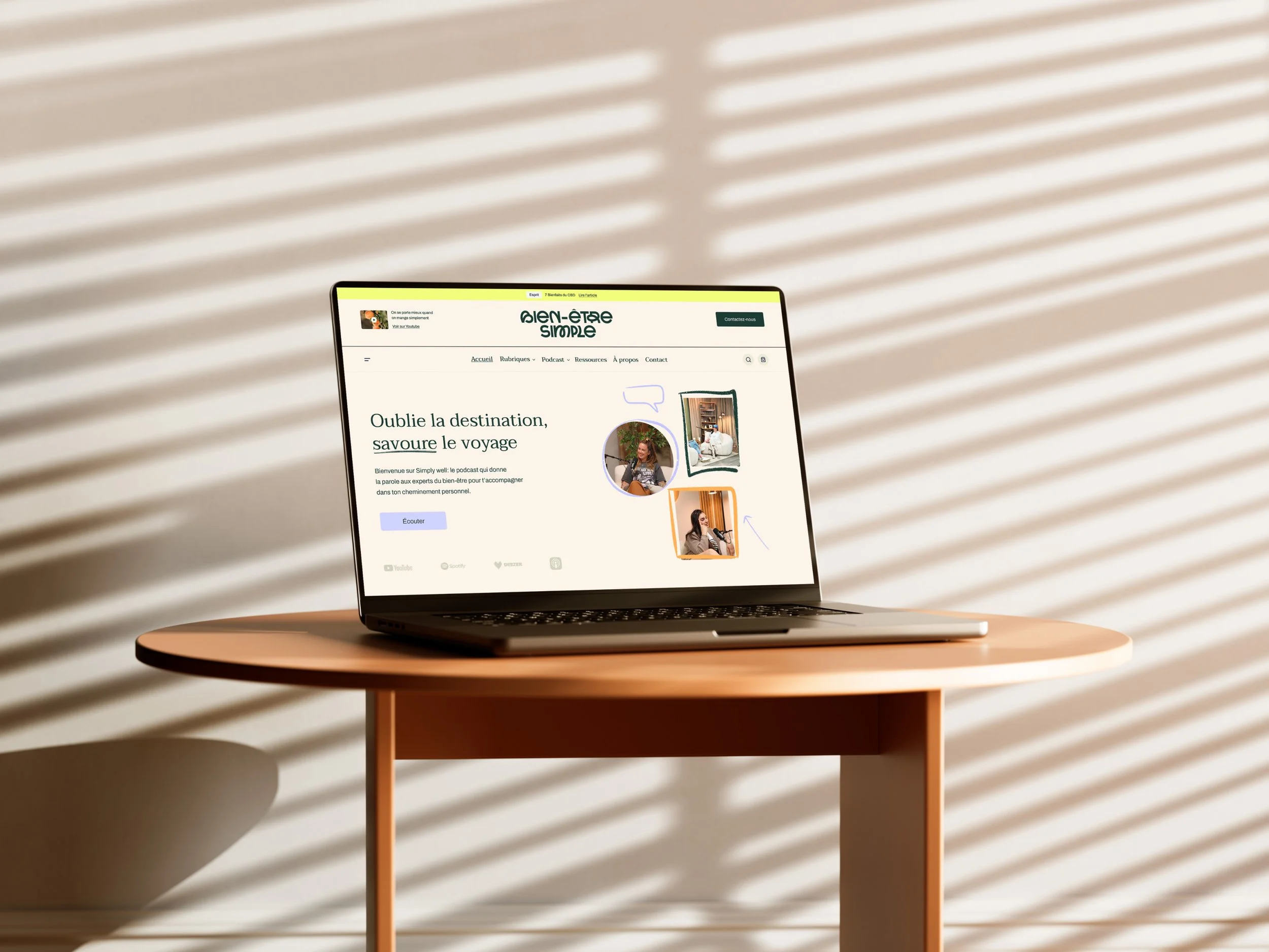
Web Design
Industry
Wellness


Challenge
Designing a visual identity for a health media platform requires a careful balance between expertise and accessibility.
The challenge was to:
Make complex health topics visually easy to understand.
Build trust without feeling overly institutional.
Humanize the brand's communication.
Create a flexible identity that works across YouTube, Instagram and the website.
Express expertise, education and approachability in equal measure.
Ultimately, the challenge was to make information easier to understand without oversimplifying it.


Objectives
Create a visual identity capable of:
Communicating clarity and educational value.
Reinforcing the media's credibility.
Building meaningful connections with a broad audience.
Supporting content creation across multiple digital platforms.
Providing a scalable identity for the brand's future growth.


Approach
We approached this project by creating an accessible visual language.
Our goal was to simplify without reducing complexity, to design an identity that supports understanding rather than distracting from it.
Every element was developed to visually express the idea of learning, progress and the ongoing journey toward better health and well-being.


A logo inspired by a journey
The logo was designed as a visual pathway. Its custom letterforms subtly evoke movement and progression, symbolizing the personal journey toward better health, a path built through learning, exploration and continuous improvement. This narrative approach reflects the very mission of the media platform.


A human and approachable identity
Soft curves and rounded forms reinforce the warmth and accessibility of the brand. Together, they create a visual language that feels welcoming while maintaining credibility and professionalism.


An educational visual system
The identity is built around a flexible collection of complementary elements:
A rich, adaptable colour palette combining natural, energetic and calming tones.
A typographic pairing that balances readability with elegance.
A custom illustration library designed to simplify complex concepts.
Dynamic layouts optimized for digital content and social media.
The result is a visual system that structures information clearly while making educational content more engaging and enjoyable to consume.


Outcome
Today, Bien-Être Simple has a visual identity that fully supports its editorial ambitions.
The project successfully delivers:
A clearer and more recognizable brand image.
Better communication of complex health topics.
A visual identity designed specifically for digital content.
Stronger engagement and connection with its audience.
The platform now confidently delivers on its mission: making health and wellness more accessible, understandable and actionable.


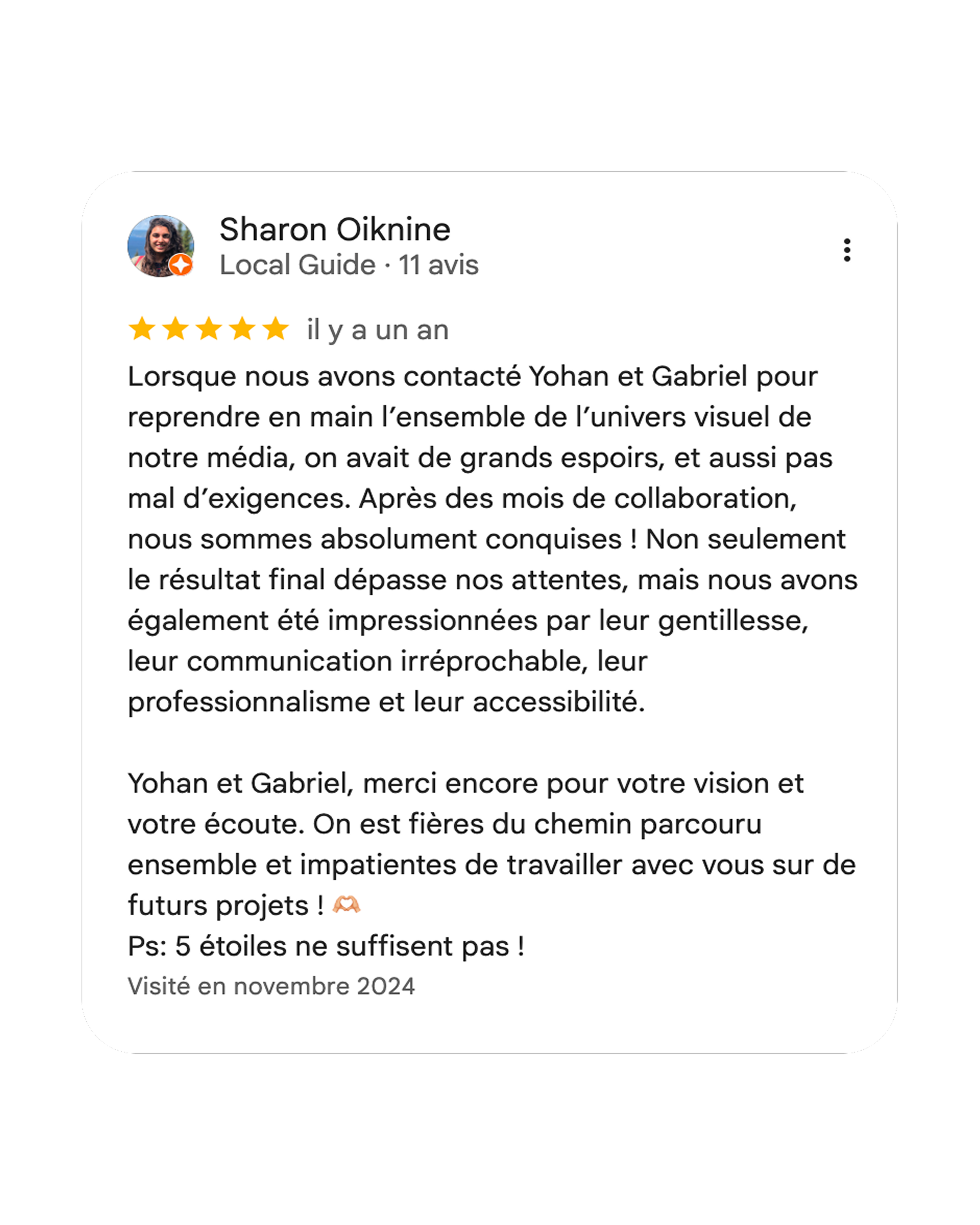
A word from our client, Sharon