Dalo is a premium skincare brand specializing in eye patches, created around a simple promise: to deliver effective, refined and thoughtfully designed products. From the very beginning, the founder envisioned a brand that would reflect the quality of its formulations through an understated yet sophisticated visual identity.
Services
Logo Design
Brand Identity
Packaging Design
Industry
Cosmetics
Challenge
In today's highly competitive skincare market, visual identity plays a crucial role in shaping perception.
The challenge was to:
Create a premium brand without relying on unnecessary visual complexity.
Express the delicacy and sensorial nature of the product.
Build a simple yet memorable identity.
Reflect the quality and transparency of the formulations.
Establish strong foundations for a long-lasting skincare brand.
The challenge was one of restraint: expressing as much as possible with as little as necessary.


Objectives
Create a visual identity capable of:
Embodying an elegant and minimalist aesthetic.
Elevating a product centered on self-care and well-being.
Building strong recognition through simplicity.
Translating a sensory experience into visual design.
Establishing the foundations of a timeless premium brand.

Approach
We approached Dalo through the principle of reduction.
Rather than adding visual elements, we carefully removed everything that wasn't essential, leaving only what genuinely contributes to the perception of the brand.
The objective was to create an identity that suggests rather than explains, allowing refinement and restraint to become defining characteristics.

Typography as the hero
The identity is built around a custom typographic logo.
Free from decorative elements, it relies entirely on the precision of its letterforms to communicate elegance, confidence and sophistication.
The result is a timeless wordmark designed to remain relevant far beyond changing design trends.
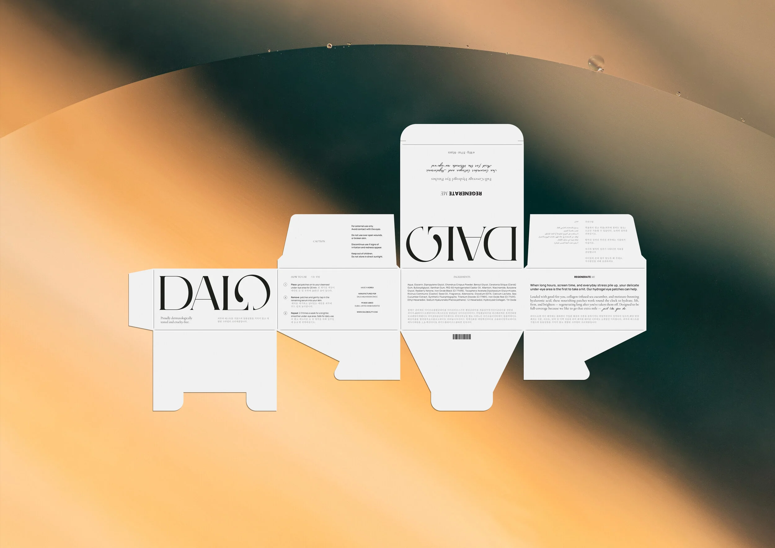
Un détail signature
Un travail particulier a été mené sur la lettre “O”, conçue comme un élément distinctif.
Sa terminaison en goutte évoque directement le produit, créant un lien subtil entre le design et l’usage. Un détail discret, mais mémorable.
A signature detail
Particular attention was given to the letter O, which becomes the brand's most distinctive feature.
Its subtle droplet-shaped terminal references the product itself, creating a discreet yet meaningful connection between the identity and the skincare ritual.
A minimal gesture that gives the logo its unique personality.

A sensory visual language
The circular shape of the O naturally echoes both the packaging and the physical gesture of applying the eye patches, reinforcing the tactile dimension of the brand.
The colour palette remains intentionally restrained:
Black and white establish timeless elegance.
Delicate gold accents reinforce the premium positioning.
Together, these elements create a visual identity that feels refined, memorable and effortlessly sophisticated.
Outcome
Today, Dalo has a visual identity that perfectly reflects its positioning and ambitions.
The project successfully delivers:
A clear and confident premium image.
A minimalist identity with strong recognition.
Complete consistency between the product, packaging and visual language.
A timeless foundation designed to support the brand's long-term growth.
Every detail has been carefully considered to ensure that simplicity becomes one of the brand's greatest strengths.

A word from our client, Dalia