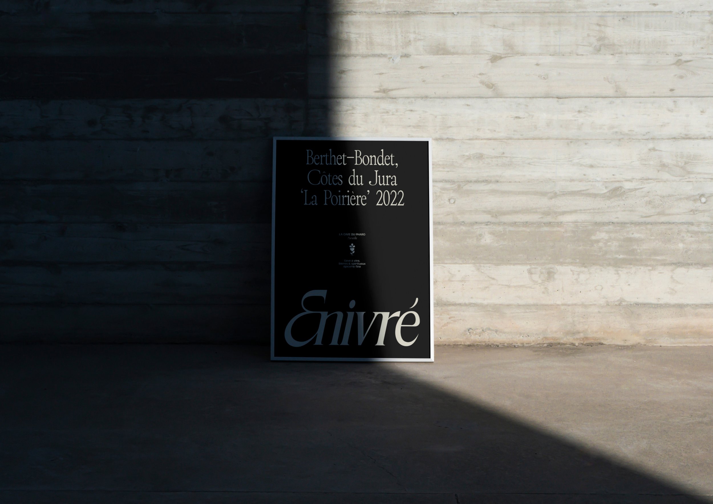
Enivré is an independent wine, beer and spirits shop based in Marseille. Formerly known as La Cave du Pharo, the business already enjoyed strong local recognition and a loyal customer base. Following its acquisition, the new owner wanted to modernize the brand while preserving the history and reputation that had made the shop a local landmark.
Services
Logo Design
Brand Identity
Storefront Design
Merchandise
Industry
Food & Beverage


Challenge
Rebranding an established local business comes with a unique challenge: transforming the brand without losing the trust and recognition it has built over the years.
The project needed to:
Support the transition to a new name while reassuring an existing customer base.
Modernize a brand image perceived as outdated.
Preserve the business's heritage and strong local reputation.
Attract new customers without alienating loyal ones.
Better showcase the richness and diversity of the product offering.
Ultimately, the challenge was to strike the right balance between continuity and transformation.


Objectives
Create a visual identity capable of:
Supporting the transition to the new brand name, Enivré.
Establishing a more contemporary and distinctive brand positioning.
Showcasing the diversity of the offering, from wines and beers to spirits and gourmet products.
Reflecting both the welcoming atmosphere and the premium character of the store.

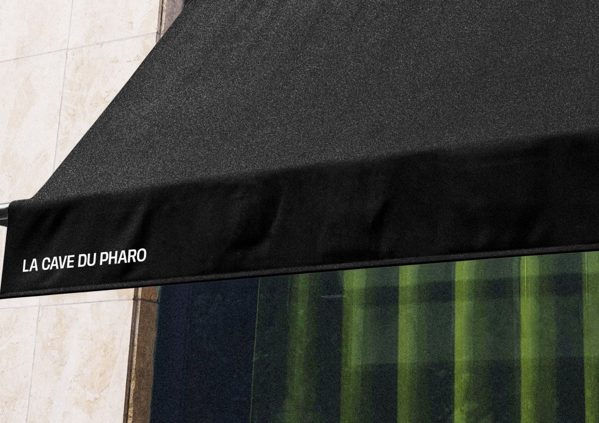
Design de la devanture de la cave à vin
Photographie de la devanture, avec Quentin le gérant de la cave


Approche
Le projet a été pensé comme une évolution progressive plutôt qu’une rupture.
L’objectif était de créer du lien entre l’histoire du lieu et sa nouvelle identité, en conservant ce qui faisait sa force tout en affirmant un positionnement plus contemporain.
Chaque choix graphique a été guidé par cette intention : faire évoluer l’image de la cave de manière naturelle, cohérente et durable.


Design des cartes de visites
A Logo that balances heritage and modernity
The logo is built around a contemporary interpretation of a classic serif typeface, preserving the character and heritage of the business while introducing a more refined and modern aesthetic.
This approach creates a sense of familiarity for long-standing customers while giving the brand a stronger, more contemporary presence.


A seamless transition
The former name, La Cave du Pharo, was intentionally retained as a tagline. By maintaining this connection to the business's history, the new identity feels familiar while helping loyal customers embrace the transition to Enivré. A simple yet strategic decision that reinforces recognition and ensures the rebrand unfolds naturally.

A rich and structured visual system
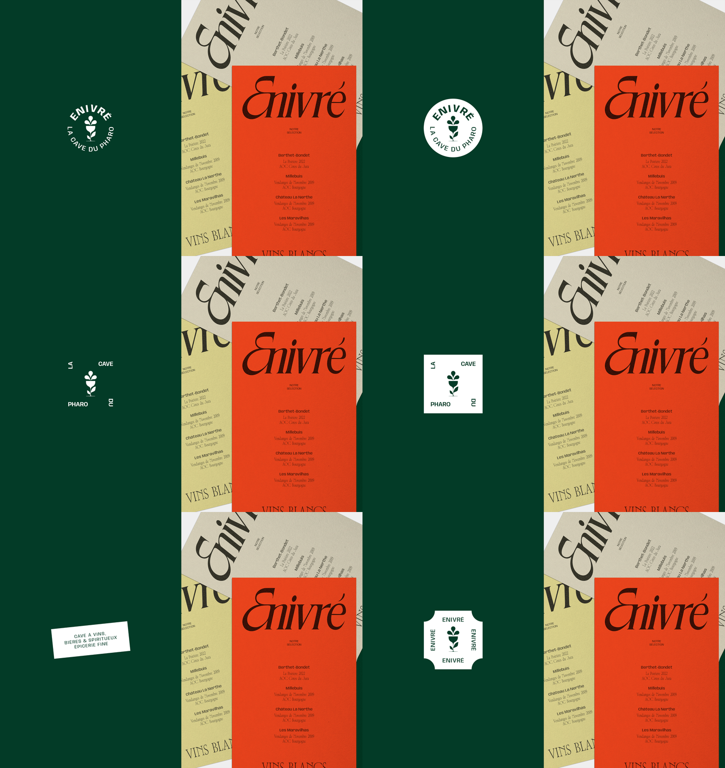
The identity is built around a collection of complementary design elements that work together to create a distinctive and flexible brand system.
These include:
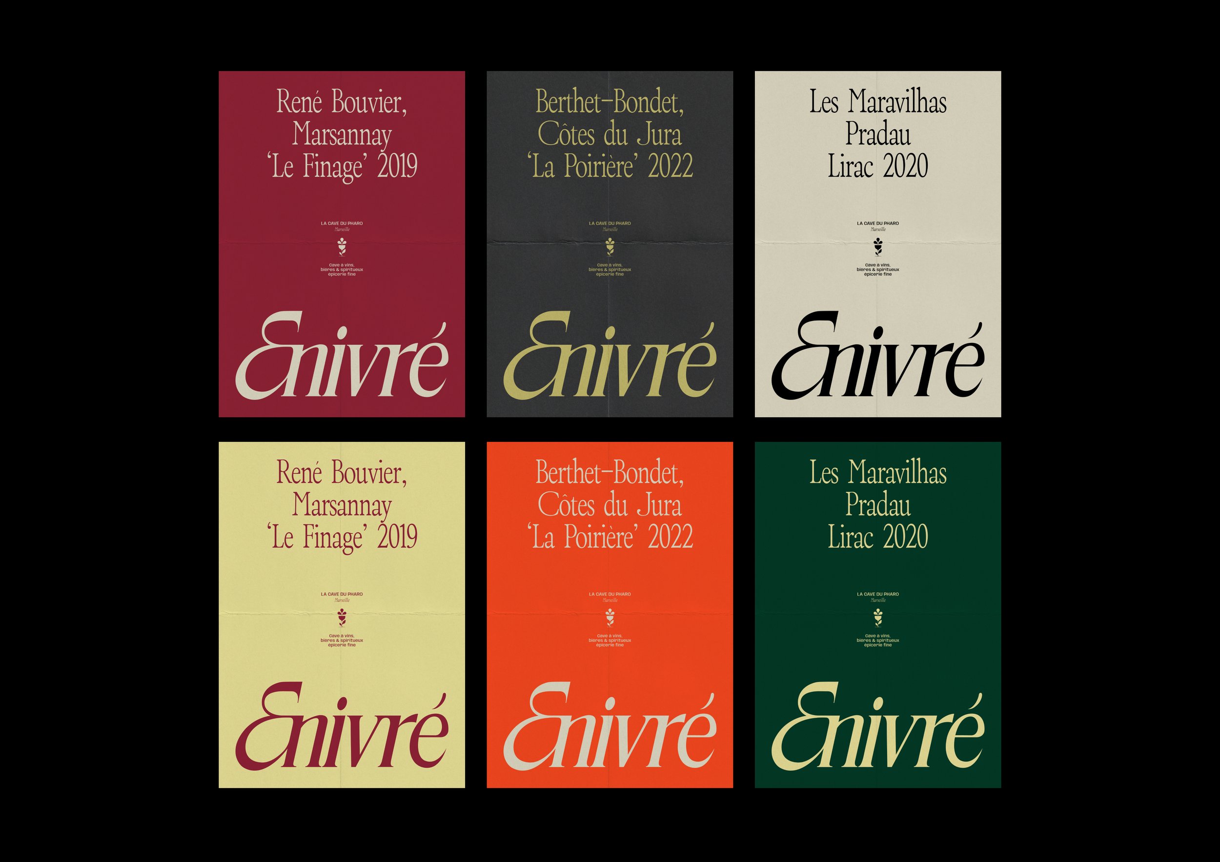
A colour palette inspired by wine, natural ingredients and warm earthy tones.
Contrasting colours that help distinguish product categories and collections.
A balanced typographic system combining tradition with clarity.
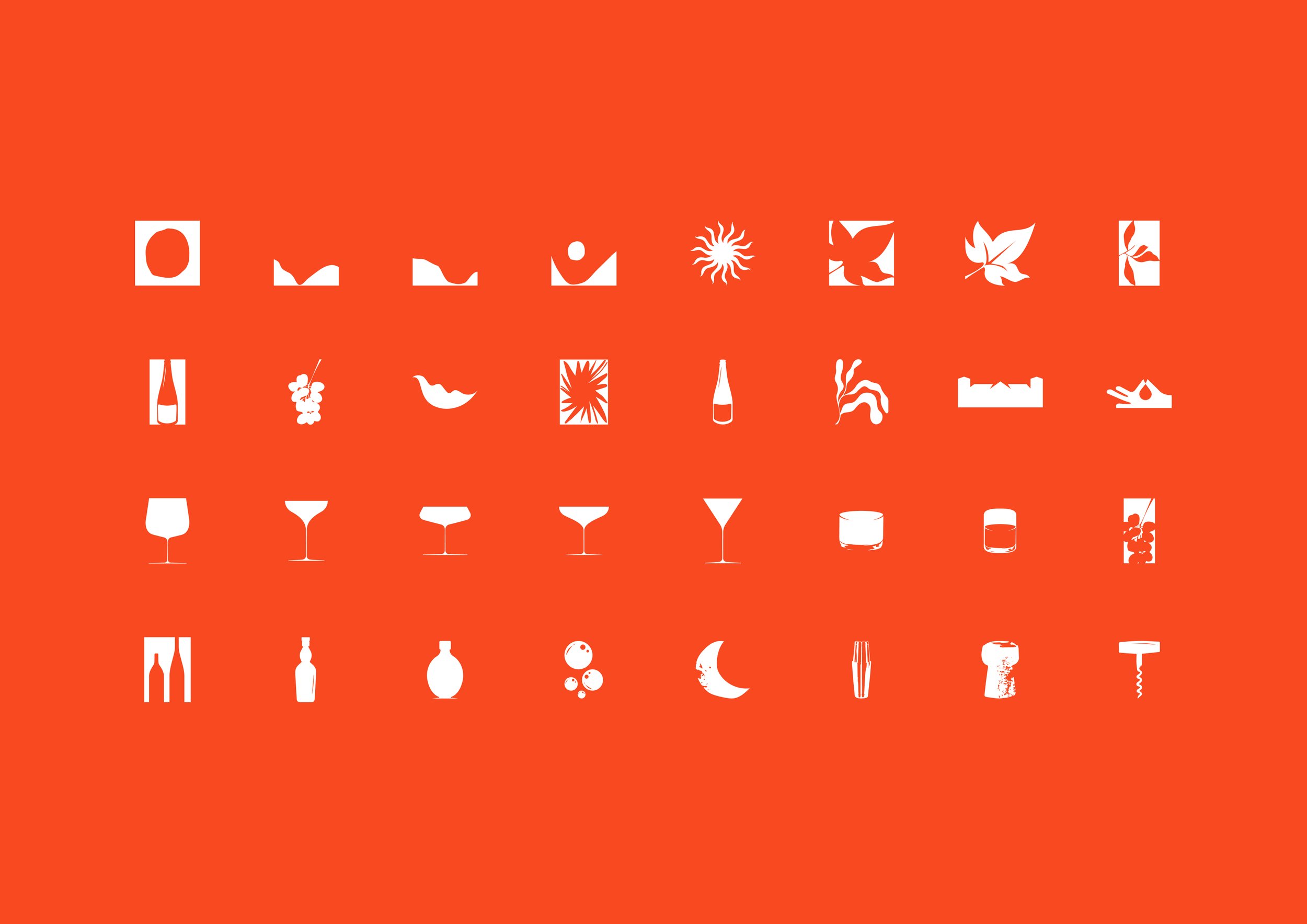
A custom set of icons inspired by botanicals, products and their origins.
Together, these elements form a rich visual language that reflects the diversity of Enivré's offering while ensuring consistency across every brand touchpoint.

Outcome
Today, Enivré has a refreshed visual identity that perfectly reflects its positioning and long-term ambitions.
The rebrand successfully:
Attracts a new generation of customers.
Preserves the trust and loyalty of existing clientele.
Clarifies the brand's positioning.
Better showcases the richness and diversity of its offering.
The redesigned storefront—one of the brand's most important touchpoints, brings this transformation to life through a clearer, more cohesive and contemporary presence. Together, these foundations equip Enivré with a timeless identity that can evolve with the business while remaining true to its heritage.


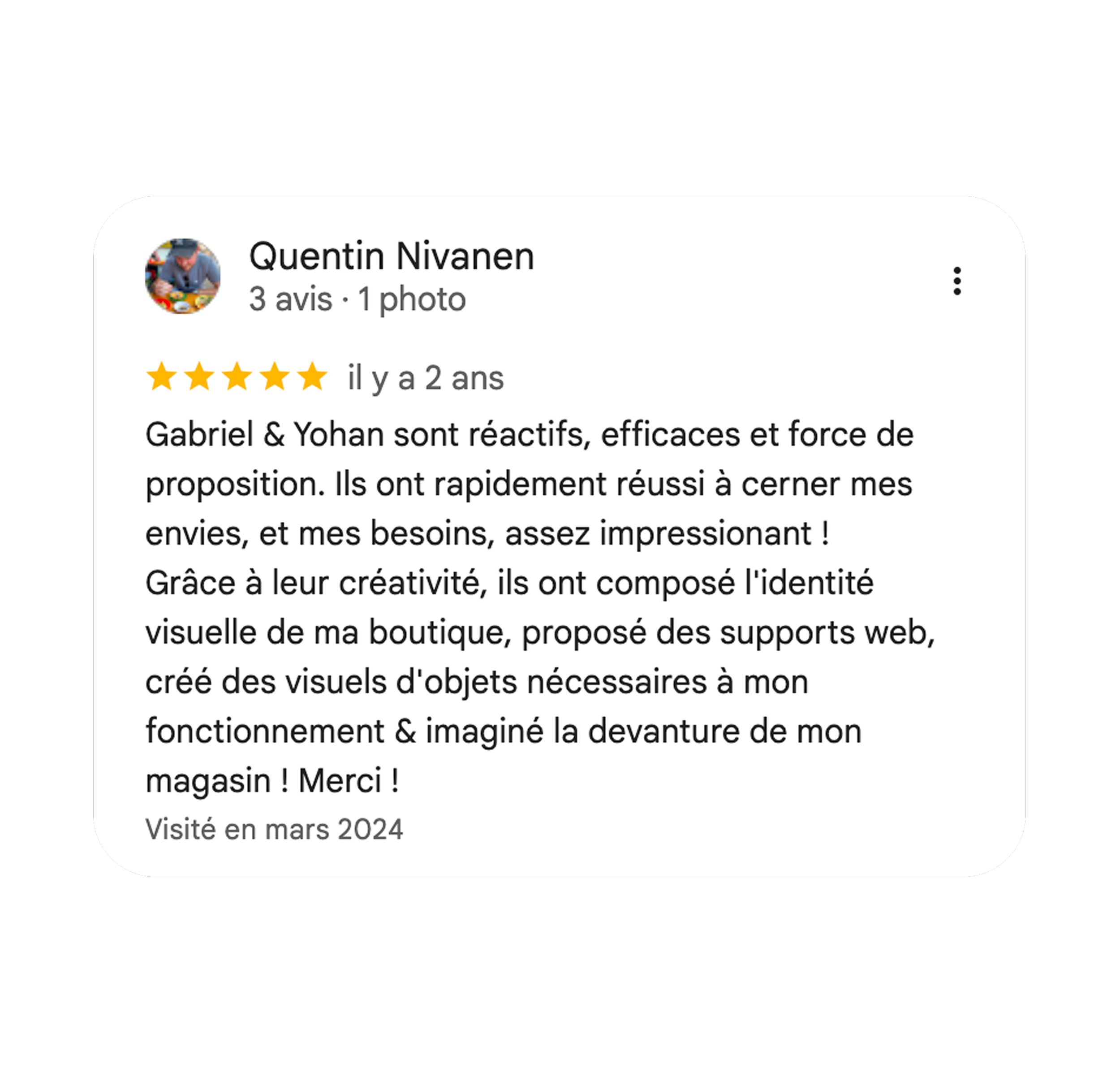
Le mot de notre client, Quentin