
When Kety, founder of Homnès, a solid shampoo brand, approached us, the business was preparing to open its very first flagship store. This marked a major turning point. Homnès was evolving into a workshop-store a space where customers could not only purchase products but also experience their creation firsthand. To support this transformation, we led a complete brand repositioning and visual identity redesign.
Services
Rebranding
Packagings
Logotype
Brand Identity
Brand Strategy
Industry
Cosmetics
Challenge
The existing identity no longer reflected the brand's ambitions.
The rebrand needed to:
Support the transition from an online-first business to a physical retail experience.
Create a stronger, more confident and distinctive brand presence.
Express the brand's craftsmanship and personalized approach.
Move away from an identity that felt too discreet and lacked differentiation.
Improve the readability and recognition of the name Homnès.
Ultimately, the challenge was to transform Homnès from a niche brand into a memorable and fully embodied brand experience.


Objectives
Design a visual identity capable of:
Expressing the new workshop-store concept.
Reflecting the brand's expertise and bespoke approach.
Giving the brand a bolder, more expressive personality.
Strengthening recognition and memorability.
Supporting the launch and growth of the physical store.


Approach
We approached this project as an exercise in brand affirmation.
Rather than reinventing Homnès, our goal was to reveal its full potential, transforming a discreet identity into one that confidently expresses its personality.
Every creative decision was made to increase presence, clarity and impact while remaining true to the brand's essence.


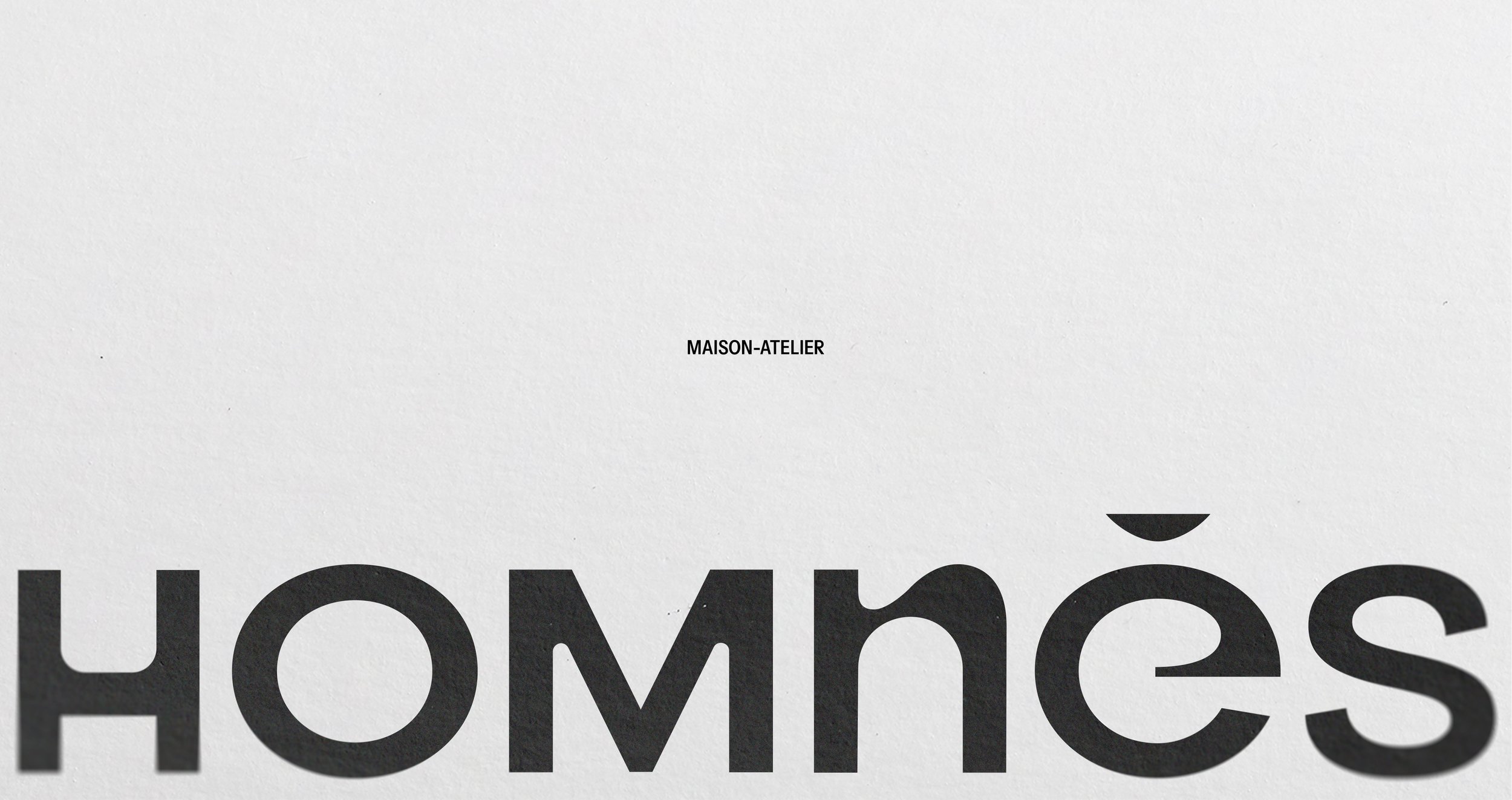
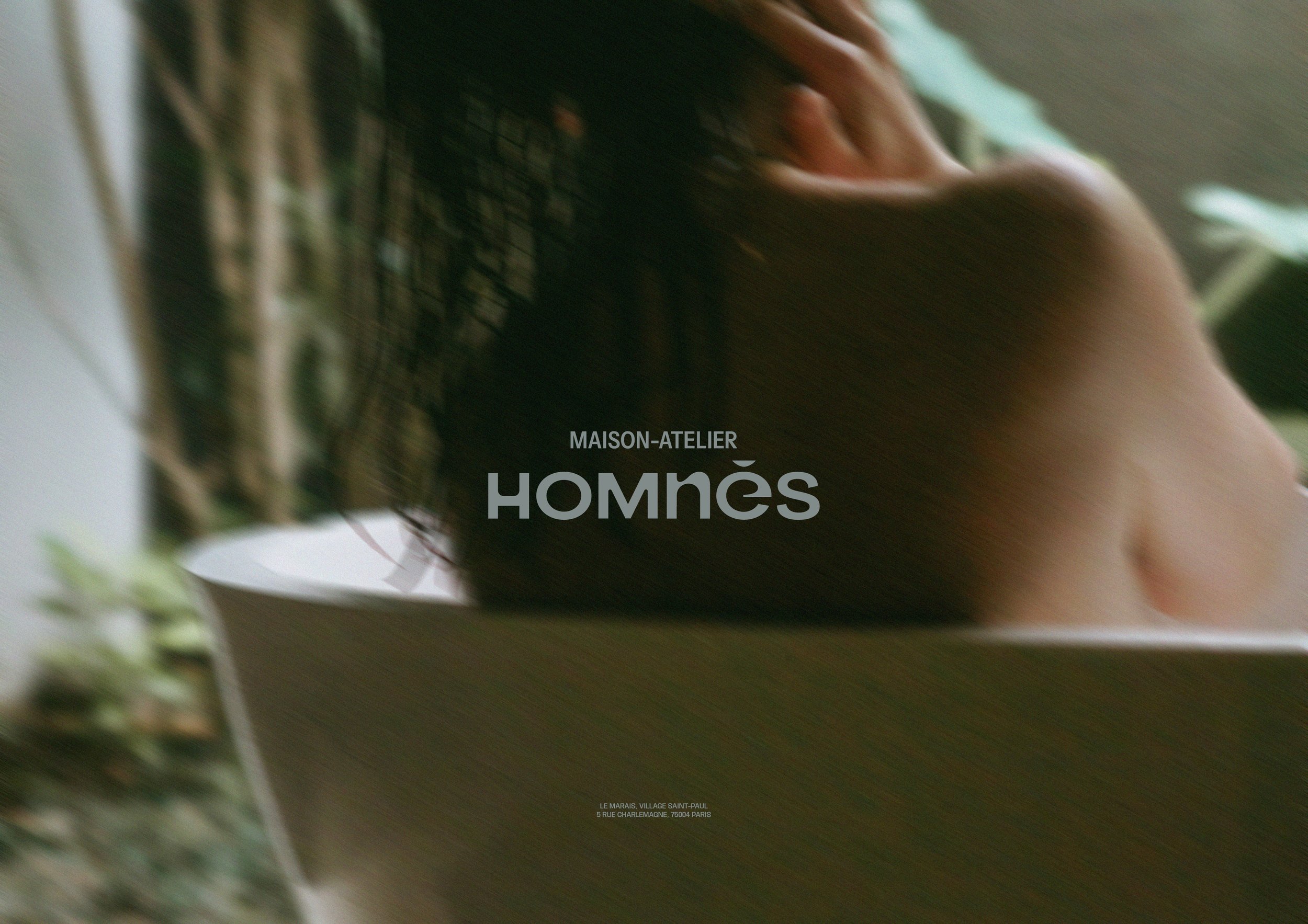
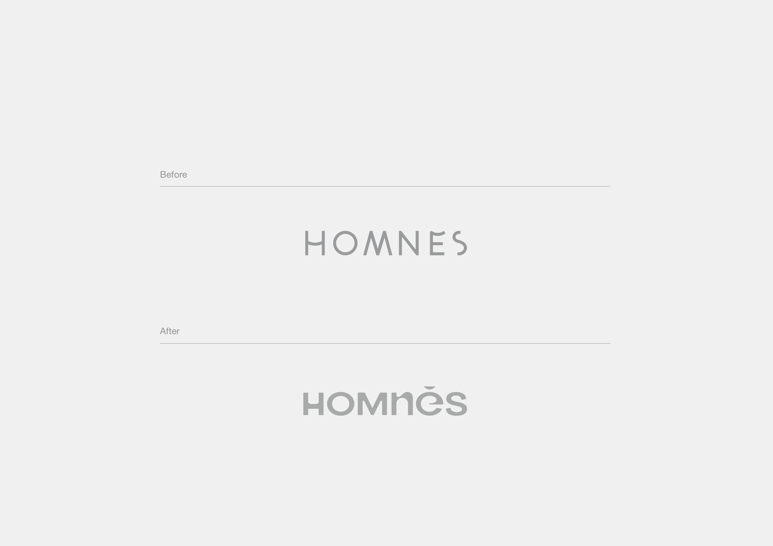
A stronger, more recognizable logo
The logo was completely redesigned to improve both visibility and legibility.
Its new composition creates a stronger rhythm through the interplay of uppercase and lowercase letterforms.
Particular attention was given to the è, which became one of the identity's most memorable features.
Its accent subtly echoes the shape of a handcrafted soap bar, while the carved detail conveys precision and craftsmanship. It also removes any confusion with the French word Hommes, making the name instantly recognizable.


Typography inspired by craftsmanship
The custom N introduces a raw, handcrafted quality that reflects the brand's artisanal manufacturing process.
It reinforces the idea of products made on-site, celebrating authenticity and visible craftsmanship.


A bolder visual identity
The visual language evolved significantly:
Nude tones were replaced with richer, more expressive colors.
Custom color pairings were created to differentiate product ranges.
Layouts became more dynamic, bold and impactful.
The result is a visual territory that gives the brand greater personality and shelf presence.


Outcome
Today, Homnès has a visual identity that fully reflects its evolution.
The rebrand has provided:
A stronger, clearer and more memorable brand image.
A confident premium positioning.
A seamless connection between the retail experience and the visual identity.
A scalable identity designed to support the brand's continued growth.
Homnès has evolved from a discreet cosmetics brand into a destination where craftsmanship, expertise and personalization come together to create a distinctive brand experience.
