La Petite Agence des Grands Moments is a French wedding planning agency celebrating its tenth anniversary with a clear ambition: to express a stronger, bolder and more distinctive brand identity. In an industry shaped by predictable aesthetics, the agency stands apart through its creative vision, attention to detail and commitment to designing unforgettable experiences. In an industry shaped by predictable aesthetics, the agency stands apart through its creative vision, attention to detail and commitment to designing unforgettable experiences.
Services
Logo Design
Brand Identity
Brand Guidelines
Industry
Event


Challenge
The wedding industry is filled with familiar visual codes—minimal palettes, elegant scripts and neutral tones that often make brands feel interchangeable.
The challenge was to:
Stand out within a highly codified market.
Express a premium positioning without relying on conventional luxury aesthetics.
Reflect the founder's bold personality and creative vision.
Build a memorable identity around a long and complex brand name.
Balance elegance, emotion and character.
Ultimately, the challenge was one of differentiation: creating a brand that feels unmistakable in a market full of visual similarities.


Création de templates de stories instagram
Objectives
Create a visual identity capable of:
Expressing a refined and creative vision of wedding planning.
Establishing a premium and distinctive brand positioning.
Reflecting the founder's strong personality.
Challenging industry conventions while remaining elegant and legible.
Bringing the promise of creating unforgettable experiences to life.

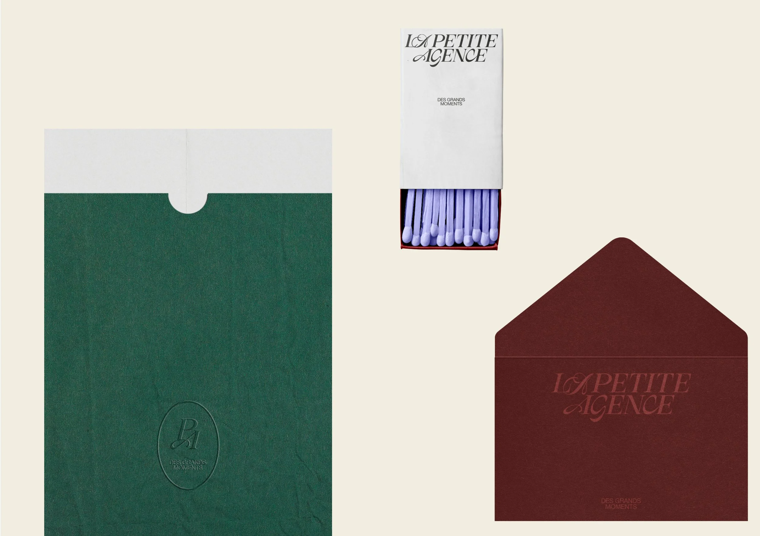
Brand Identity Applications

Stationery Design

Branded Envelope Design
Approach
We approached this project as a statement of intent.
Rather than following the visual conventions of the wedding industry, we chose to question them—creating a more expressive identity that confidently embraces its own personality.
Every design decision was made to surprise without sacrificing sophistication, resulting in a brand that feels both bold and timeless.


Expressive typography
The logo is built around a bold typographic composition that plays with contrast, rhythm and movement.
The dialogue between different typographic styles creates tension and personality, while subtle italic gestures introduce a sense of motion reflecting the dynamic, emotional experiences the agency creates.

Details with meaning
Several repeated letterforms were intentionally designed differently, introducing subtle variations throughout the wordmark.
These details reflect the agency's adaptability and bespoke approach to every event. Particular attention was given to the CE letter pairing, which subtly symbolizes connection between the agency and its clients, and ultimately between the couples whose stories it helps bring to life.


A bold visual language
The identity extends through:
A vibrant and expressive colour palette.
A typographic system balancing romance, elegance and character.
Editorial layouts inspired by the world of fashion.
A careful balance between structure and creative freedom.
Together, these elements create a visual identity that feels distinctive, sophisticated and immediately recognizable.


Outcome
Today, La Petite Agence des Grands Moments has a visual identity that fully reflects its personality and ambitions.
The project successfully delivers:
A memorable presence in a highly competitive industry.
A brand image aligned with the founder's creative vision.
A confident premium positioning.
An art direction that resonates with couples looking for something truly distinctive.
The result is a brand that confidently embraces its philosophy: creating meaningful celebrations where elegance meets bold creativity.

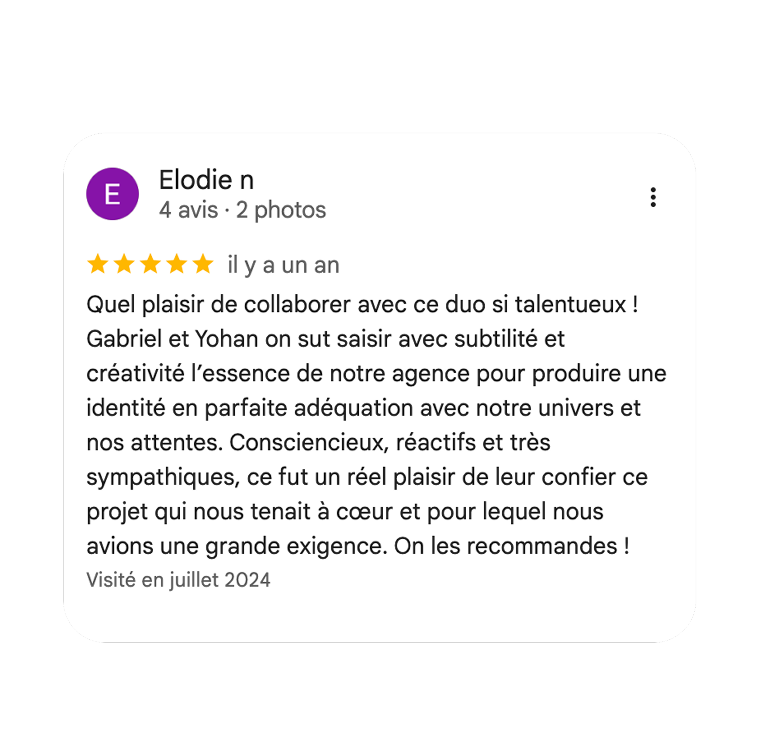
A word from our client, Élodie