La Petite Agence des Grands Moments est une agence d’organisation de mariages qui célèbre ses 10 ans avec une volonté claire : affirmer une image plus forte, plus audacieuse et plus alignée avec son positionnement.
Dans un secteur très codifié, l’agence se distingue par une approche sensible, exigeante et tournée vers la création d’expériences uniques.
Services
Logotype
Univers visuel
Charte graphique
Industrie
Evenementiel


Enjeux
Le secteur du mariage repose sur des codes visuels très établis, souvent minimalistes et peu différenciants.
Le défi était de :
se démarquer d’un univers souvent uniforme (noir, blanc, tons neutres)
affirmer un positionnement haut de gamme sans tomber dans le classique
traduire une personnalité audacieuse et singulière
structurer une identité autour d’un nom long et complexe
refléter à la fois l’élégance, l’émotion et le caractère de l’agence
Un enjeu de différenciation : exister dans un marché saturé de codes similaires.


Création de templates de stories instagram
Objectifs
Créer une identité visuelle capable de :
incarner une vision exigeante et créative du mariage
affirmer un positionnement premium et différenciant
refléter la personnalité forte de sa fondatrice
sortir des conventions tout en restant lisible
traduire la promesse de “créer du beau à vivre”

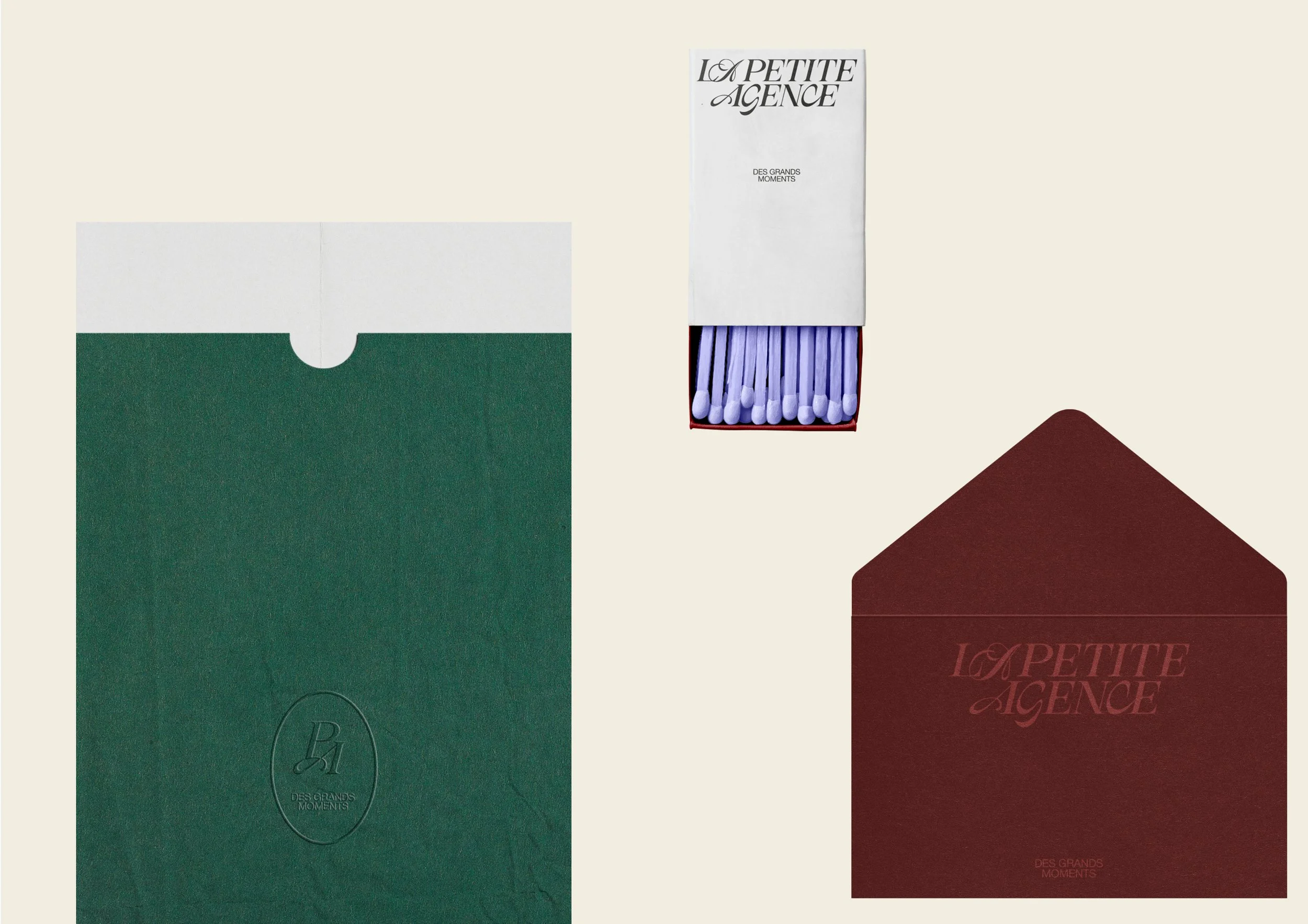
Déclinaisons de l’identité pour renforcer l’image de marque.

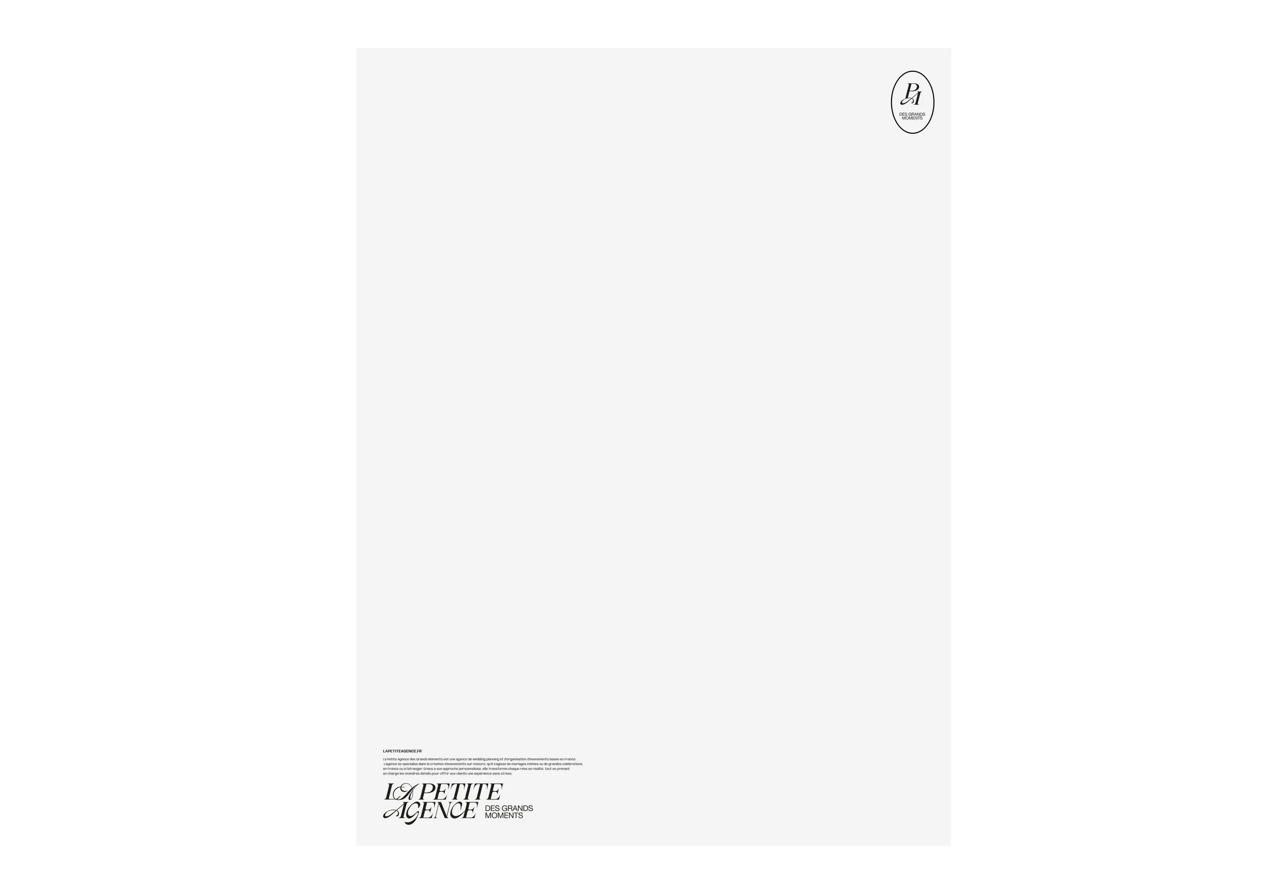
Design de la papeterie de LPADGM.

Design des enveloppes de l’agence.
Approche
Nous avons abordé ce projet comme une prise de position.
L’objectif n’était pas de suivre les codes du secteur, mais de les questionner et de proposer une alternative plus expressive. Nous avons cherché à construire une identité qui assume ses partis pris, capable de surprendre tout en conservant une élégance maîtrisée.


Une typographie expressive et assumée
Le logotype repose sur une composition typographique forte, jouant sur les contrastes et les tensions.
L’opposition des styles affirme une identité qui tranche et qui assume ses choix, tandis que l’inclinaison des caractères apporte mouvement et dynamisme. Une écriture vivante, à l’image des expériences créées par l’agence.

Des détails porteurs de sens
Certaines lettres identiques sont volontairement traitées différemment, introduisant des variations maîtrisées.
Elles traduisent la capacité d’adaptation de l’agence et son goût pour l’originalité. Un travail spécifique a été mené sur certaines combinaisons typographiques, comme le duo “CE”, qui évoque le lien : celui entre l’agence et ses clients, mais aussi celui qui unit les couples qu’elle accompagne.


Un univers visuel audacieux
L’identité se déploie à travers :
une palette colorée, vibrante et assumée
un mélange typographique mêlant élégance, romantisme et expressivité
des compositions inspirées des codes de la mode
un équilibre entre structure et liberté
L’ensemble crée une identité forte, capable de se démarquer immédiatement tout en conservant une dimension haut de gamme.


Résultat
La Petite Agence des Grands Moments dispose aujourd’hui d’une identité visuelle forte, singulière et différenciante.
Le projet permet :
une image immédiatement reconnaissable dans un secteur codifié
une identité en phase avec la personnalité de la fondatrice
un positionnement premium clairement assumé
une direction artistique capable de séduire une clientèle en quête d’originalité
L’agence affirme désormais pleinement son approche : créer des expériences uniques, à la frontière entre élégance et audace.

Le mot de notre cliente, Élodie