Conceived as a social sanctuary, it is a place for connection, inspiration and personal renewal. Created by its founder after years of international travel and personal exploration, LIV was imagined as an urban retreat, a space where people can pause, connect with others and reconnect with themselves. We partnered with LIV to create a complete brand identity that reflects this philosophy and transforms every customer interaction into part of a larger experience.
Services
Brand Identity
Packaging Design
Logo Design
Merchandise
Industry
Hospitality


Challenge
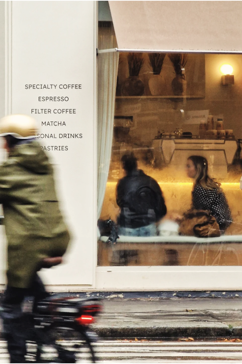
In Paris' highly competitive specialty coffee scene, the challenge was to create a brand capable of standing apart from the conventions of the category.
The identity needed to:
Express a concept that goes beyond coffee itself.
Reflect the brand's human and spiritual philosophy.
Differentiate itself within an increasingly homogeneous visual landscape.
Build the foundations of a place designed to bring people together.


Objectives
Create a visual identity capable of:
Expressing an experience rather than simply a venue.
Reflecting the values of hospitality, inspiration and well-being.
Balancing minimalism, warmth and sophistication.
Supporting the growth of a community-driven destination.

Approach
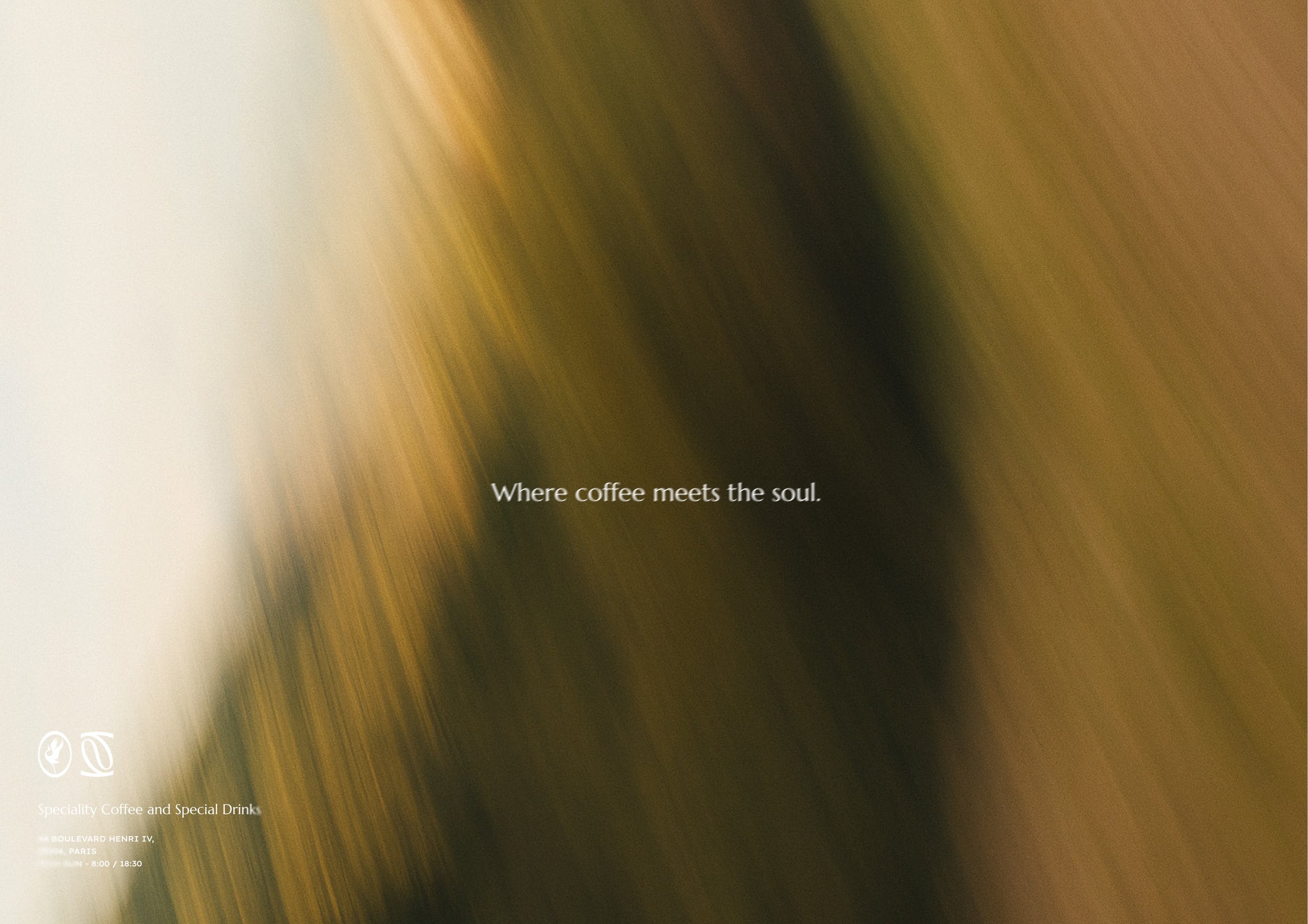
We approached LIV by designing an experience rather than simply a visual identity.
Our ambition was to create a brand that communicates a feeling—a rhythm, a moment of pause, an invitation to slow down.
Every graphic element was carefully considered to reinforce this sense of movement, reflection and personal transformation.


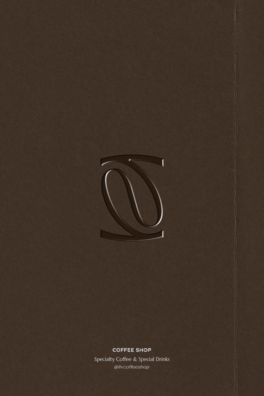
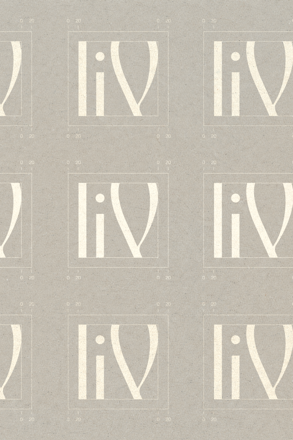
A living signature
The custom wordmark was designed as a symbol of elevation.
Its flowing letterforms suggest movement, breathing and personal growth, reflecting the emotional journey visitors experience when stepping into LIV.
Rather than simply identifying the place, the logo embodies its philosophy: arriving to pause, leaving inspired.


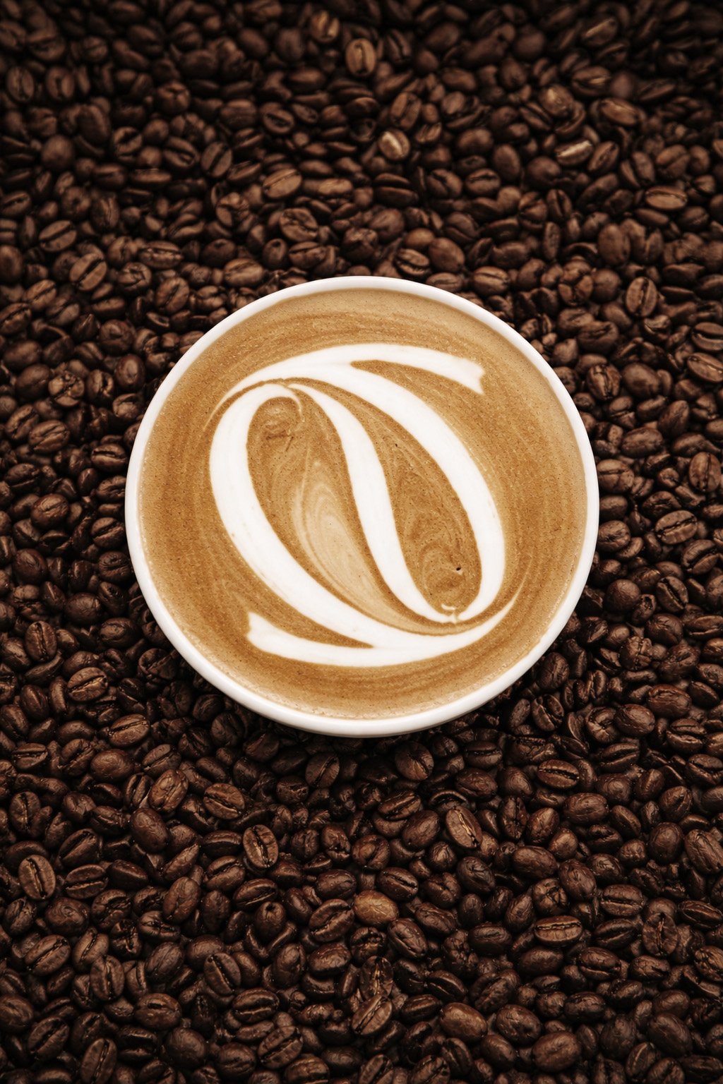
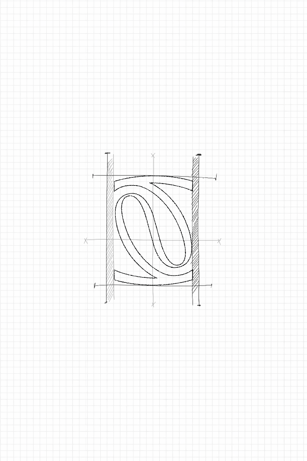
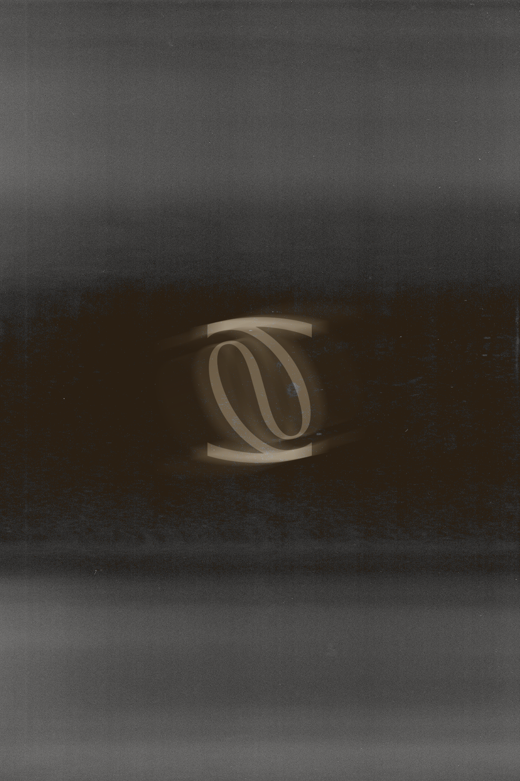
A symbolic visual language
The identity is built around two central symbols.
The first is an organic form that simultaneously evokes a coffee bean and an introspective movement, reinforcing the connection between the physical product and the inner experience.
The second is the crane, a migratory bird representing transition, freedom and personal growth.
Together, these symbols create a distinctive visual language that adds depth and meaning to the brand experience.


A grounded colour palette
Natural shades of warm brown and bamboo green establish a calm, welcoming atmosphere.
The palette reinforces the feeling of comfort, grounding and authenticity while reflecting the sensory experience offered by the space.


Outcome
Today, LIV has a distinctive visual identity that perfectly reflects its philosophy and positioning.
The project successfully delivers:
A memorable presence within a highly competitive market.
A brand experience fully aligned with the atmosphere of the venue.
A strong emotional and narrative dimension that extends beyond visual aesthetics.
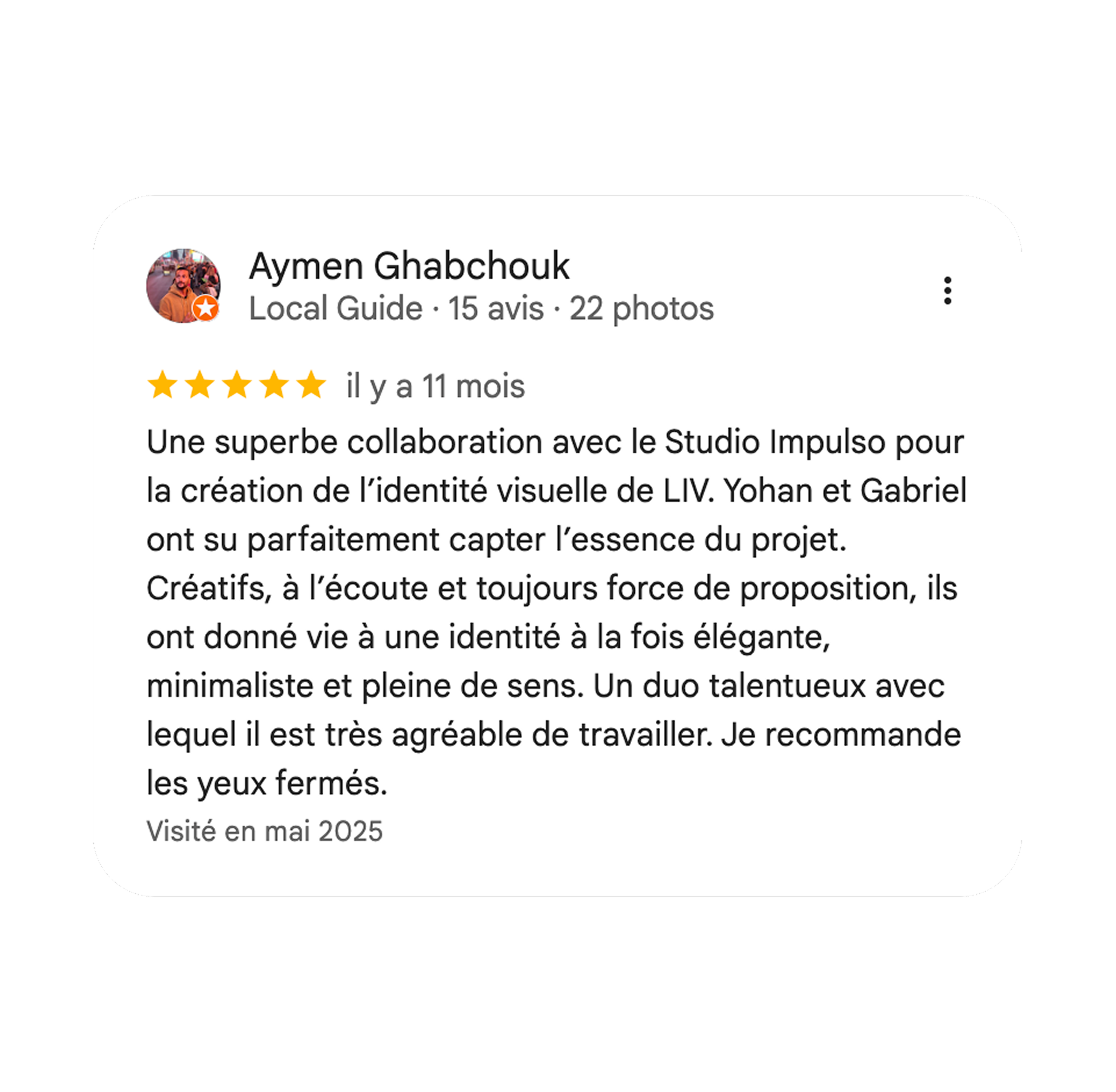
This consistency between identity and experience is reflected in the café's outstanding reputation, with a 4.9-star Google rating based on more than 1,000 reviews.
More than a coffee shop, LIV has established itself as a destination where branding, hospitality and human connection come together to create a truly meaningful experience.


A word from our client, Aymen