Miranbella is a natural haircare brand created for curly, coily and textured hair. Founded by Jocelina Miranda, the brand draws inspiration from the natural richness of Cape Verde, with a clear ambition: to create authentic, effective products rooted in a deeply personal story.
Services

Packagings
Logotype
Visual universe
Web

Website


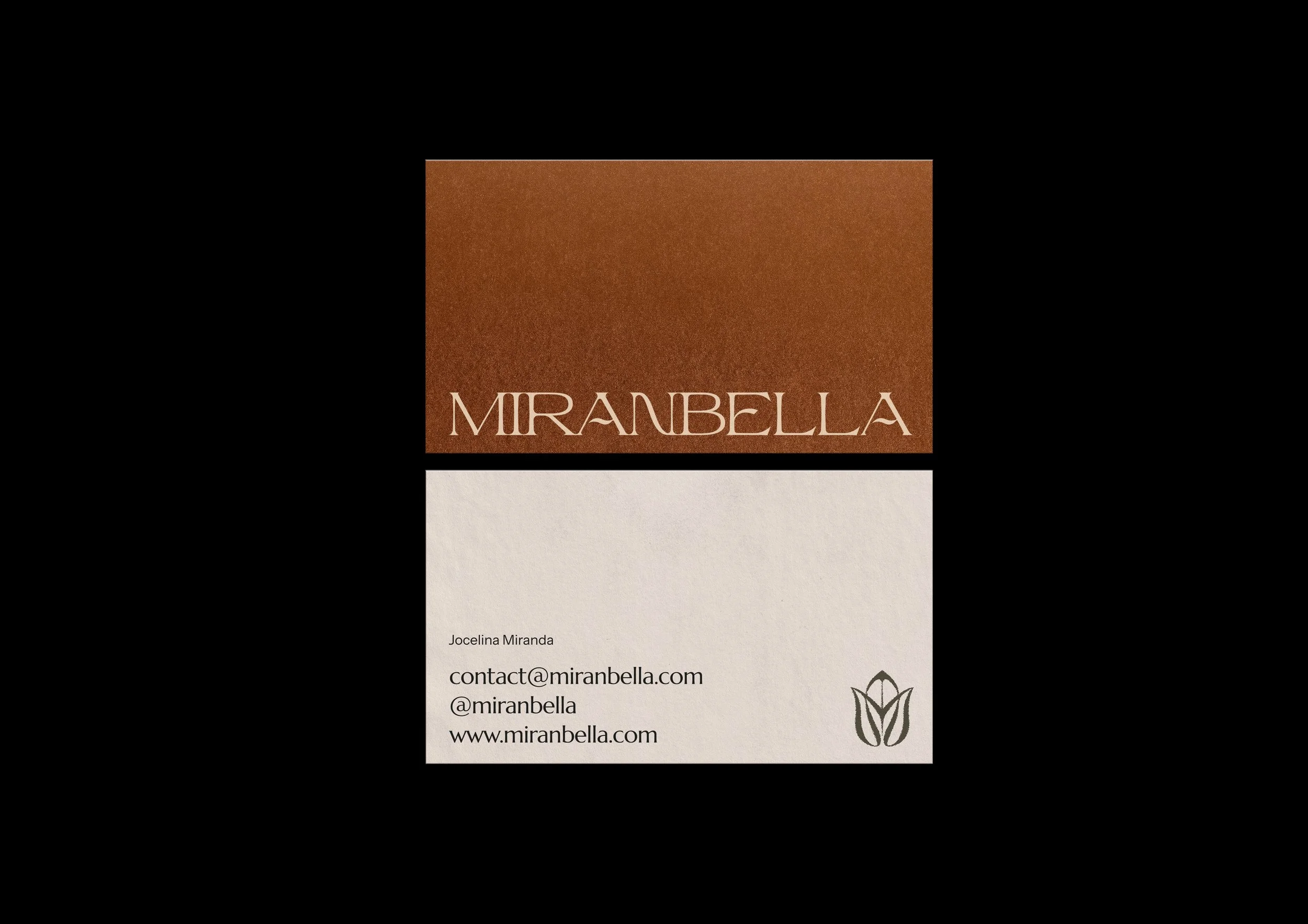
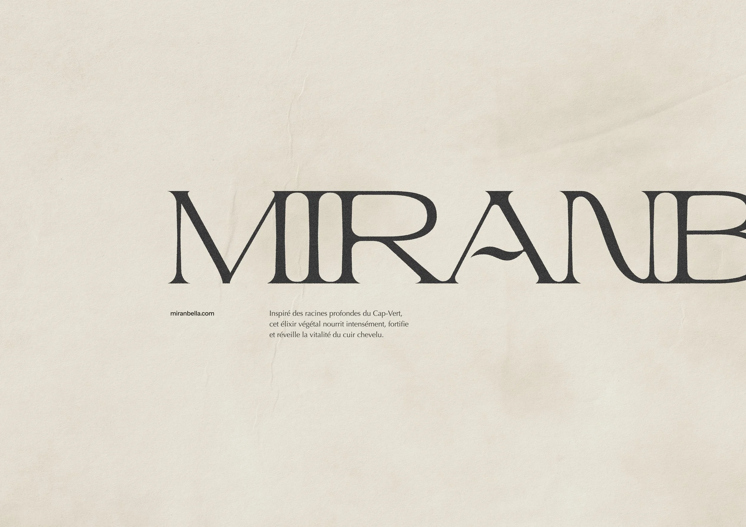
Logotype Miranbella en lettrage doré sur fond brun terre volcanique
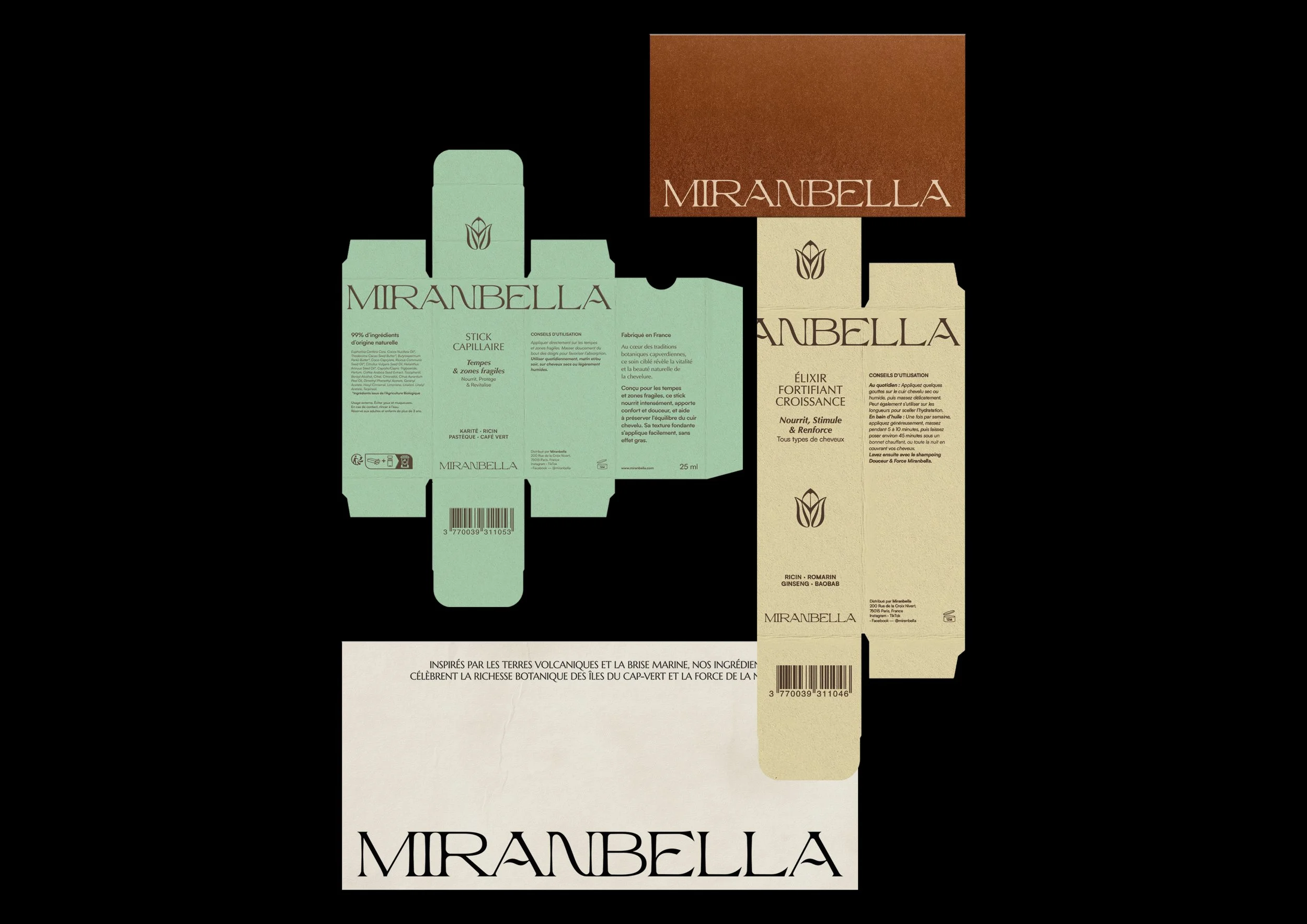
Packaging Miranbella se démarquant des codes visuels du secteur cosmétique naturel

Challenge

Everything had to be built from the ground up.

The challenge was twofold:

  • Stand out in a highly competitive market where many natural beauty brands share similar visual codes.

  • Create a visual identity that tells a meaningful story without relying on the clichés often associated with "natural" cosmetics.

Our goal was also to establish the foundations of a long-lasting brand—cohesive, memorable and flexible enough to evolve across every touchpoint.
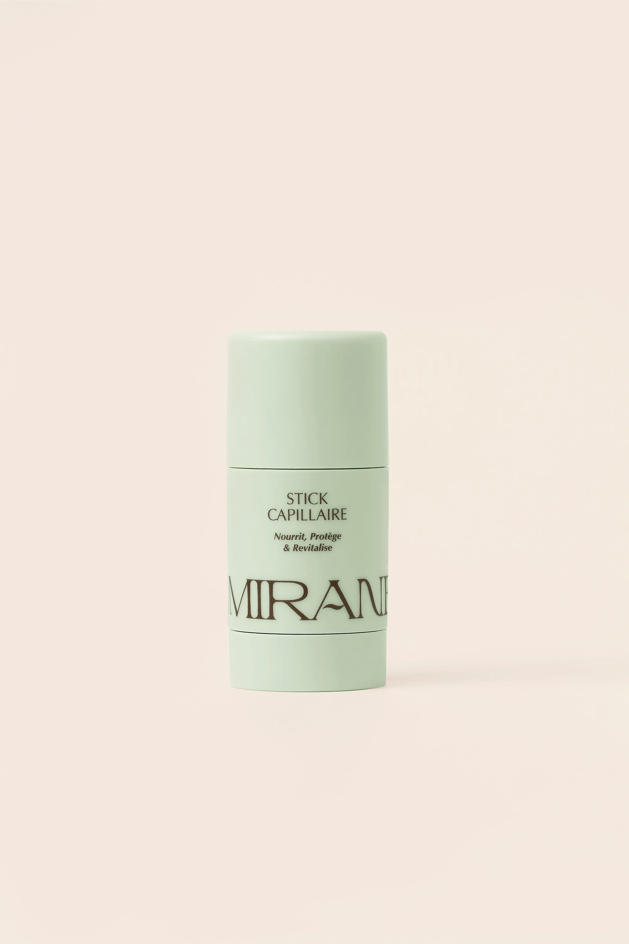
A white cylindrical container with a white cap, labeled 'Stick Capillaire' and 'Mirand' in black letters, standing on a plain surface with a neutral background.
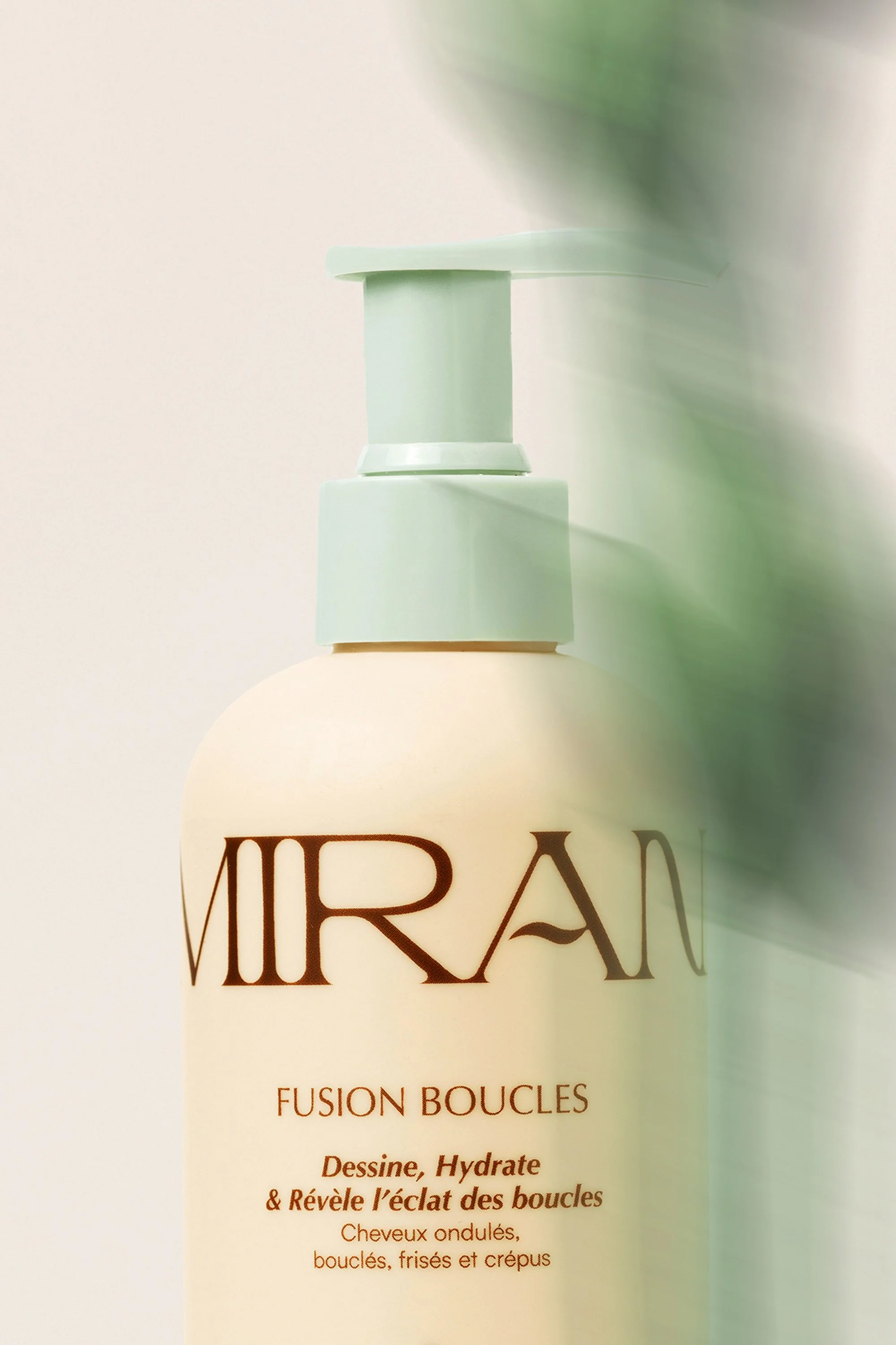
Close-up of a bottle labeled 'MIRA', with a pale green cap and a white body, featuring text about hair care products in both English and French.
Business card for Mirabella by Jocelina Miranda, featuring contact information and a logo of a stylized flower.

Objectives

Create a complete brand identity that would:

  • Capture attention instantly.

  • Position the brand as premium while remaining approachable.

  • Reflect the authenticity of the founder and the natural origins of the products.

  • Build a consistent visual system across packaging, digital platforms and social media.
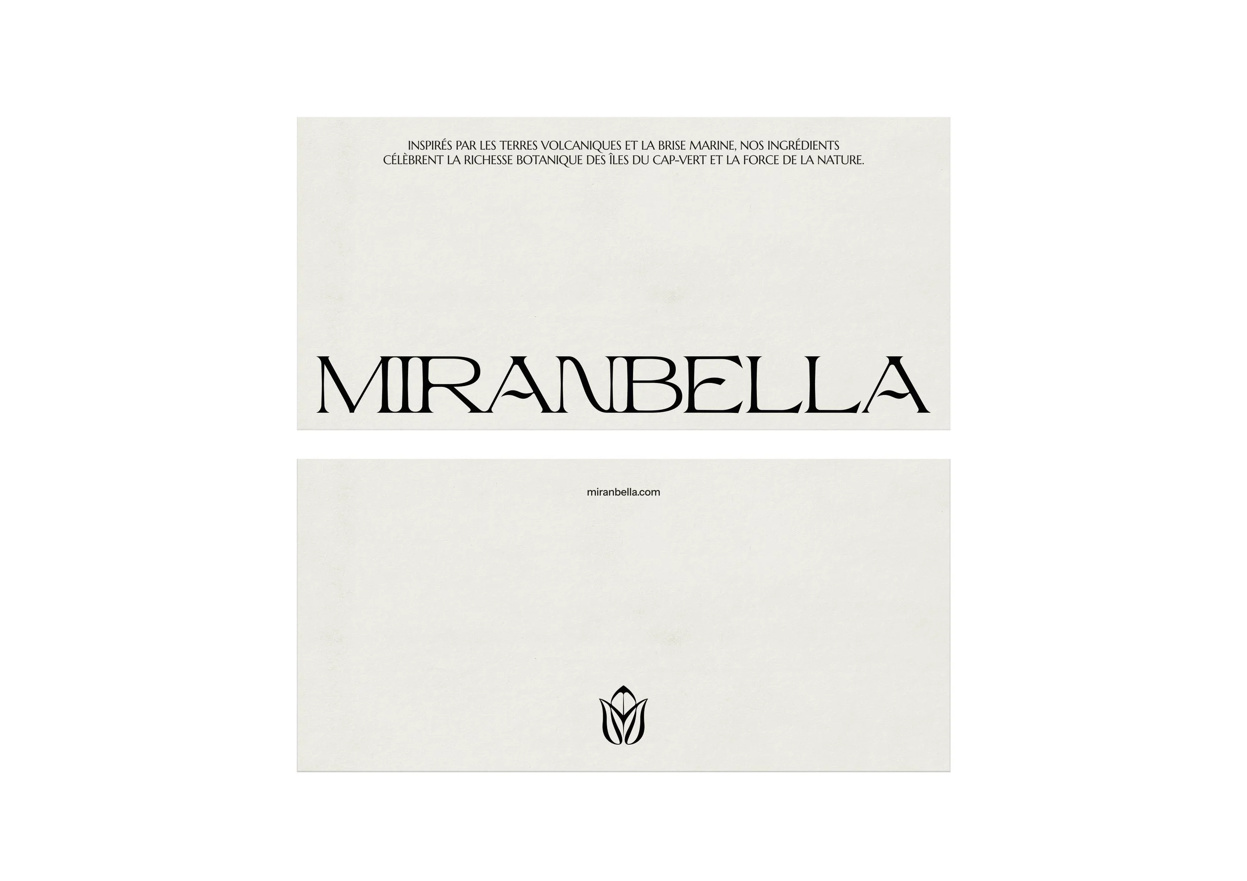
A white book cover titled 'MIRAMELLA' with black text, a small black flower symbol, and a website URL miranbella.com.
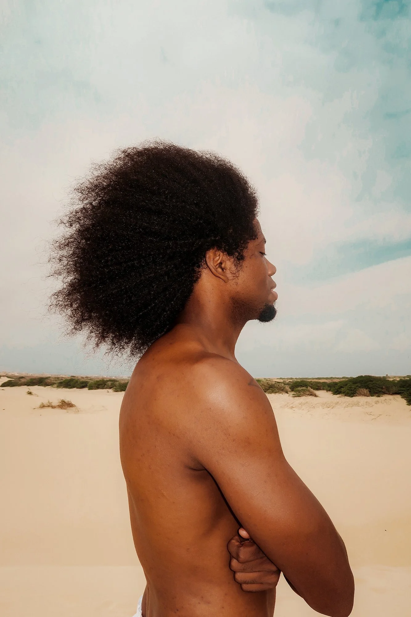
A shirtless Black man with an afro hairstyle standing in profile view on a beach with sand and low vegetation, under a cloudy sky.
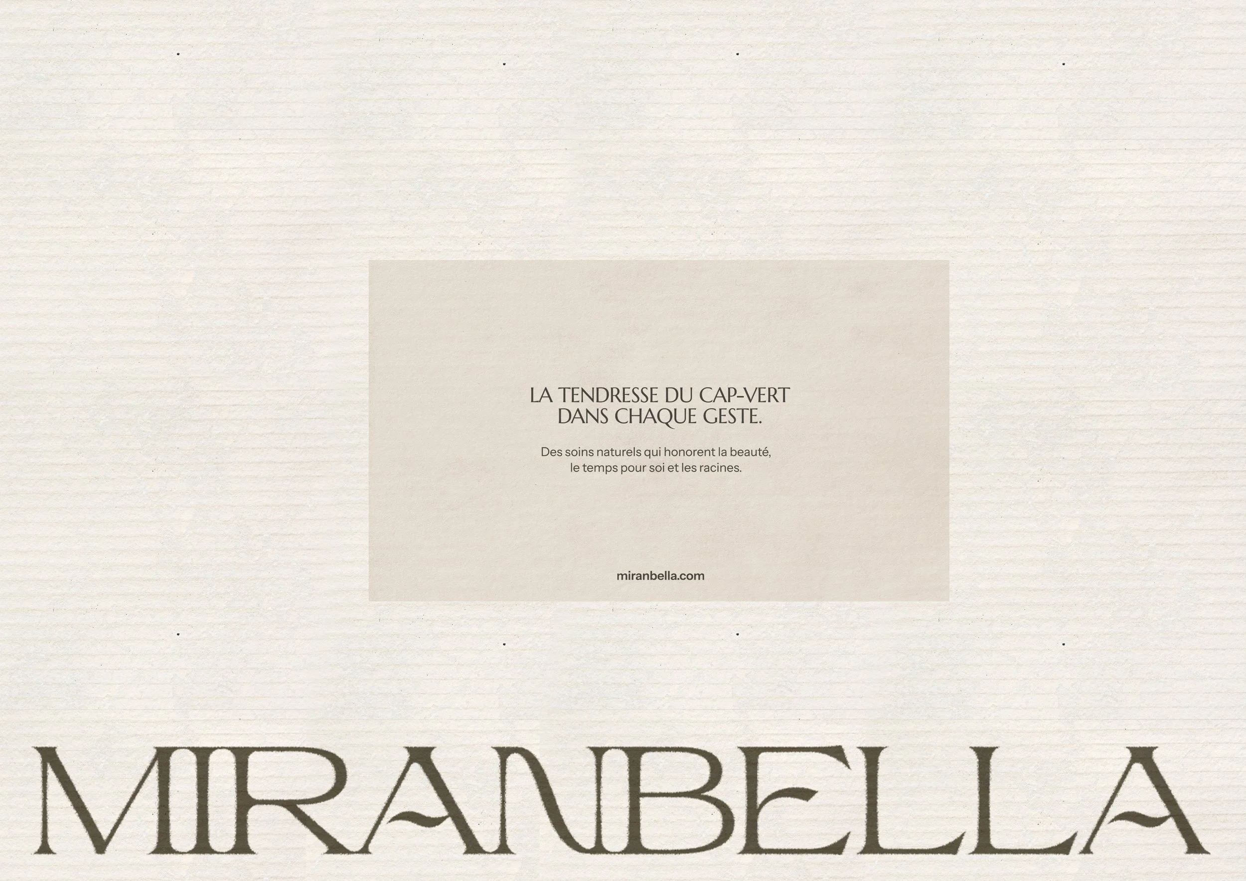
A close-up of a beige textured background with a white rectangular overlay containing French text and a website URL at the bottom.
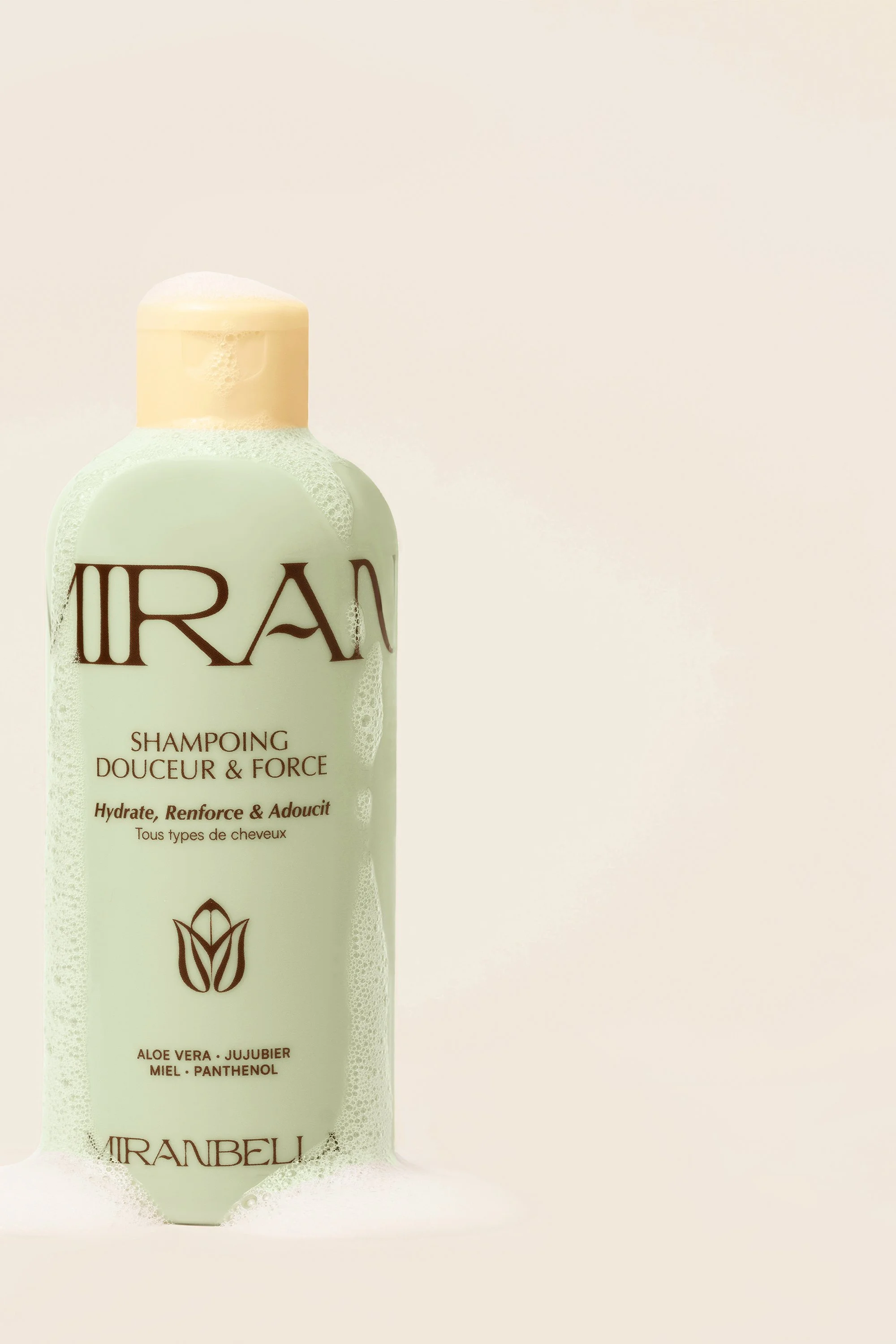
Bottle of IRANBEL shampoo with a cream-colored cap and cream, greenish liquid inside. The label mentions ingredients like aloe vera, jojoba, honey, and panthenol, with benefits to hydrate, reinforce, and soften all hair types.
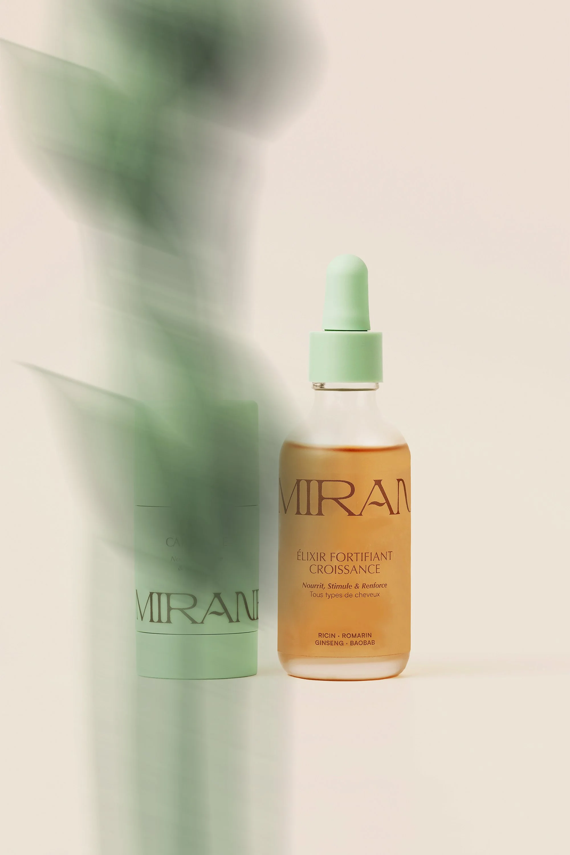
A bottle of Miradél Fortifying Growth Elixir with a green cap and liquid inside, positioned in front of its white cylindrical packaging box, against a plain background.

Approach

Rather than following the conventional aesthetics of the natural cosmetics industry, we chose a more subtle visual language based on emotion and suggestion rather than literal representations of ingredients or nature.

The objective was to create a brand identity that people could feel before they fully understood it—an identity expressing softness, craftsmanship and depth.
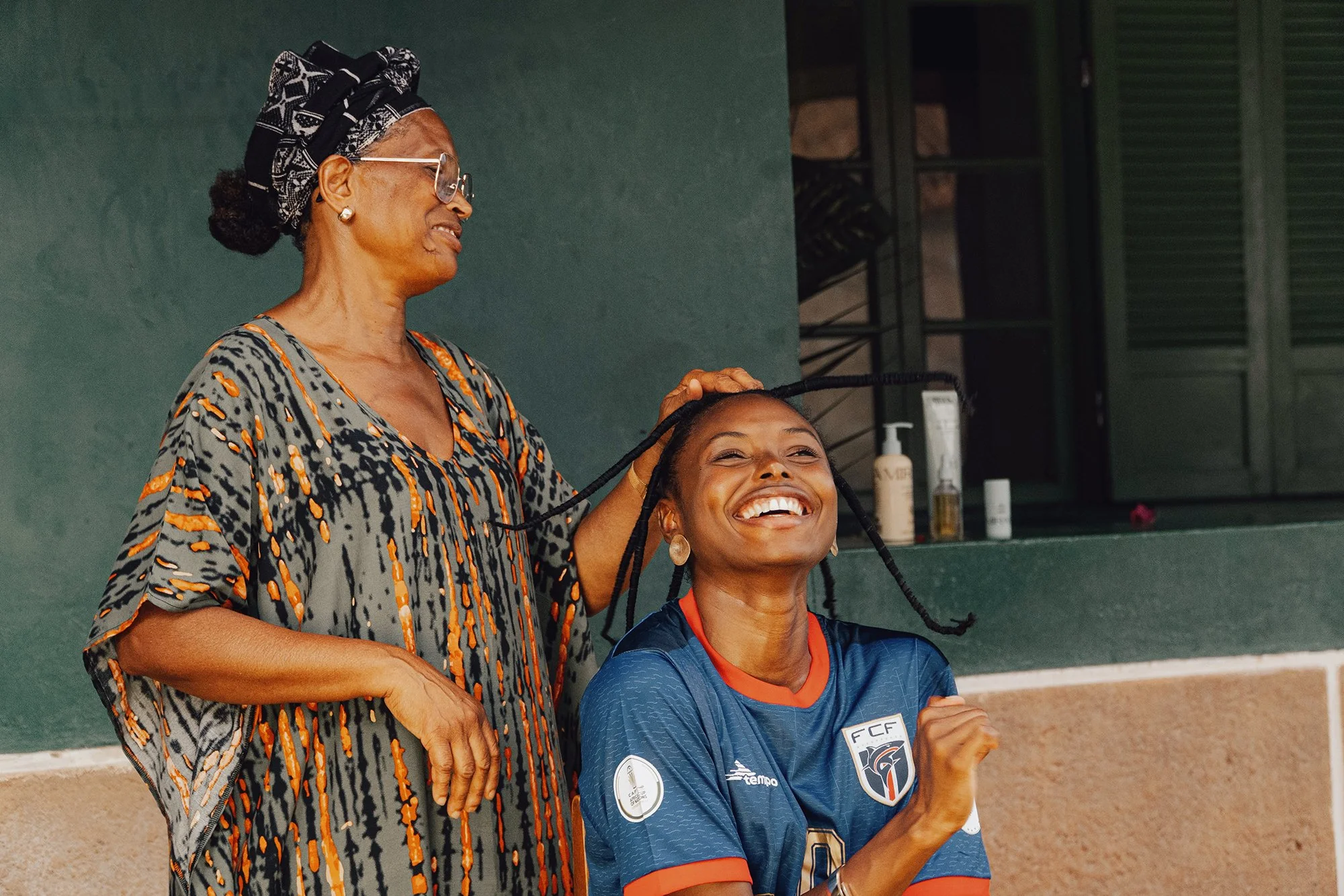
An older woman with glasses and a headscarf smiling while standing next to a young girl with braided hair in a sports uniform, both smiling and appearing joyful.
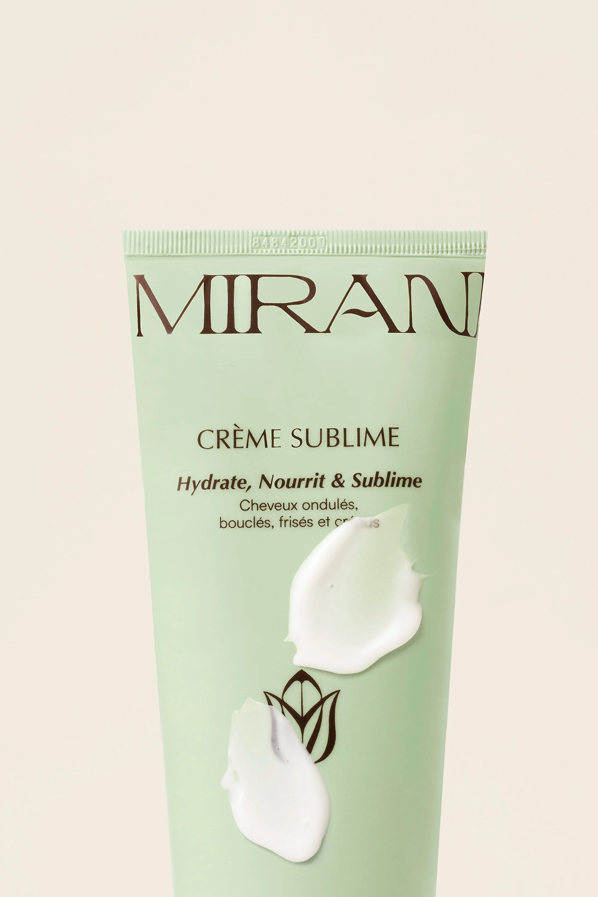
Close-up of a light green tube of MIRAN Crème Sublime skincare product with white cream visible at the bottom, set against a plain light background.
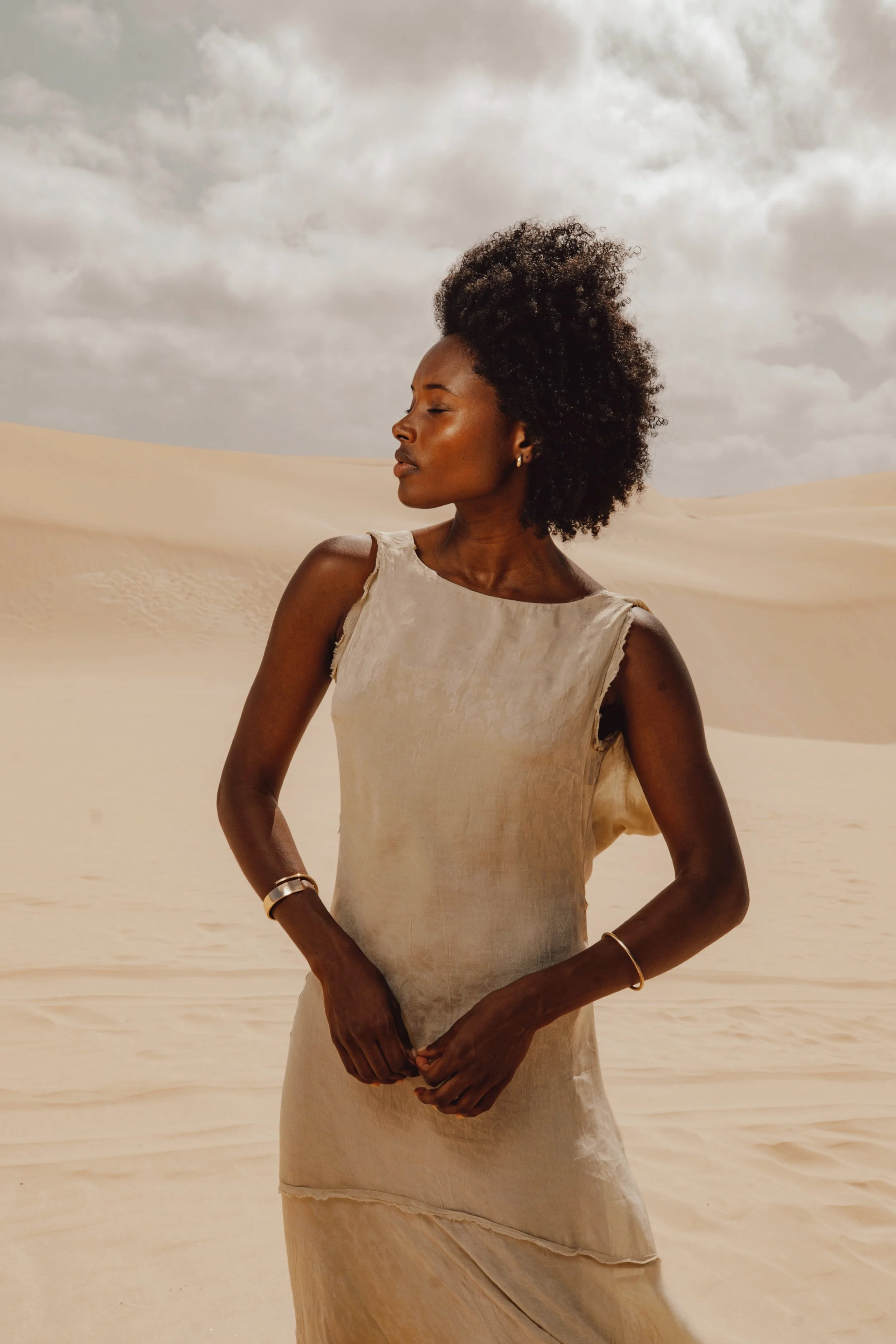
A woman with dark skin and natural afro hair stands in a desert landscape with sand dunes and a cloudy sky behind her. She is wearing a sleeveless, beige dress and various bracelets.

Art direction

The logo was custom-designed to create a distinctive and instantly recognizable signature. Its organic forms and subtle details evoke authenticity, naturality and the rich cultural roots behind the brand.

The color palette takes inspiration from the landscapes of Cape Verde:

  • Warm sand yellow

  • Deep botanical green

  • Rich volcanic brown

Together, these colors establish a distinctive visual territory while reinforcing the brand's premium positioning.

The typography complements the identity with soft yet confident letterforms, balancing elegance, personality and readability.
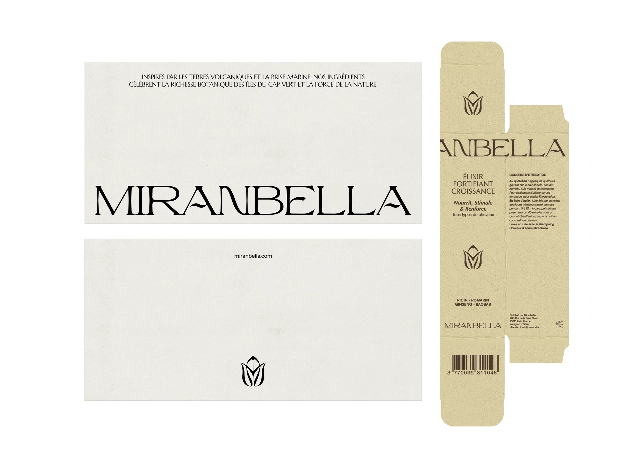
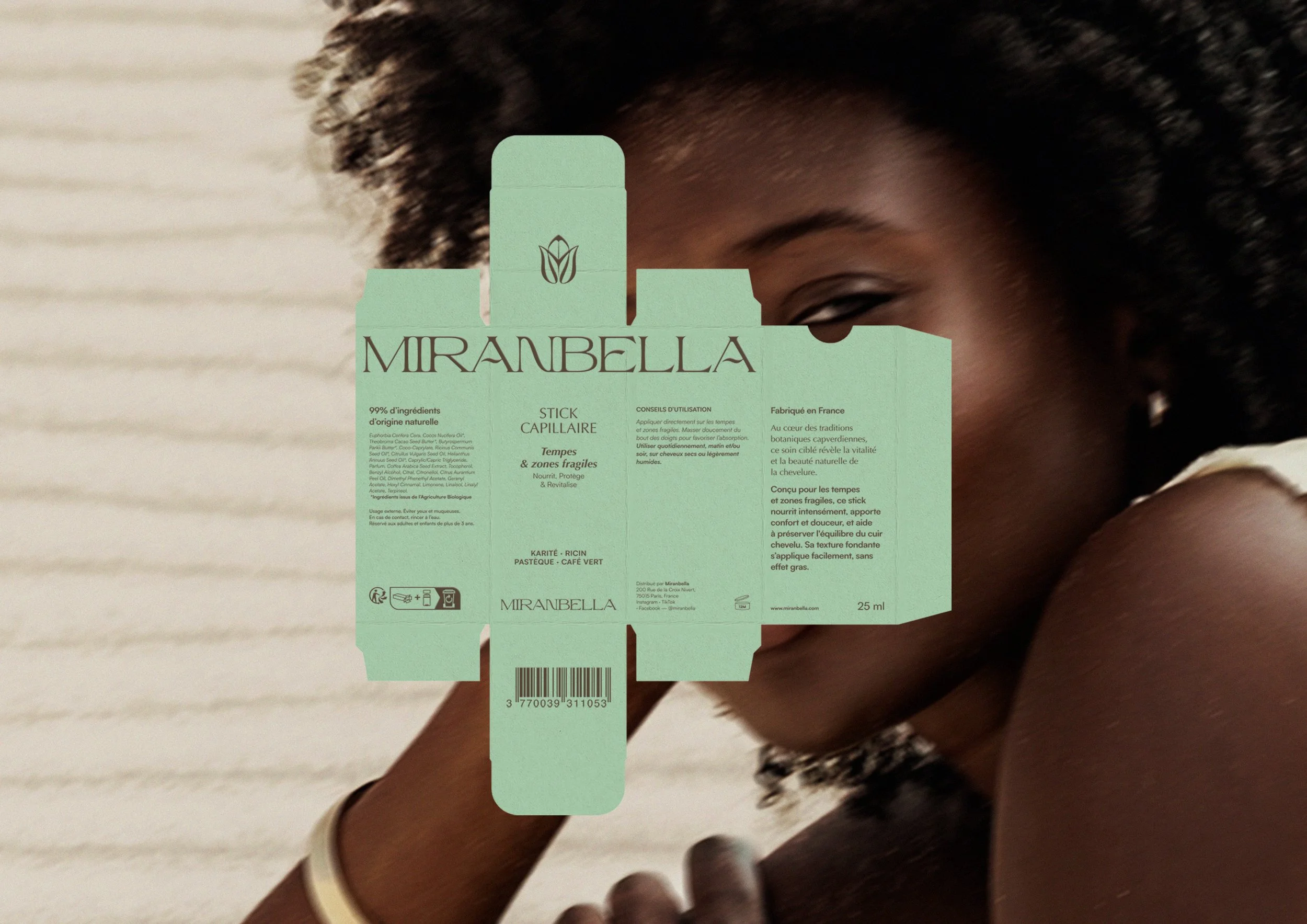
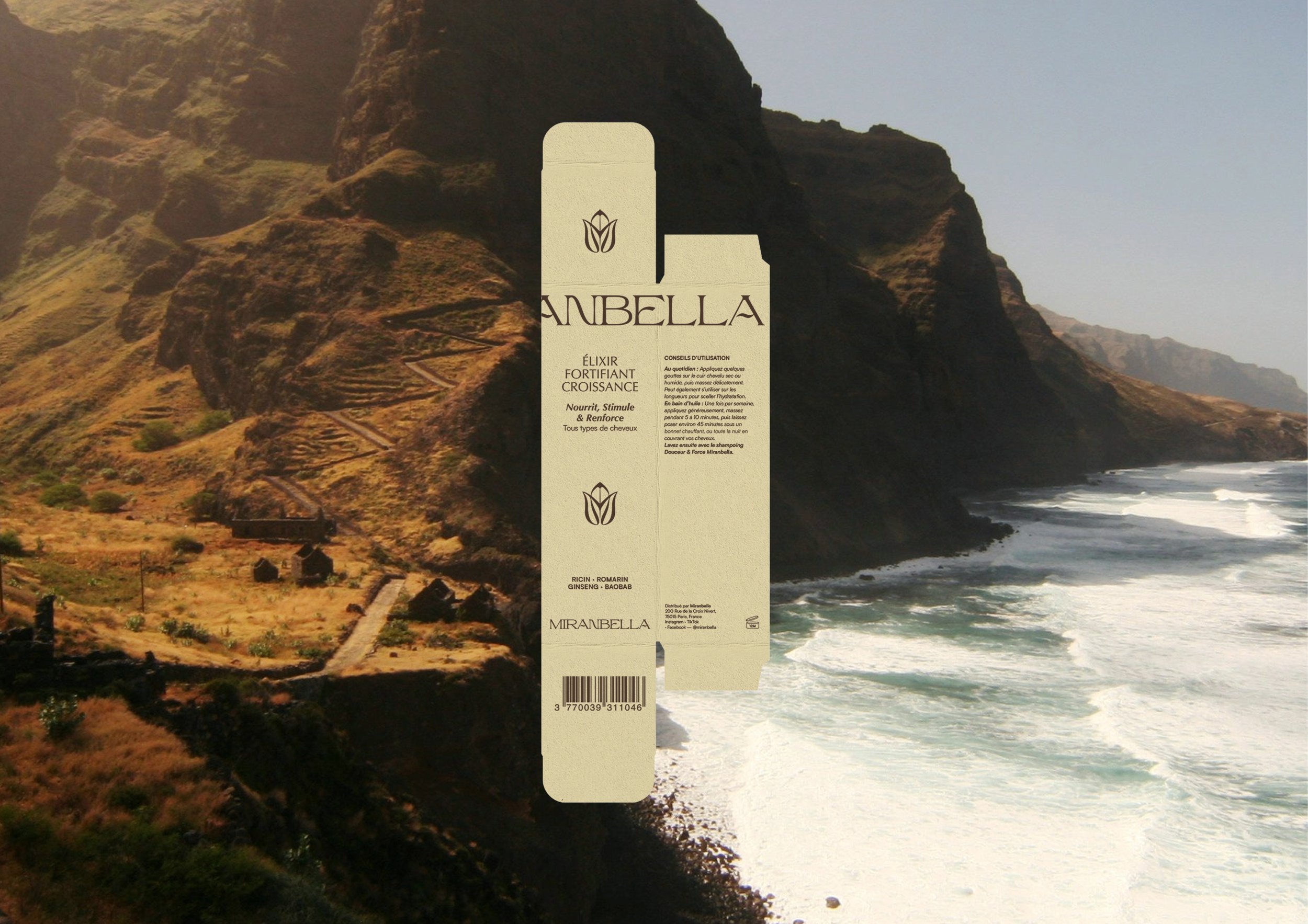
Packaging box and label for Mirabella botanical hair elixir, with text describing ingredients and usage instructions in French.
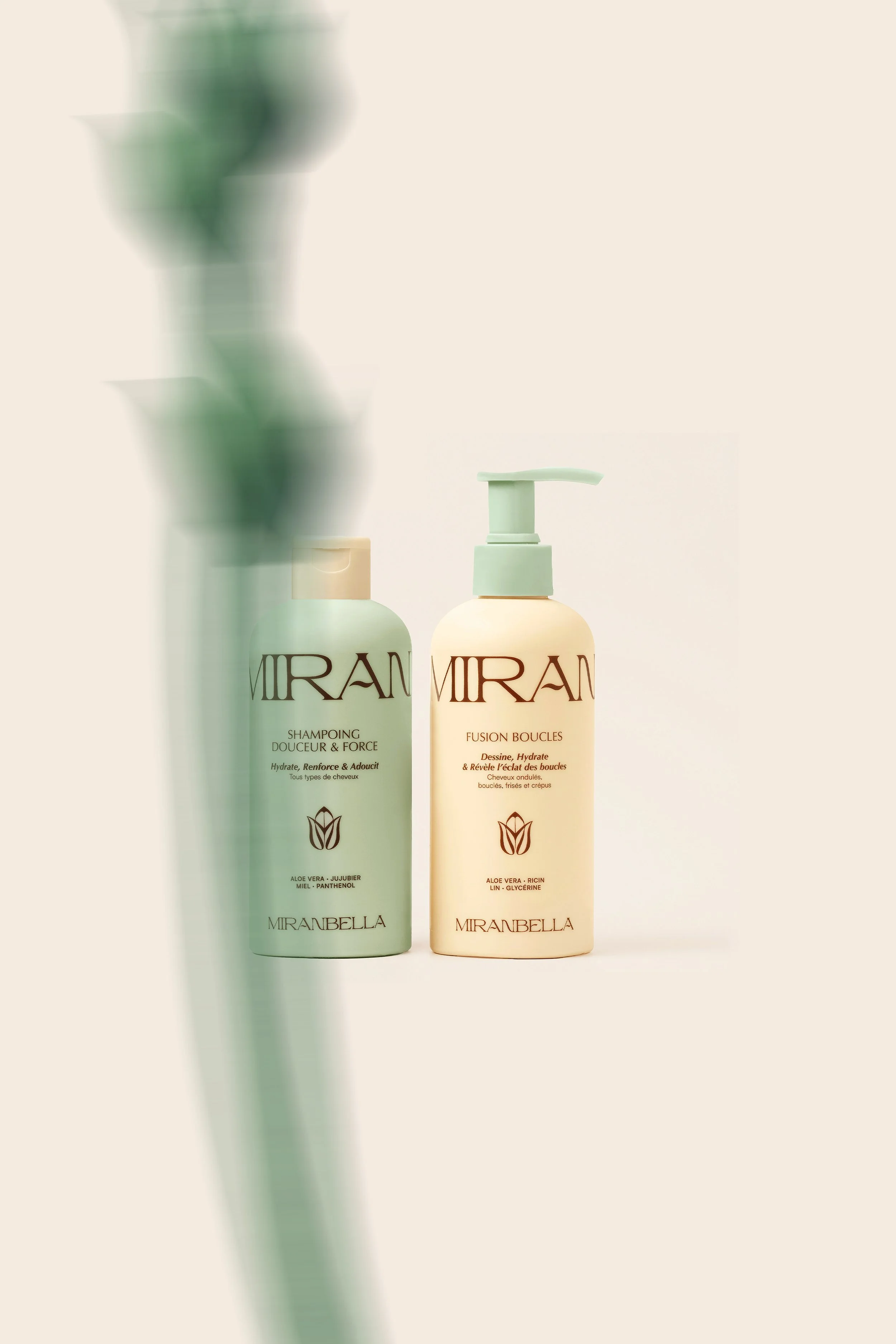
Two bottles of Mirabella hair care products, one labeled shampoo and the other labeled fusion boucles, against a light background with a blurred reflection in the foreground.
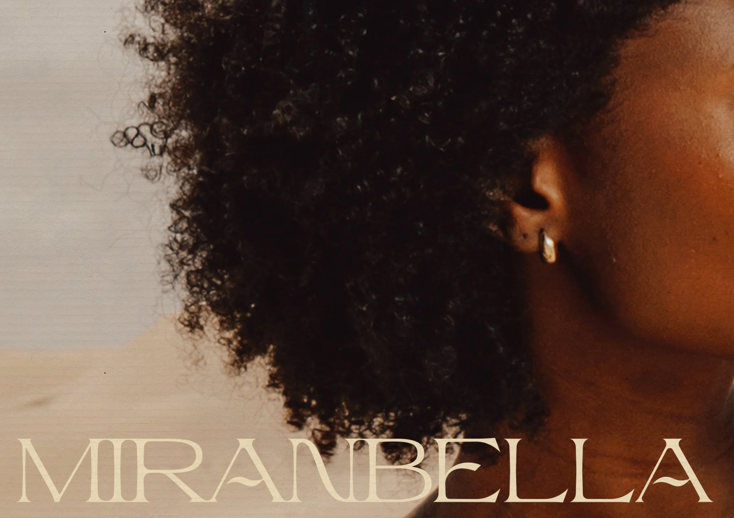
A person holding a Mirabella hair care product package in front of their face, with only one eye and part of their hair visible.

Outcome

Today, Miranbella benefits from a strong and instantly recognizable visual identity.

The brand now stands out from its very first touchpoints thanks to:

  • A distinctive identity in a saturated market.

  • A premium and cohesive brand perception.

  • A flexible visual system designed to work seamlessly across packaging, digital experiences and social media.

This solid foundation allows the brand to grow consistently while strengthening its credibility, recognition and appeal.
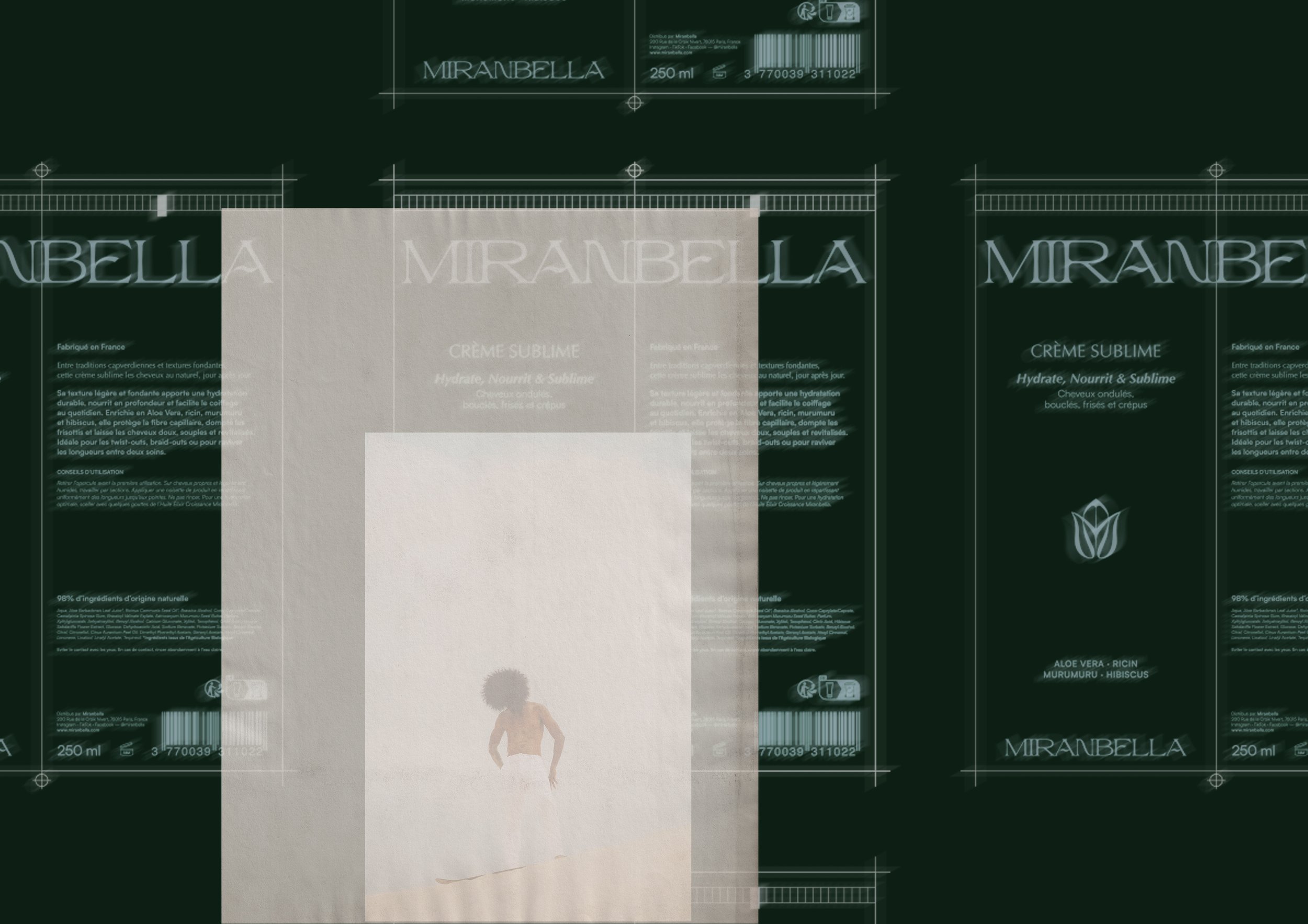
The image appears to be a digitally manipulated or corrupted representation of a product packaging label for Miranbella, a hair care item. The label includes the product name, volume (250 ml), barcode, and descriptions in French about the product's benefits and ingredients, with some visual elements like a small plant graphic and a person with curly hair at the bottom.
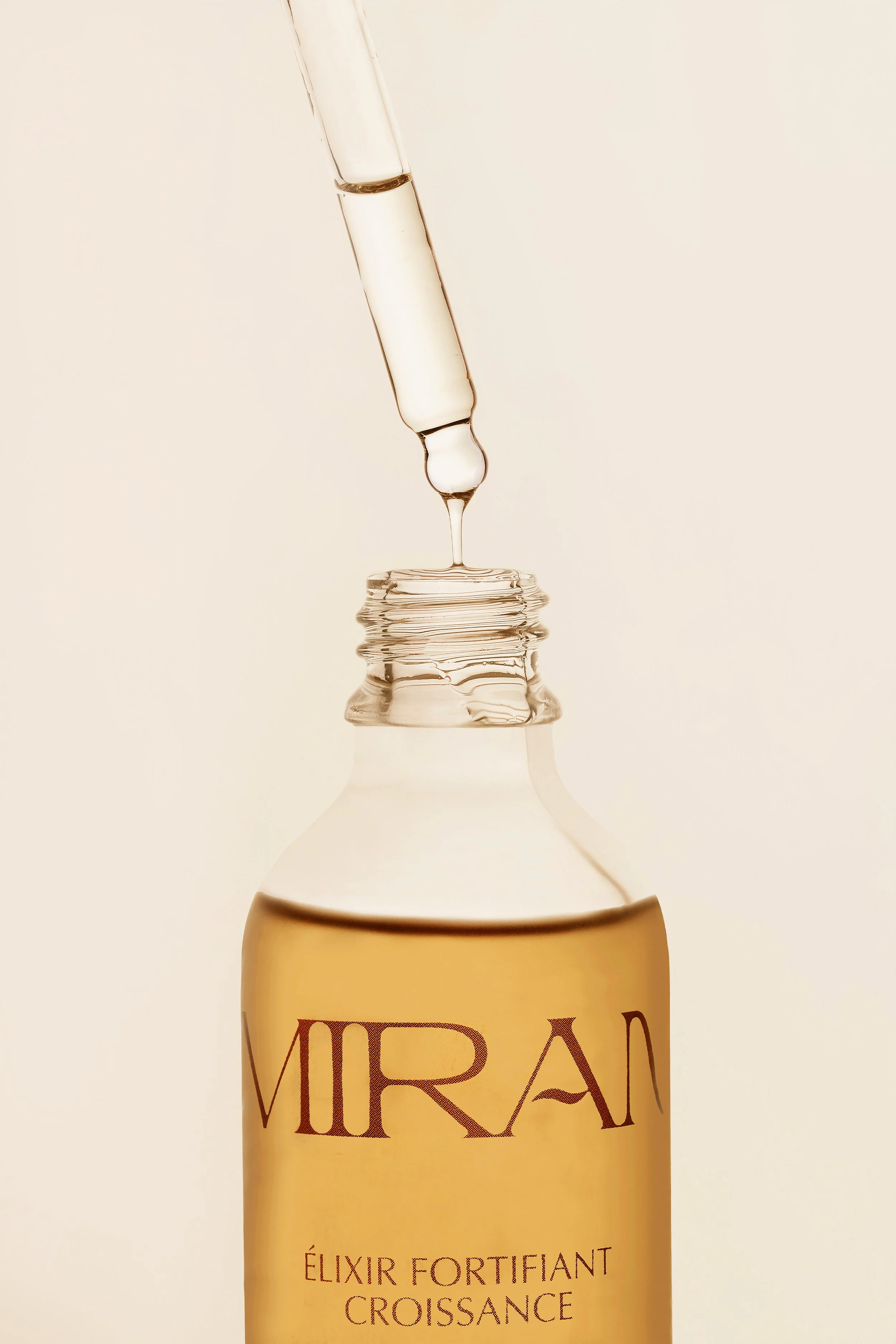
Close-up of a dropper releasing a droplet of clear liquid onto the opening of a light-colored bottle labeled "MIRAD" with additional text "ÉLIXIR FORTIFIANT CROISSANCE".
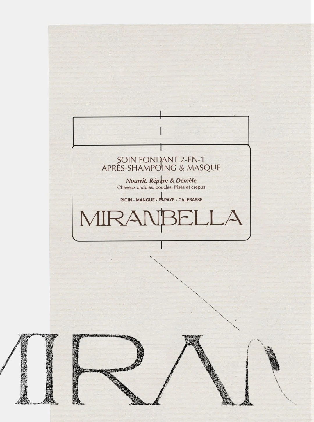
Product packaging for MiraU Bella hair care, including a 2-in-1 shampoo and mask for curly, wavy, and frizzy hair, with ingredients like ricin, mango, papaya, and calebass.
Colorful packaging for Mirabella hair care products including a light green stick, a brown box, and a beige box, all with the Mirabella logo.
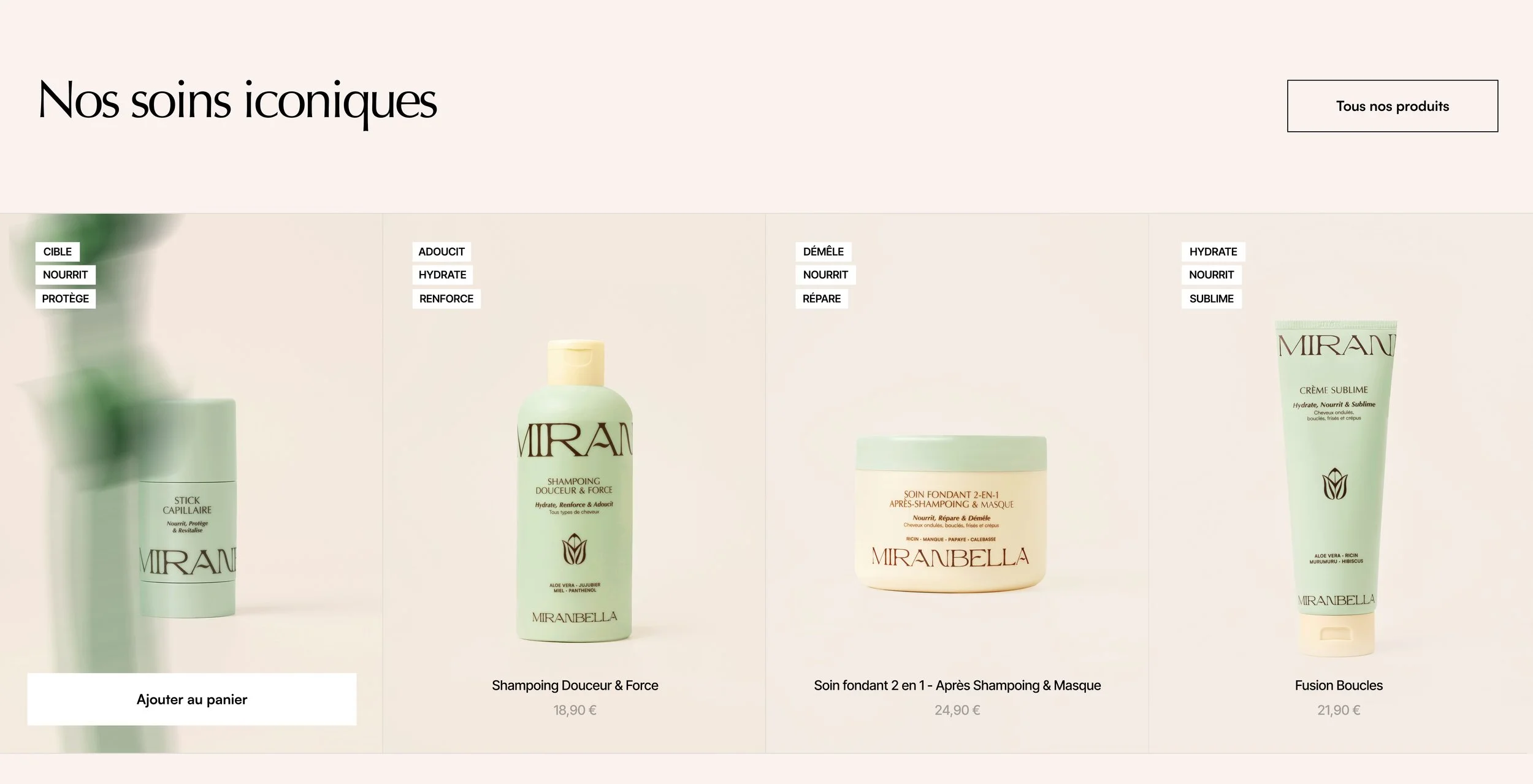
Beauty product website showcasing three Mirabella hair care products with descriptions and prices in euros. The products include a scalp treatment, a shampoo, and a leave-in conditioner.

Le mot de notre cliente

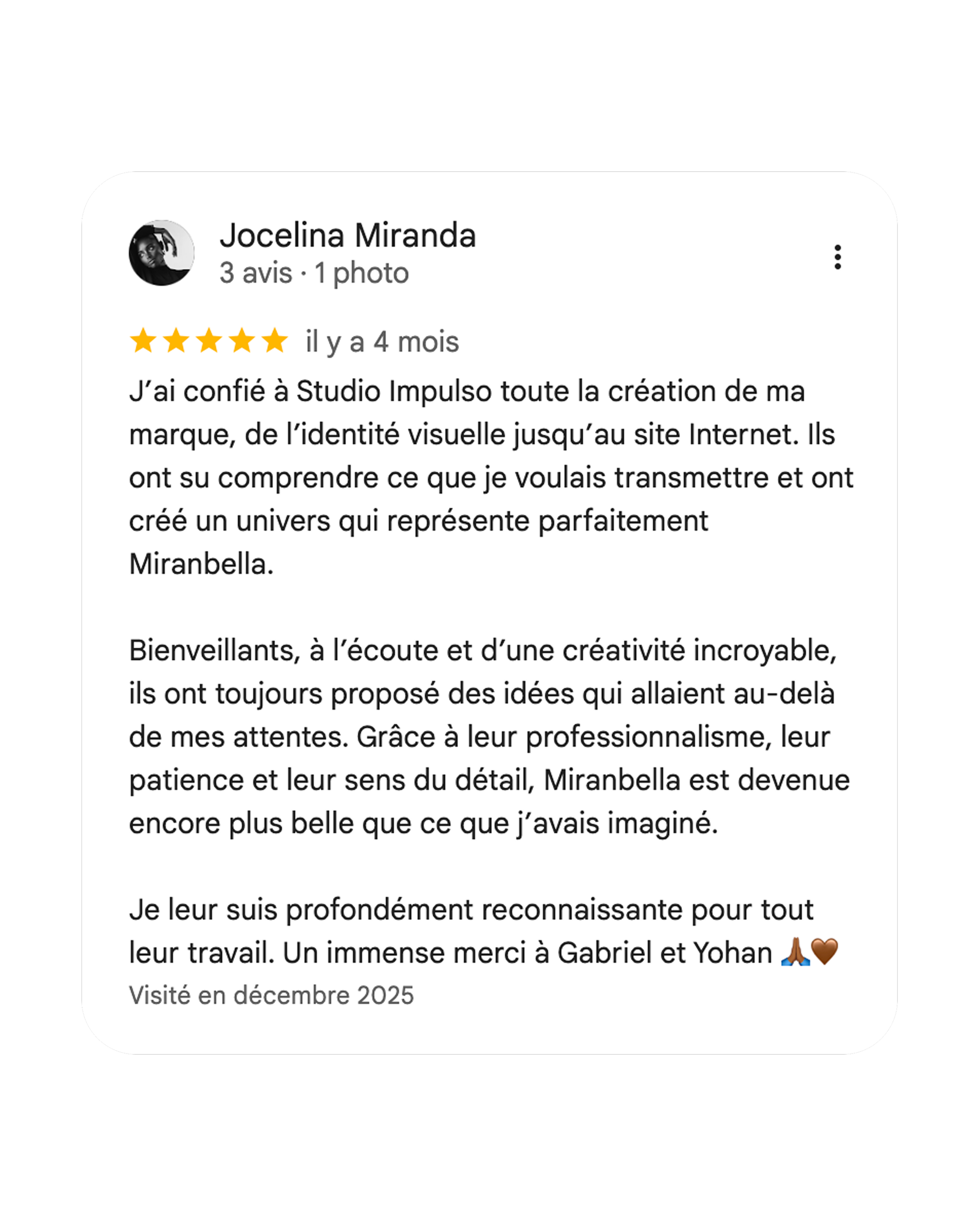
A review written in French praising Studio Impulso for creating a visual identity and website, mentioning trust, creativity, professionalism, patience, and gratitude to Gabriel and Yohan. The review includes 5-star rating, emojis of a prayer hands and a heart, and was visited in December 2025.