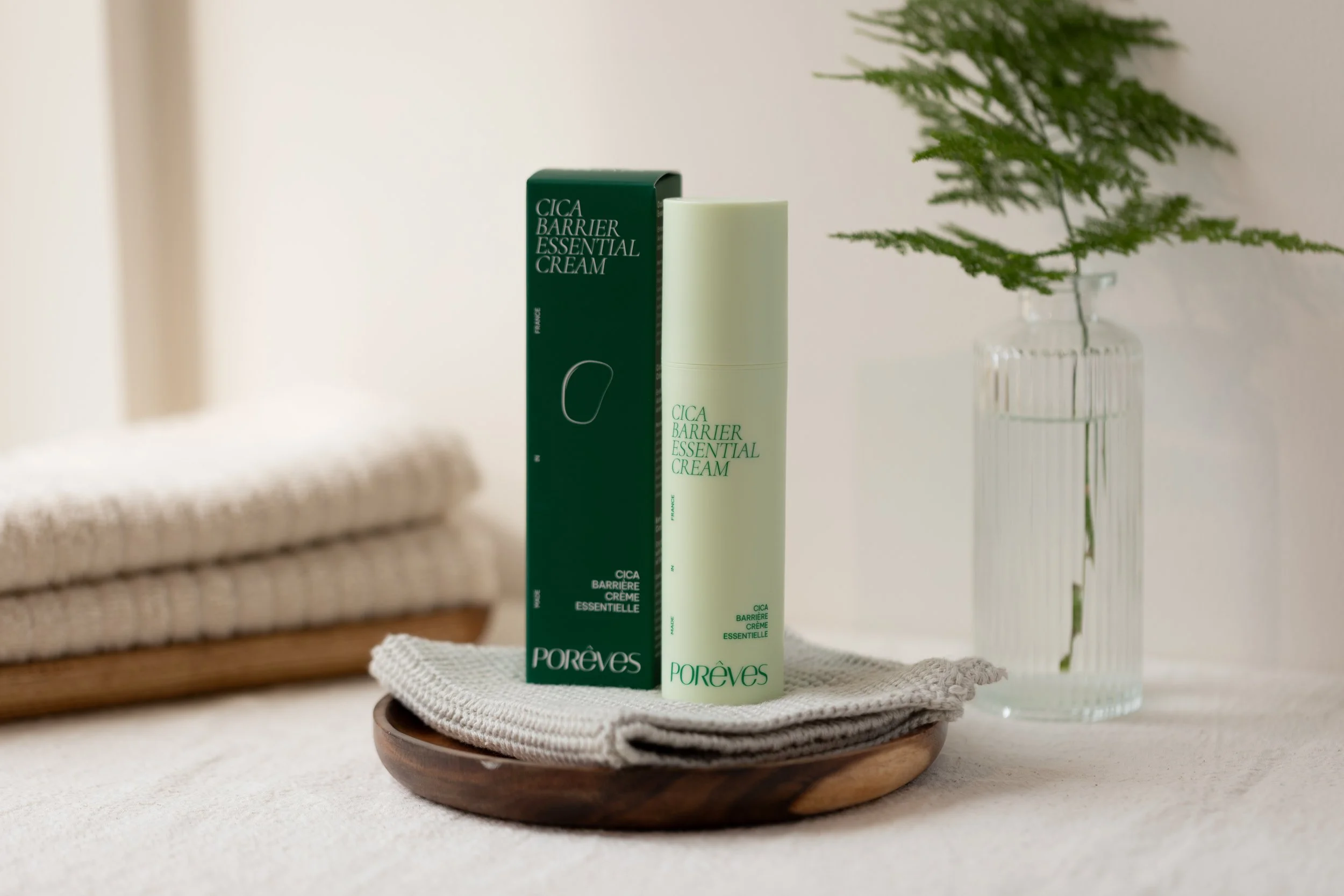
Porêves is a French-Vietnamese skincare brand created to meet the specific needs of Asian skin, particularly Vietnamese skin. The brand bridges French cosmetic expertise with natural Vietnamese ingredients inspired by traditional herbal medicine.We partnered with Porêves to develop its brand identity and packaging design for its first four products: a cleanser, mask, serum and moisturizer.
Services
Packagings
Brand universe
Industry
Cosmetics


Challenge
In an increasingly competitive skincare market, the visual identity needed to communicate two complementary worlds.
The challenge was to:
Express the meeting point between science and nature.
Celebrate the brand's bicultural identity (France & Vietnam).
Create a premium, credible and distinctive brand image.
Build a cohesive product range from launch.
Develop a visual system that could seamlessly extend across packaging and digital touchpoints.
The project was ultimately about finding the perfect balance between scientific expertise and sensory beauty.

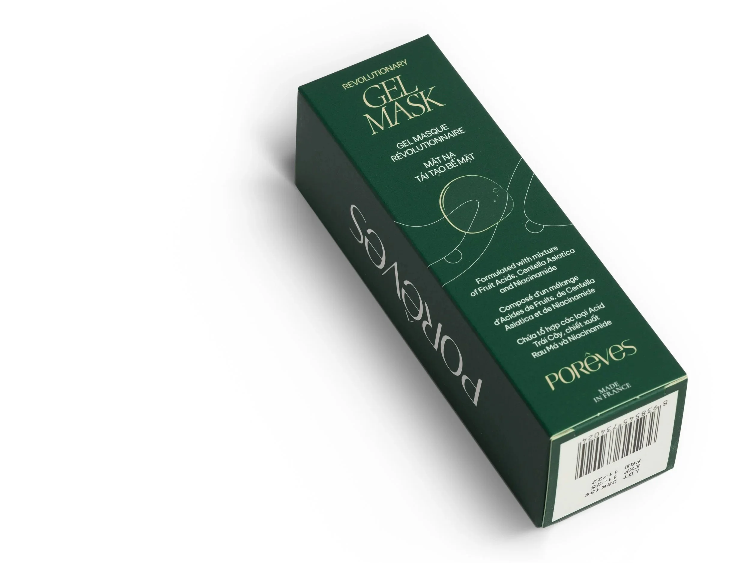
Création du packaging exterieur du gel masque

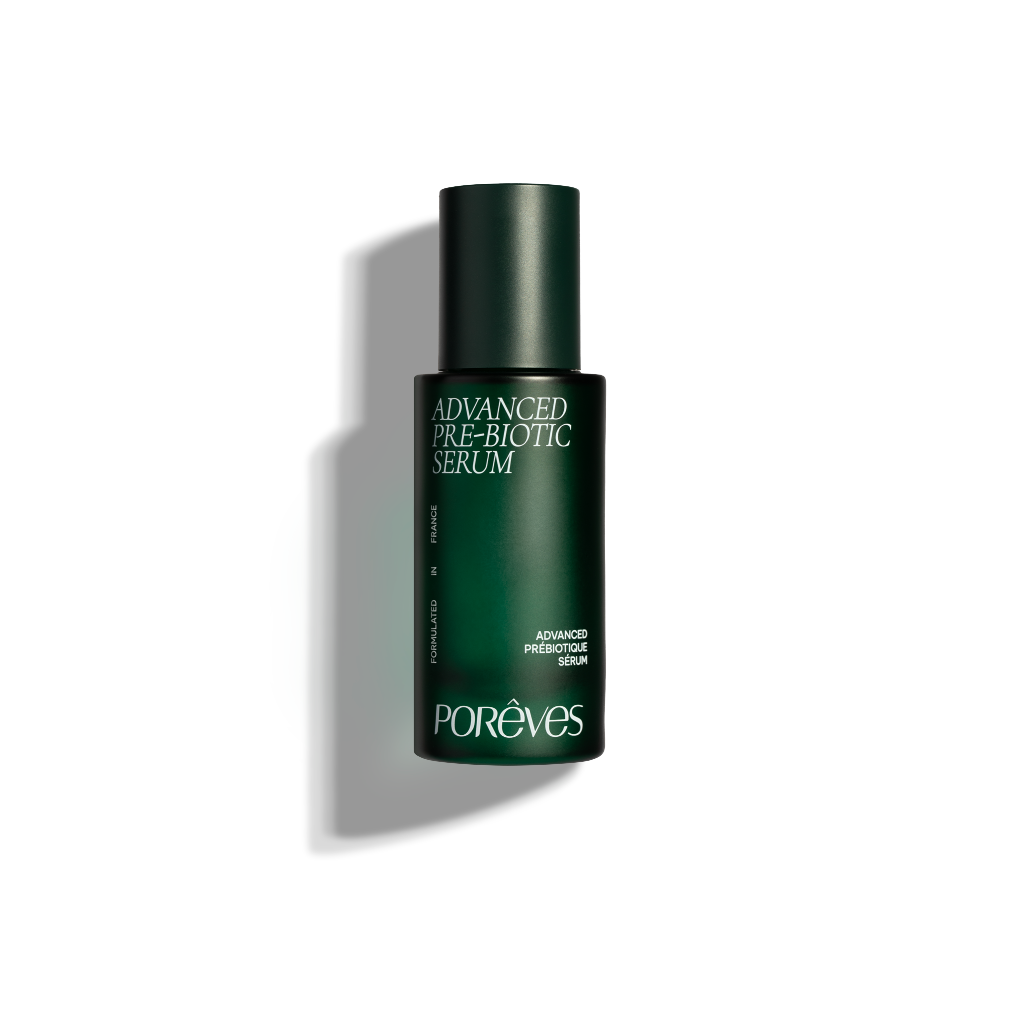
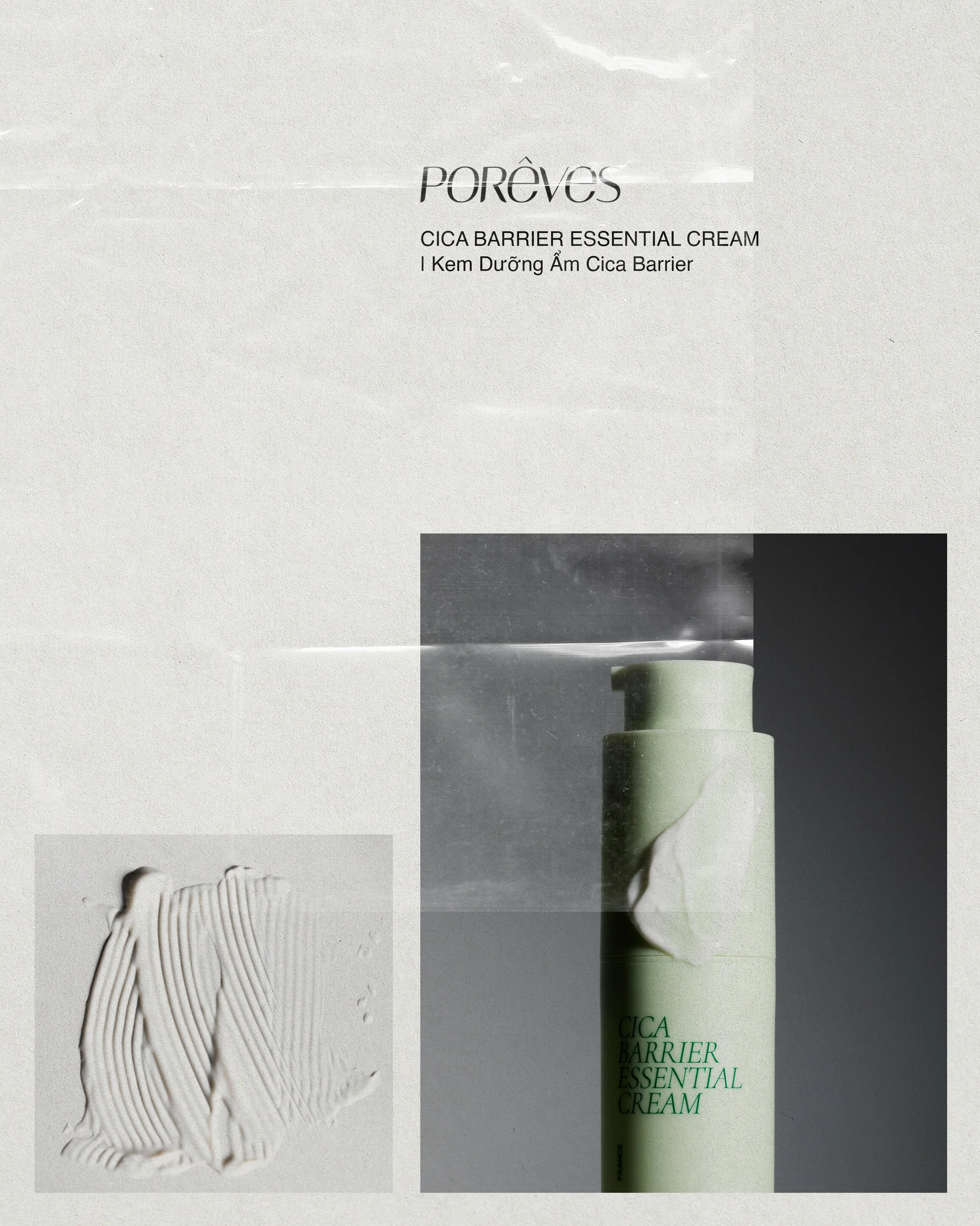
Création du packaging du sérum prébiotique avancé
Objectives
Create a visual identity capable of:
Positioning Porêves as both an expert skincare brand and a naturally inspired one.
Reflecting the meeting of two cultures and two traditions.
Giving every product its own personality while maintaining a cohesive product family.
Expressing an experience that feels both scientific and sensorial.
Building a premium brand designed to grow over time.

Création des packaging primaire et secondaire du gel masque
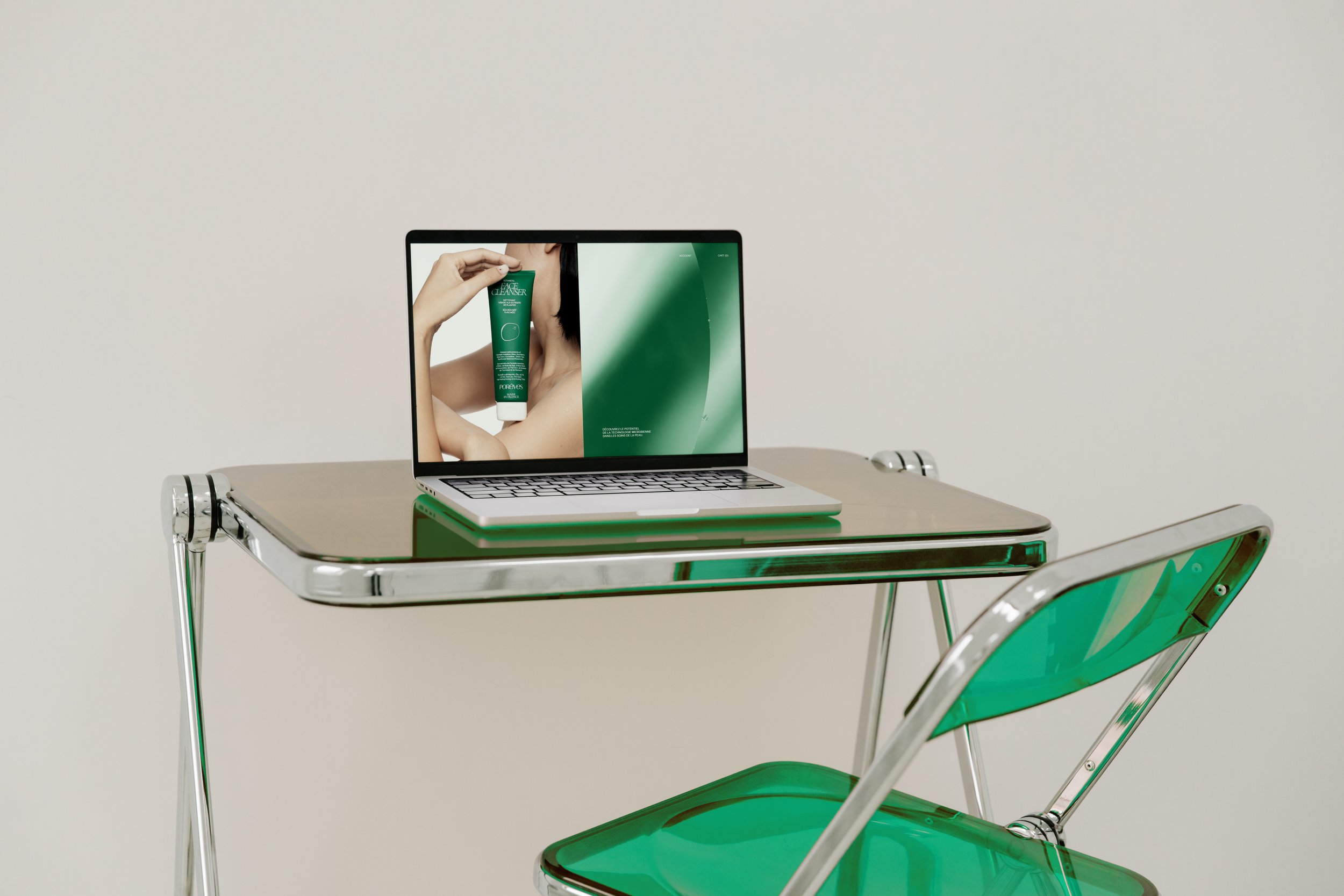
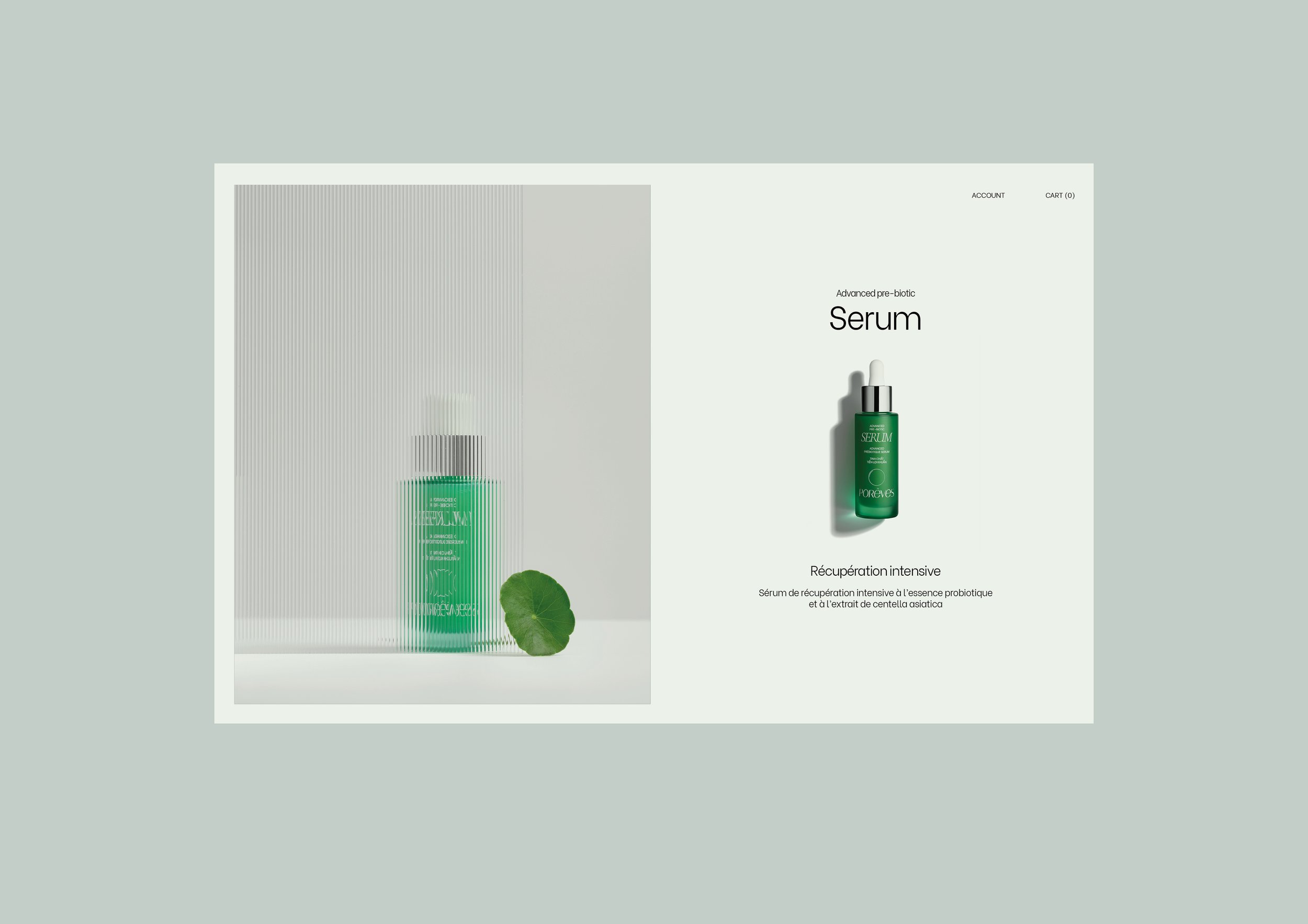
Conception des maquettes du site internet de l’e-shop
Approach
We approached the project by designing a hybrid visual language where science and nature coexist in harmony.
Every creative decision was carefully considered to balance precision, softness and sophistication, creating an identity that feels trustworthy without losing its emotional appeal.
A visual identity between science and nature
The visual system is built around the dialogue between two worlds:
Scientific precision, expressed through clean layouts, structured compositions and clear information hierarchy.
Organic softness, inspired by plants, skincare rituals and natural ingredients.
This balance became the foundation of the entire brand identity.
A bicultural typographic system
Typography plays a central role in expressing the brand's dual heritage.
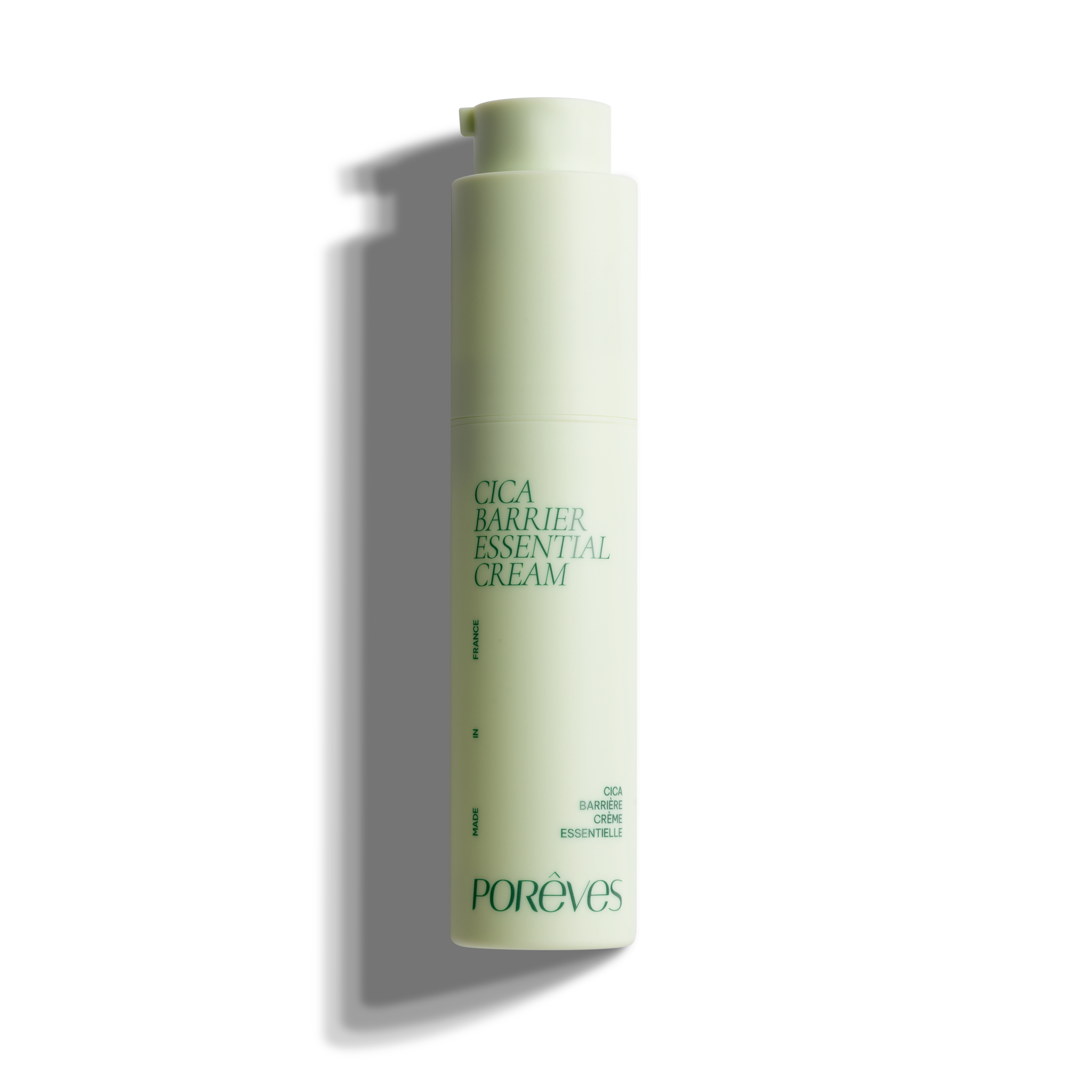
Be Vietnam, designed by Vietnamese type designers, ensures perfect readability in both French and Vietnamese.It is paired with Cormorant, used for product names, bringing refinement and elegance inspired by French heritage.Together, these two typefaces visually embody the meeting of both cultures.

Design du tube du nettoyant visage
Vernis selectif au niveau de la goutte sur le packaging exterieur
Un travail de détail au service du sens
The Cormorant letterforms were subtly tightened to create a more delicate, almost floral appearance, reinforcing the connection with the botanical universe.
Additional graphic elements were developed throughout the identity:
Fine lines and circular forms inspired by skin cells and tissue structures.
A signature droplet appearing across every product.
This droplet becomes one of the brand's most recognizable visual assets—simultaneously referencing scientific research, water, botanical extracts and skincare.
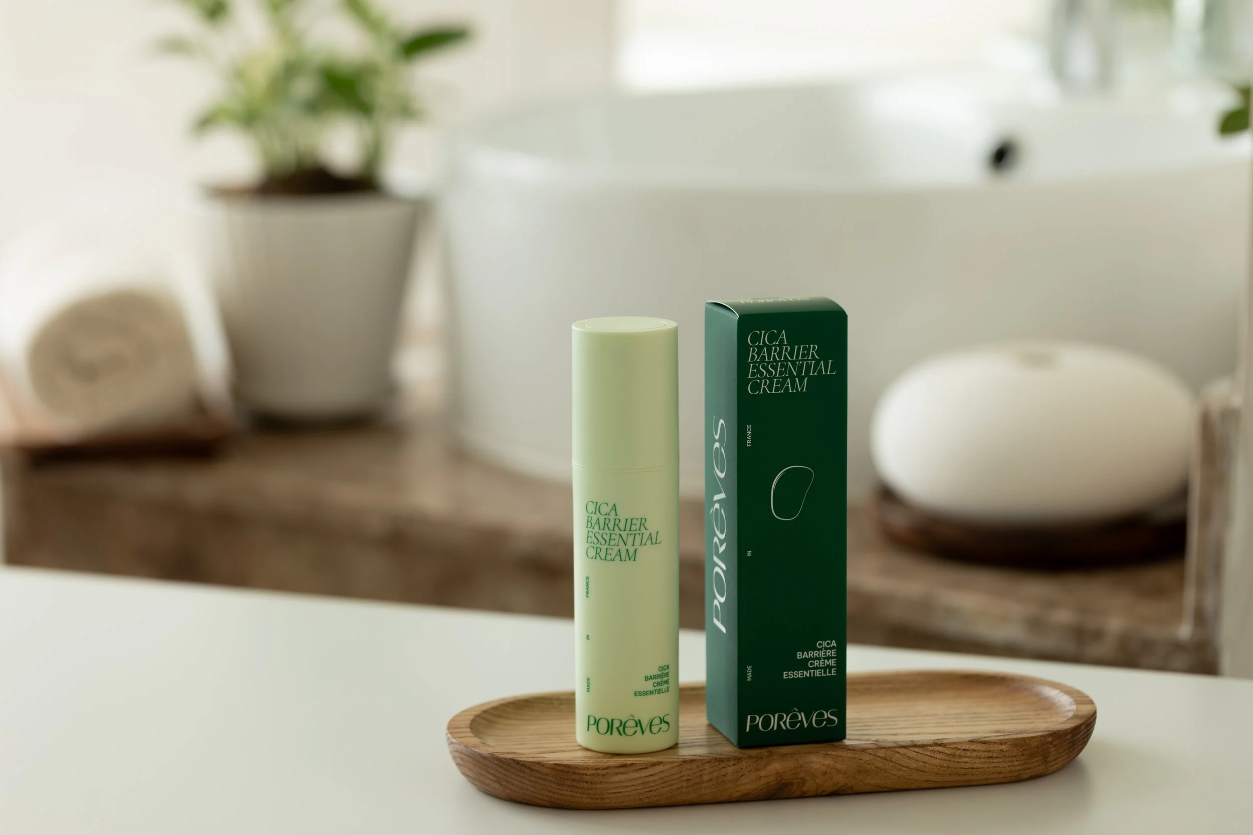
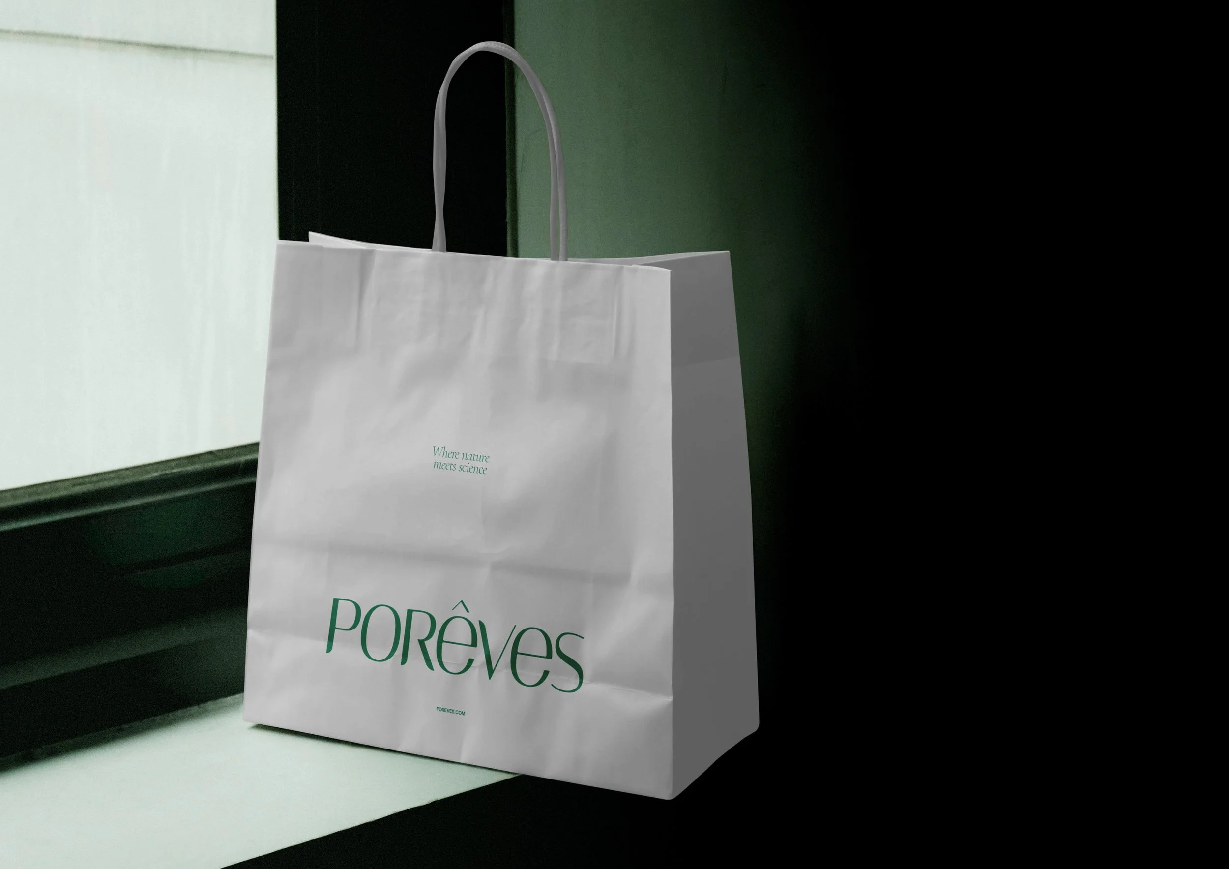
A refined colour palette
Green naturally became the dominant colour throughout the identity.
Its different shades evoke:
Nature
Innovation
Scientific research
The palette is complemented by soft whites and warm beige tones, creating a premium, calm and sophisticated visual experience.

Mise en forme des maquettes responsive du site internet


Design des pages produits de l’eshop


Outcome
Today, Porêves benefits from a visual identity perfectly aligned with its positioning.
The project successfully delivers:
A clear and premium brand perception.
Strong consistency between the identity and the packaging system.
A meaningful expression of the brand's bicultural heritage.
Excellent readability across the entire product range.
The result is a flexible brand identity designed to support long-term growth while creating an immediate sense of trust and recognition.


Création des stories instagram de la marque


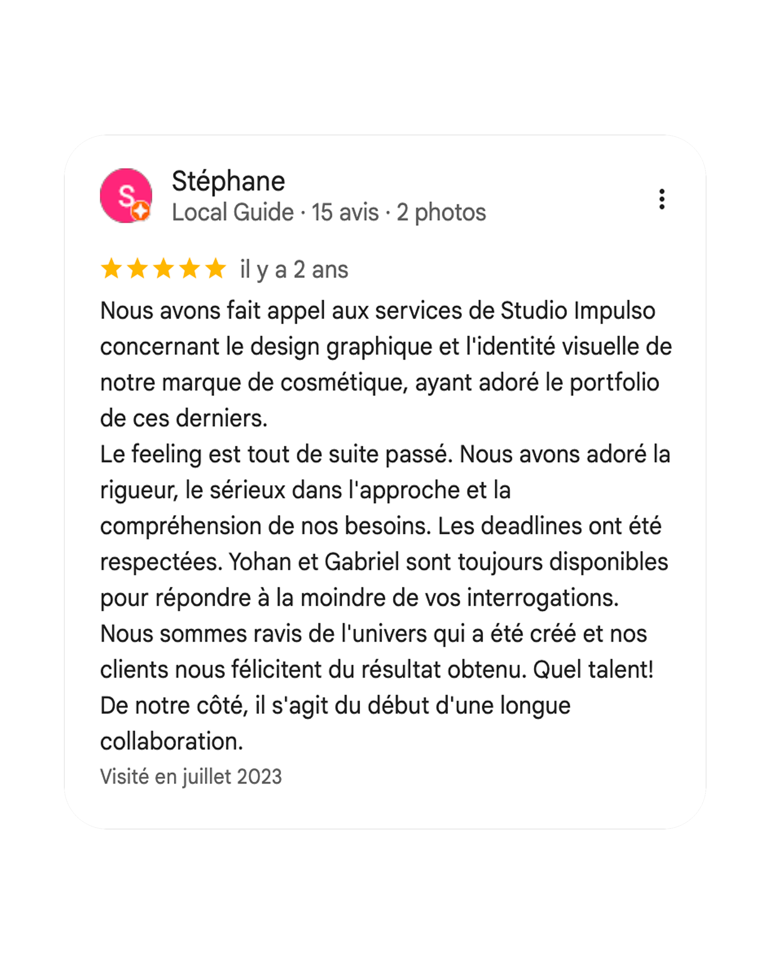
A word from our client, Stéphane