A few years ago, we partnered with PimpMyTrip during its early stages. As the project evolved into Spooot, we had the opportunity to help shape this new chapter by redesigning the application's entire visual ecosystem.
Services
Visual Identity
Brand Guidelines
Design System
UX Design
Industry
Tourism
Overview
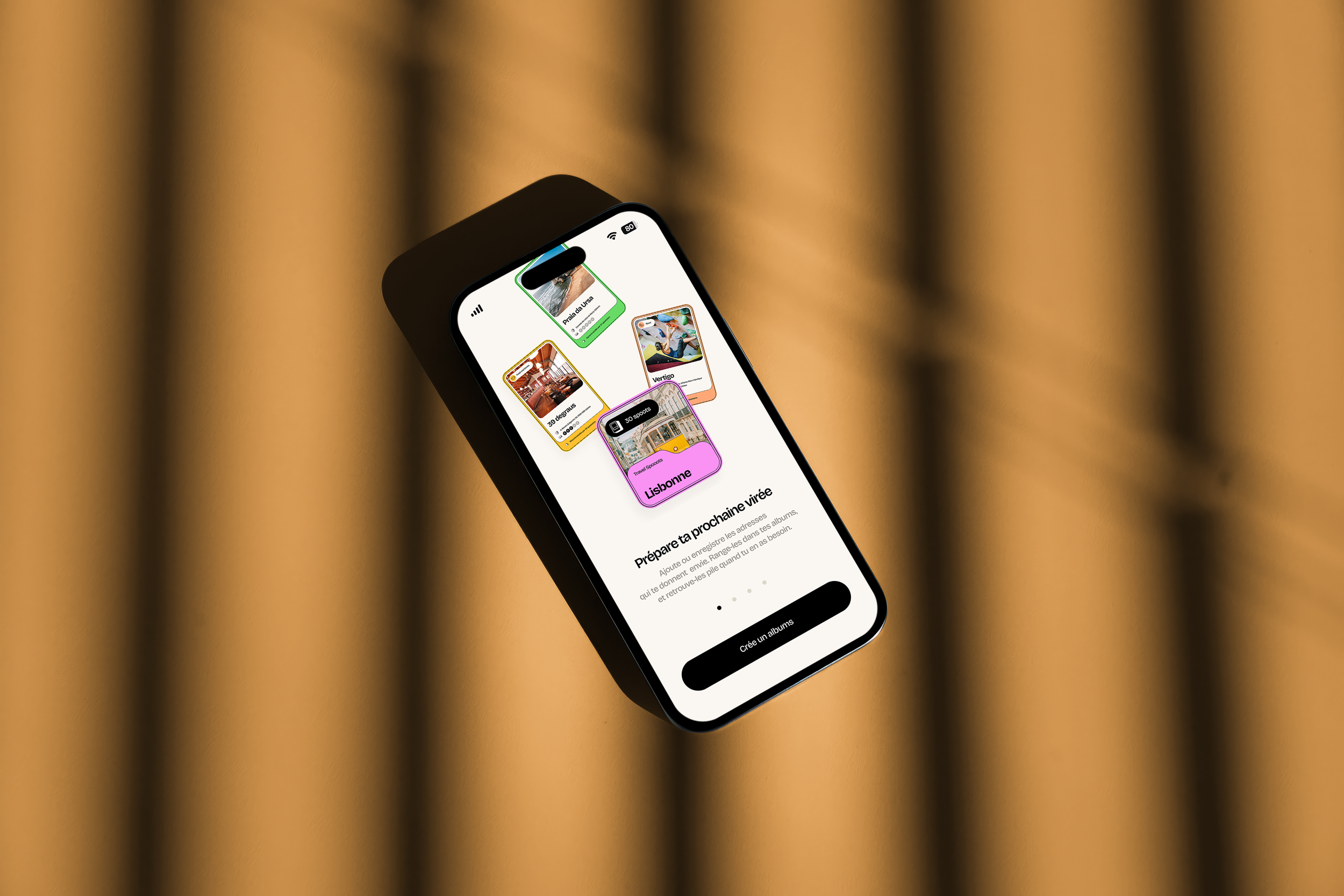
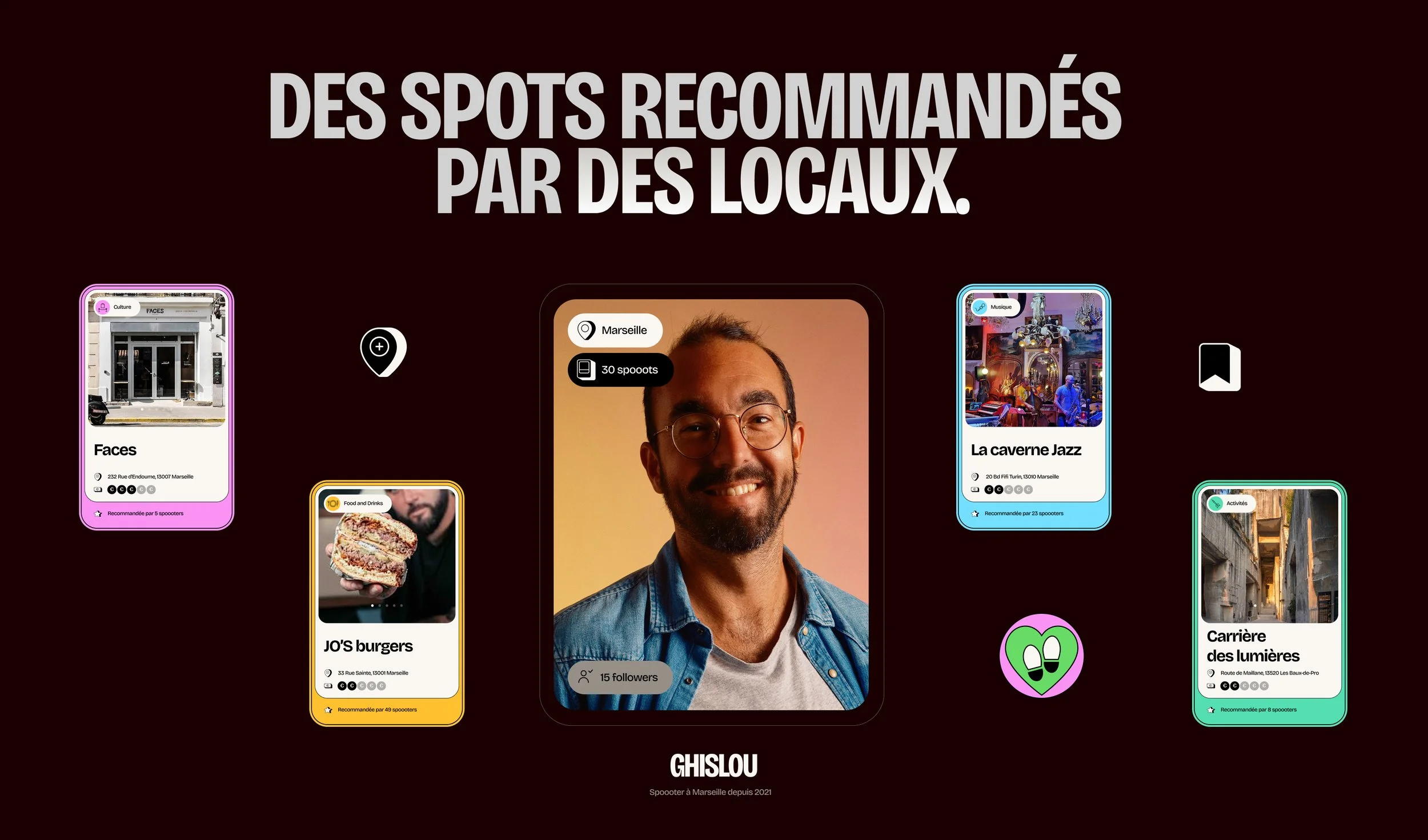
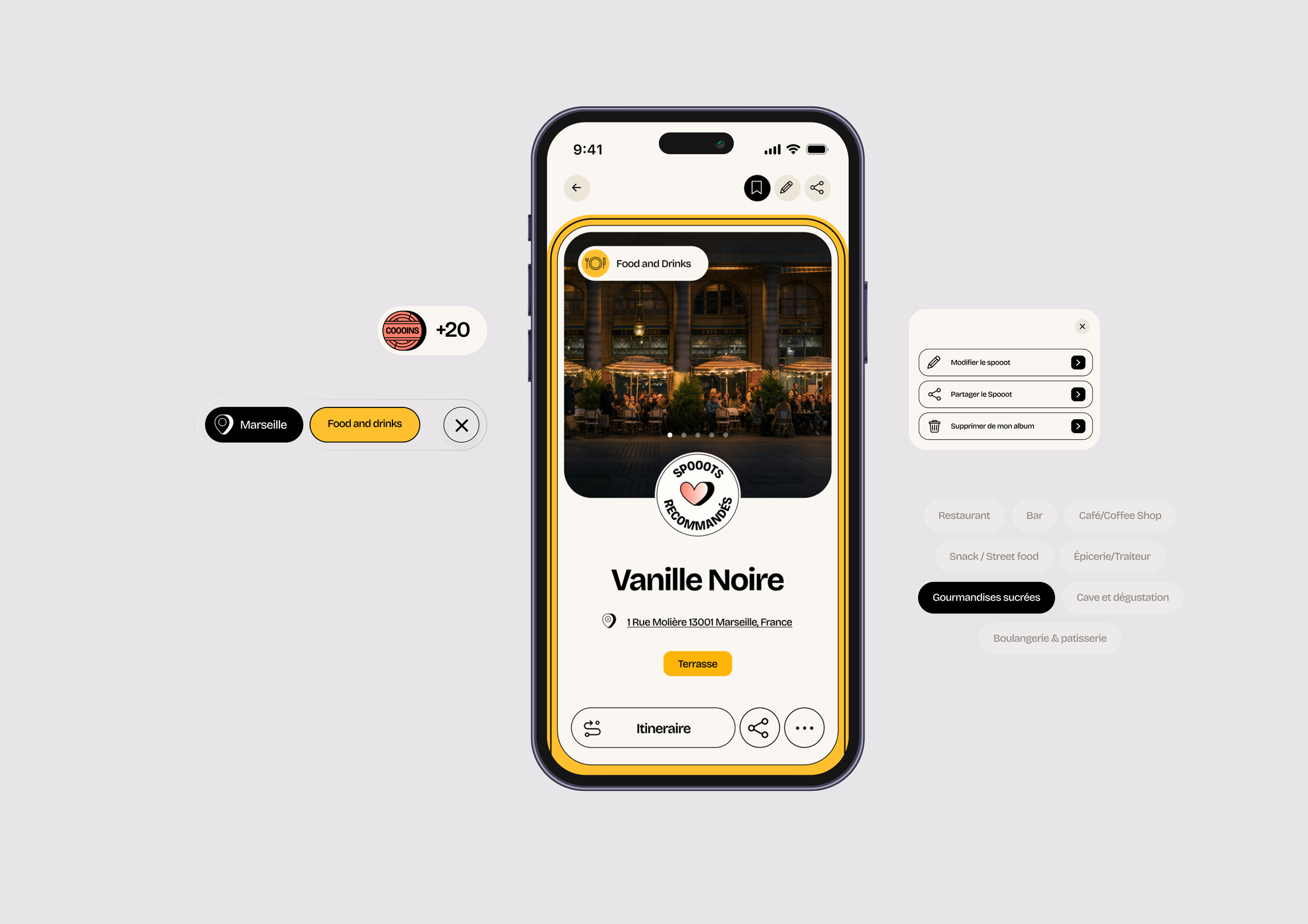
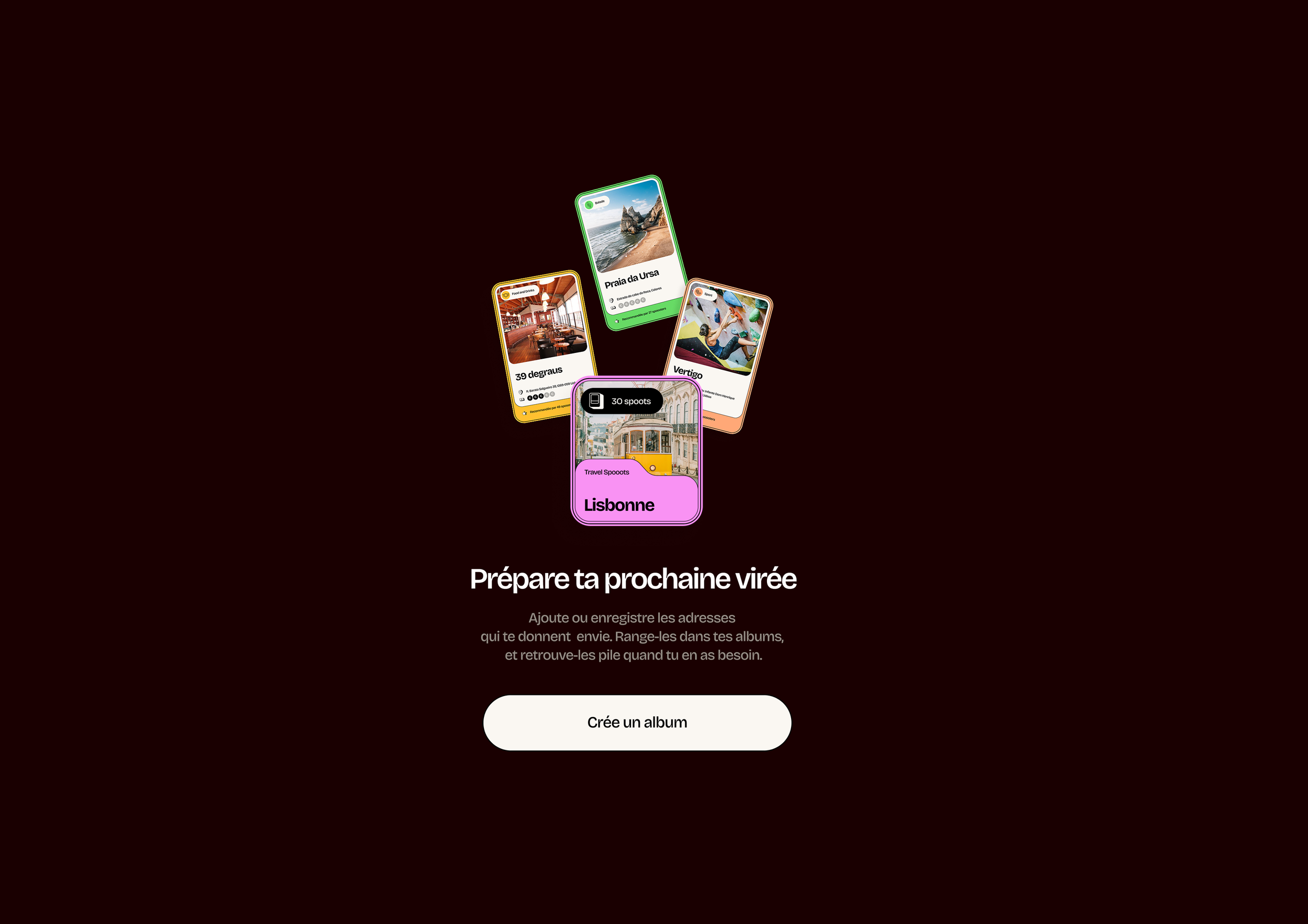
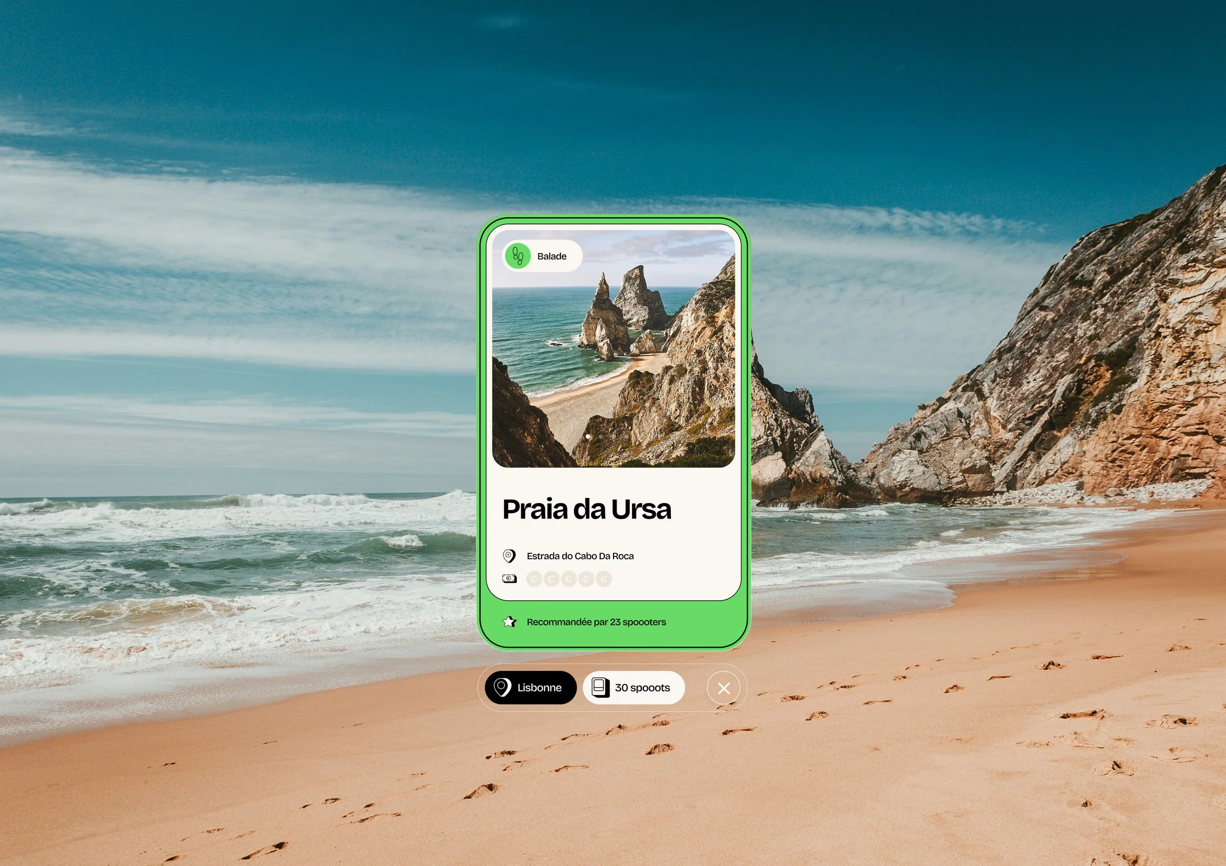
Spooot is a travel discovery app designed for people who love exploring, organizing and sharing their favourite places. Born from the evolution of PimpMyTrip, the platform allows users to collect and organise restaurants, cafés, hotels, activities and hidden gems, distinguishing between places they've already visited and those they want to discover next. Beyond a simple bookmarking app, Spooot combines local recommendations, artificial intelligence and gamification to transform discovering new places into an engaging and rewarding experience. Having previously collaborated with PimpMyTrip, we were invited to imagine the complete visual language for both the product and its communication.

Challenge
The primary challenge was to design a digital identity capable of reflecting the richness of the application's features while remaining intuitive, accessible and enjoyable to use.
The project needed to:
Create a distinctive identity within the highly competitive travel app market.
Develop a complete visual language for the gamification system.
Make the experience playful without compromising usability.
Build consistency between the product interface and the brand's communication.
Support the transition from PimpMyTrip to Spooot with a stronger, more memorable identity.
Approach
We approached Spooot as the creation of an entire visual ecosystem.
Rather than simply designing an interface, our objective was to build a cohesive graphic language capable of supporting every user interaction.
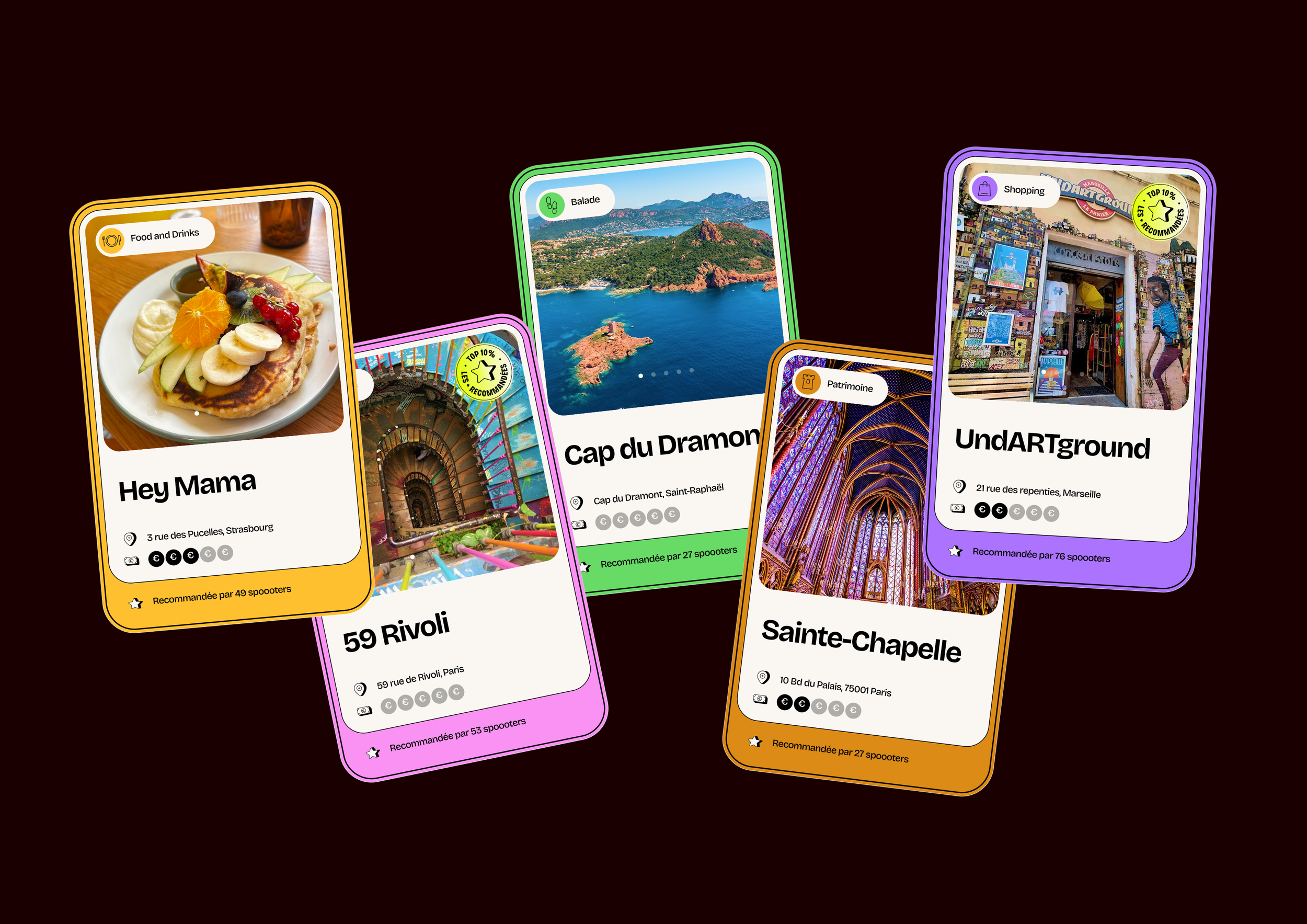
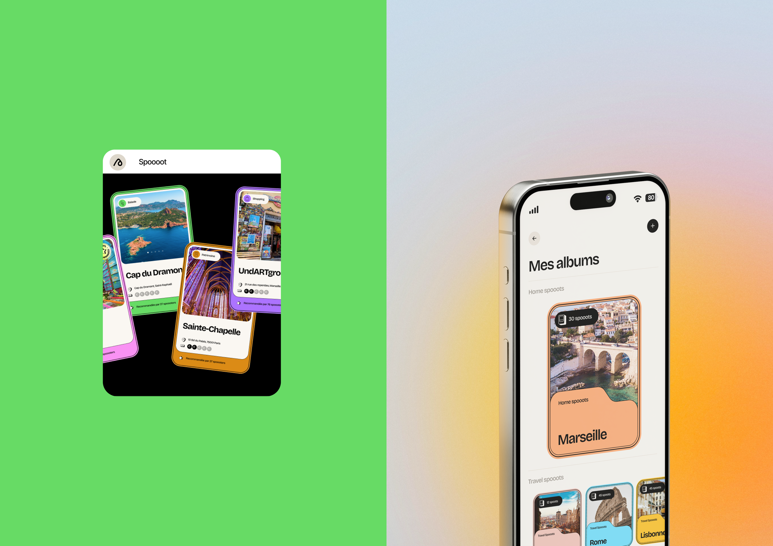
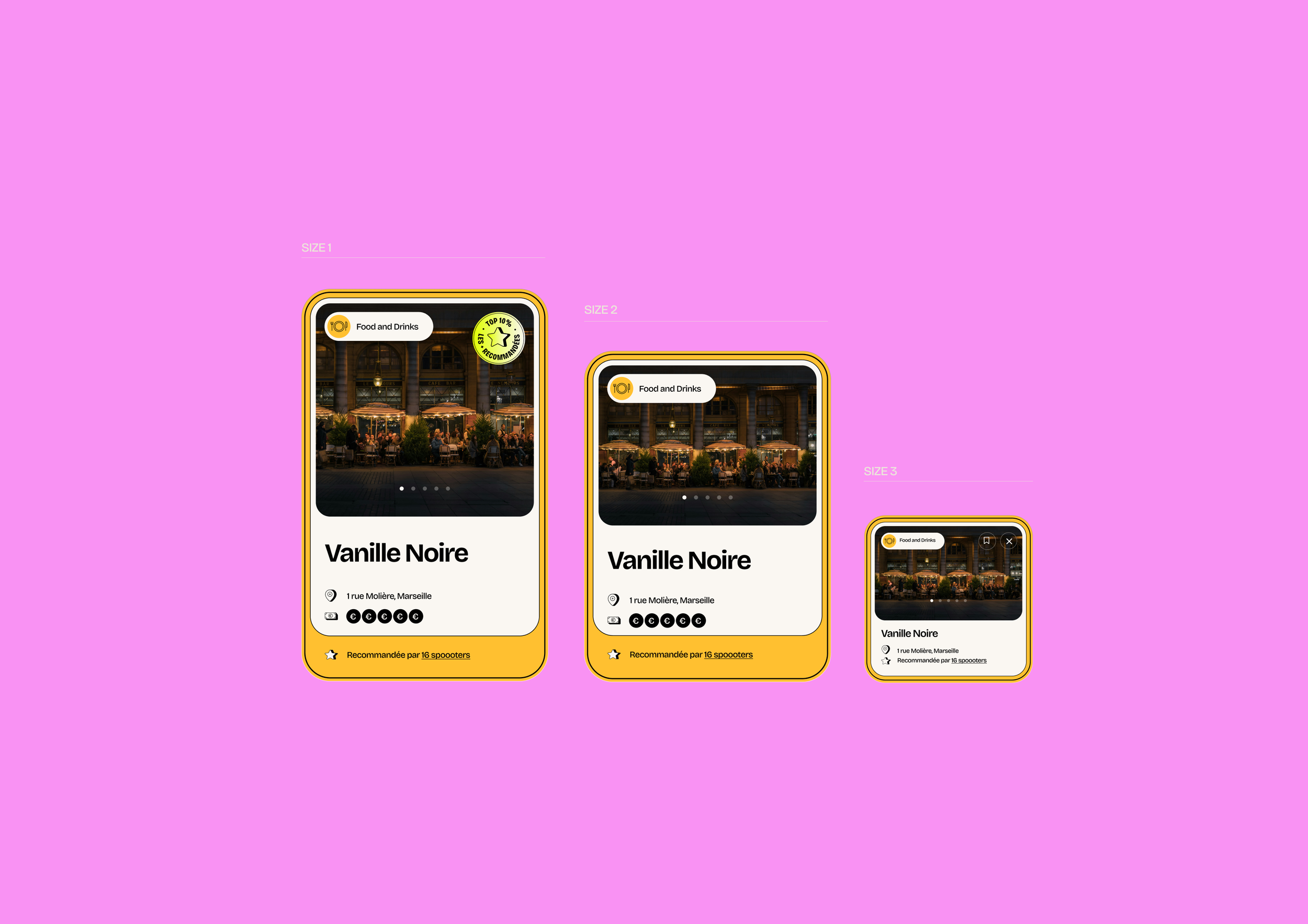
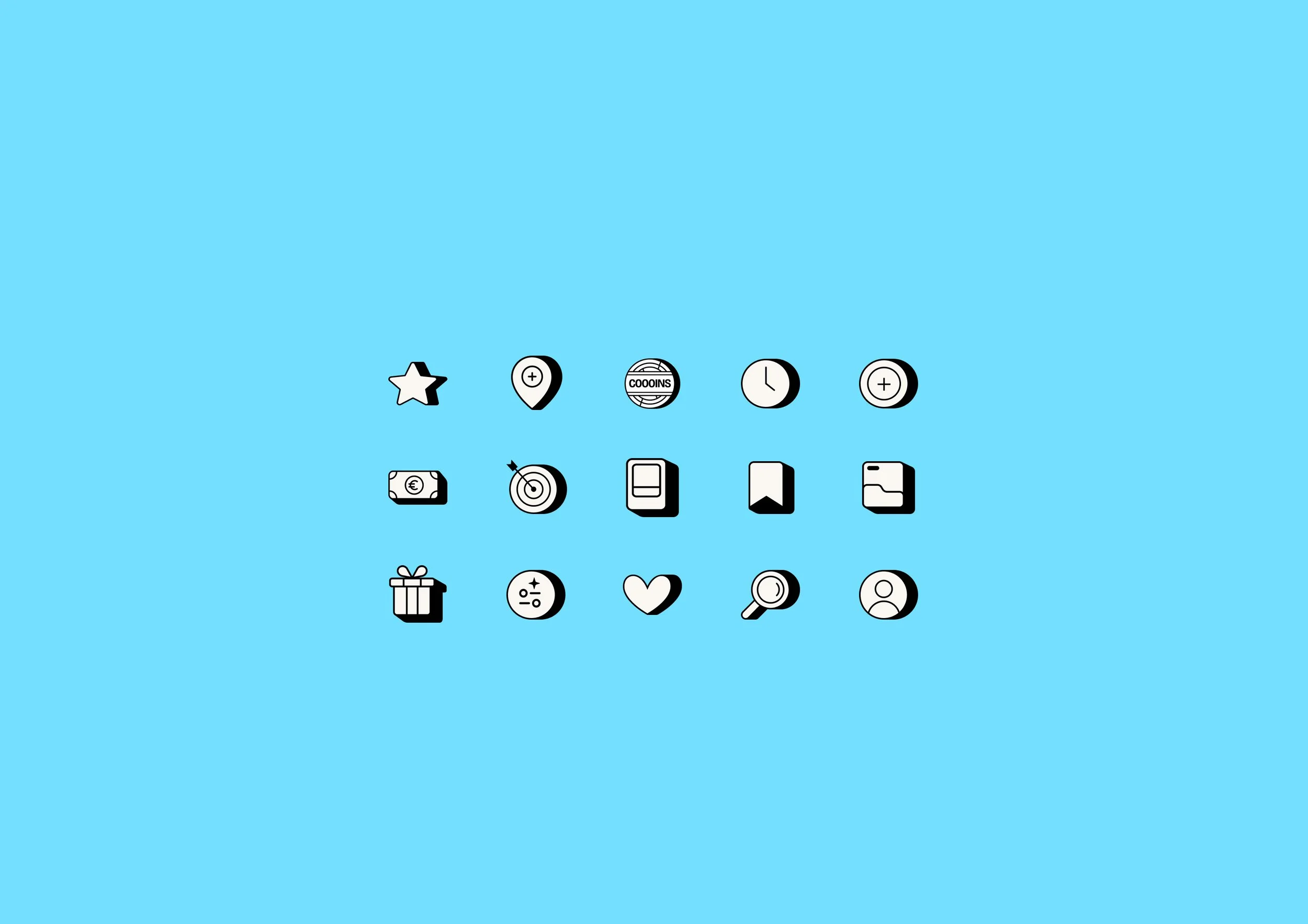
Every component, from cards and collections to icons, badges and achievements, was designed to reinforce both usability and brand personality.
The result is a design system that feels intuitive, engaging and instantly recognizable.
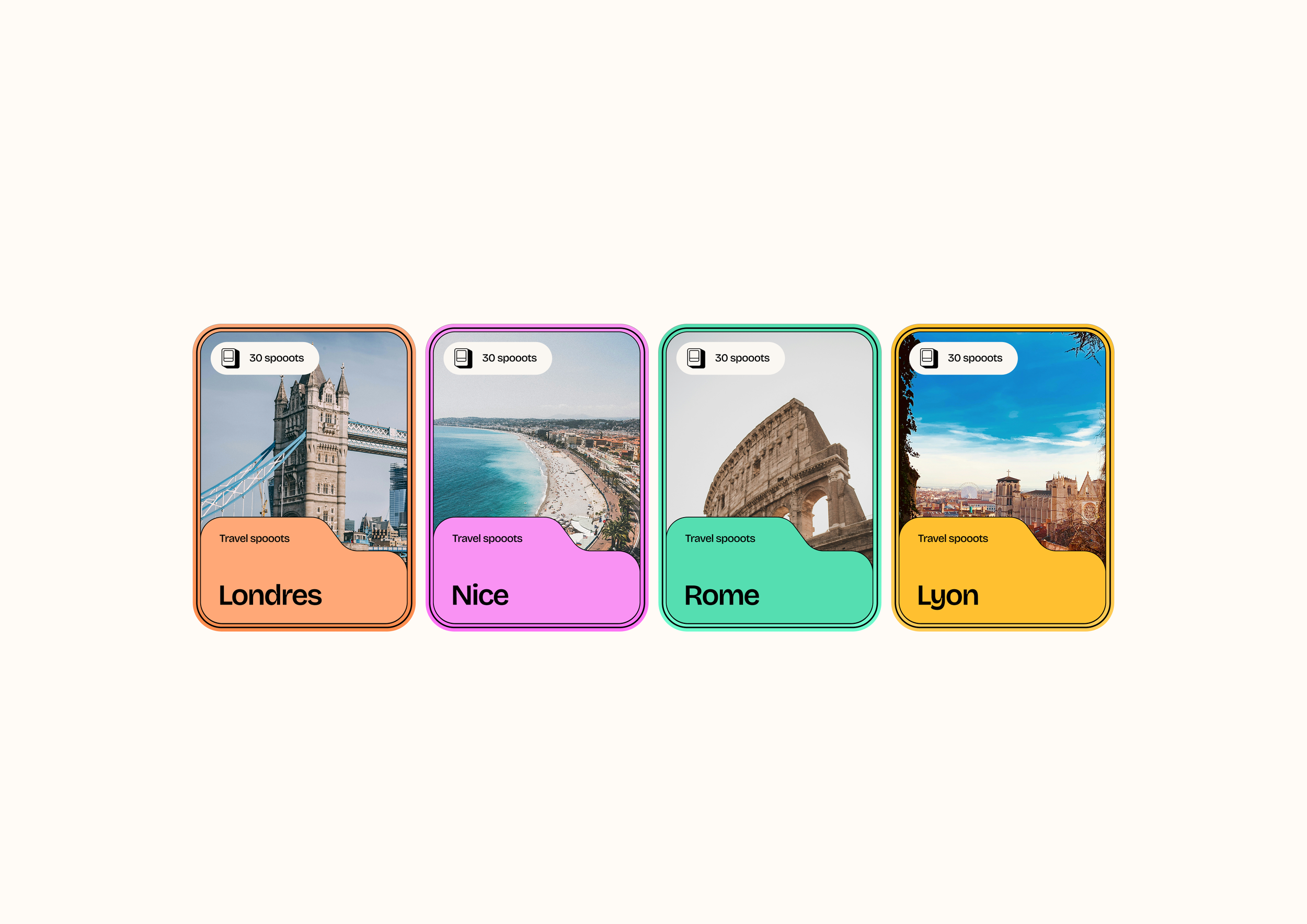
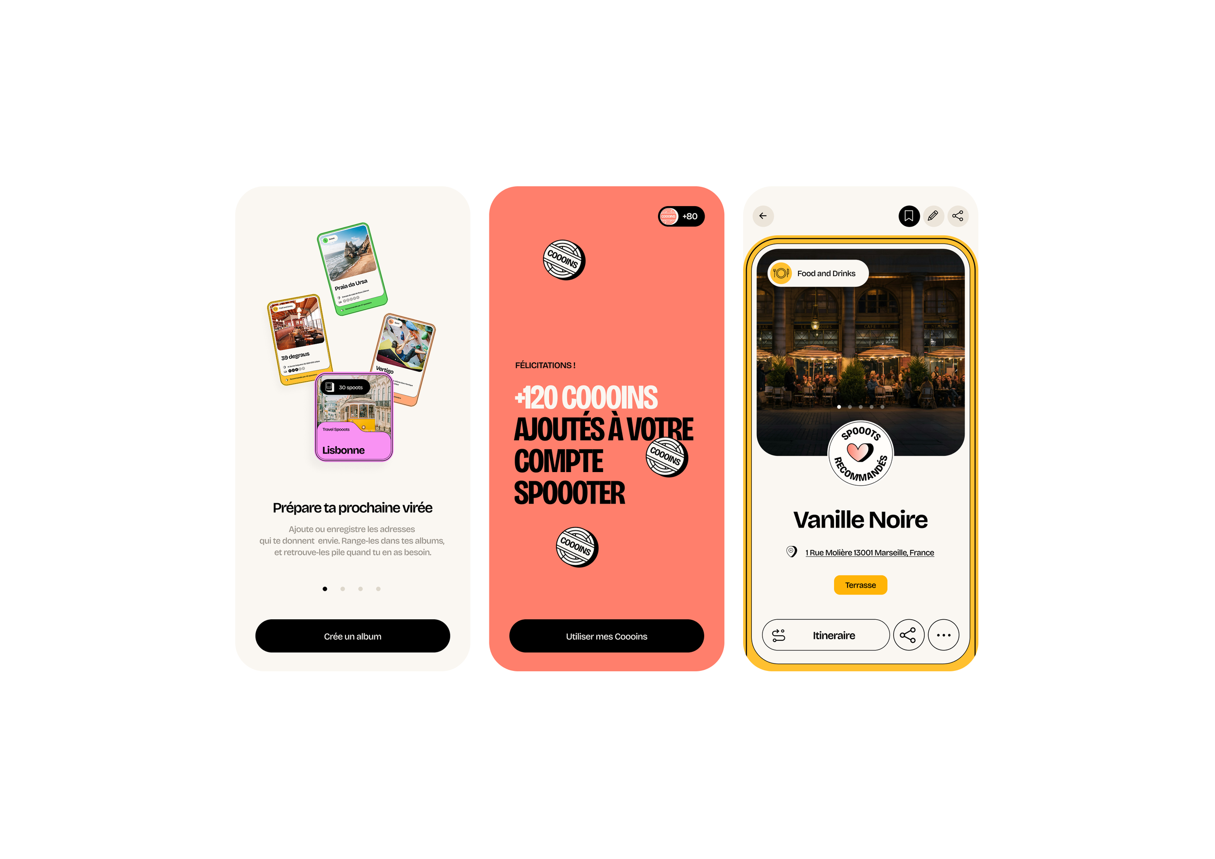
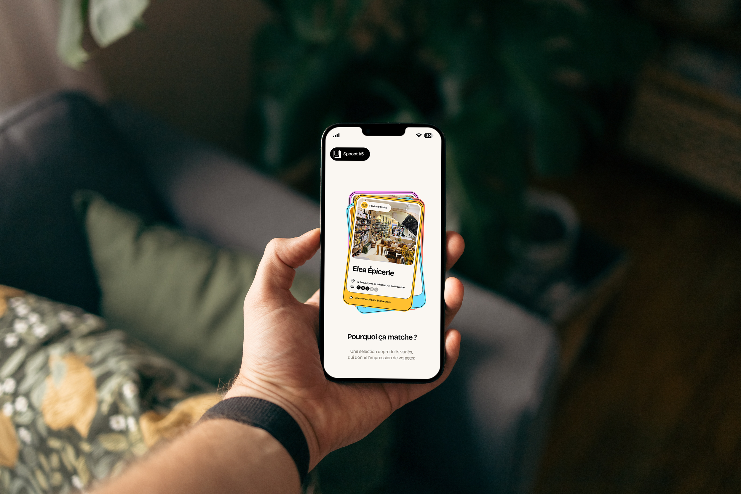
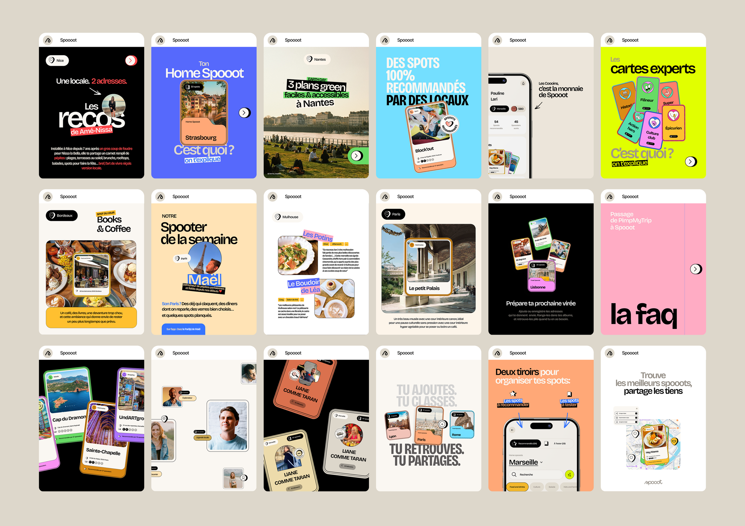
Designed for discovery
The visual identity draws inspiration from exploration, curiosity and collecting memorable places.
Every location becomes something worth saving, sharing and rediscovering.
Interfaces were designed to showcase content while maintaining a smooth and intuitive navigation experience.
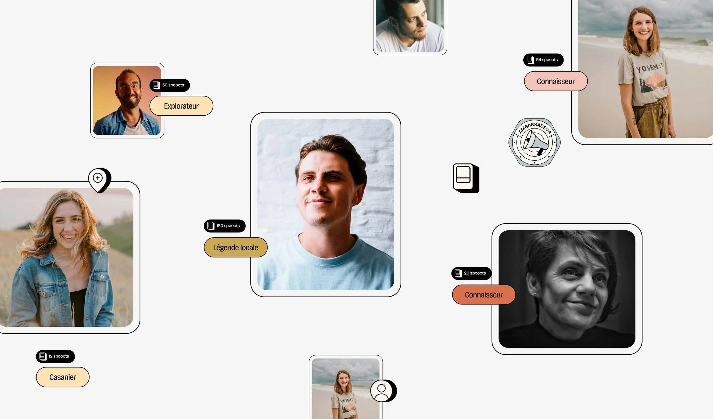
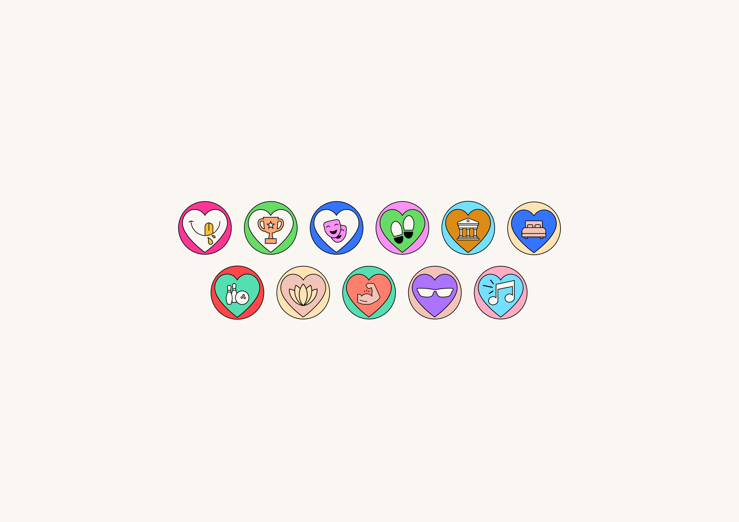
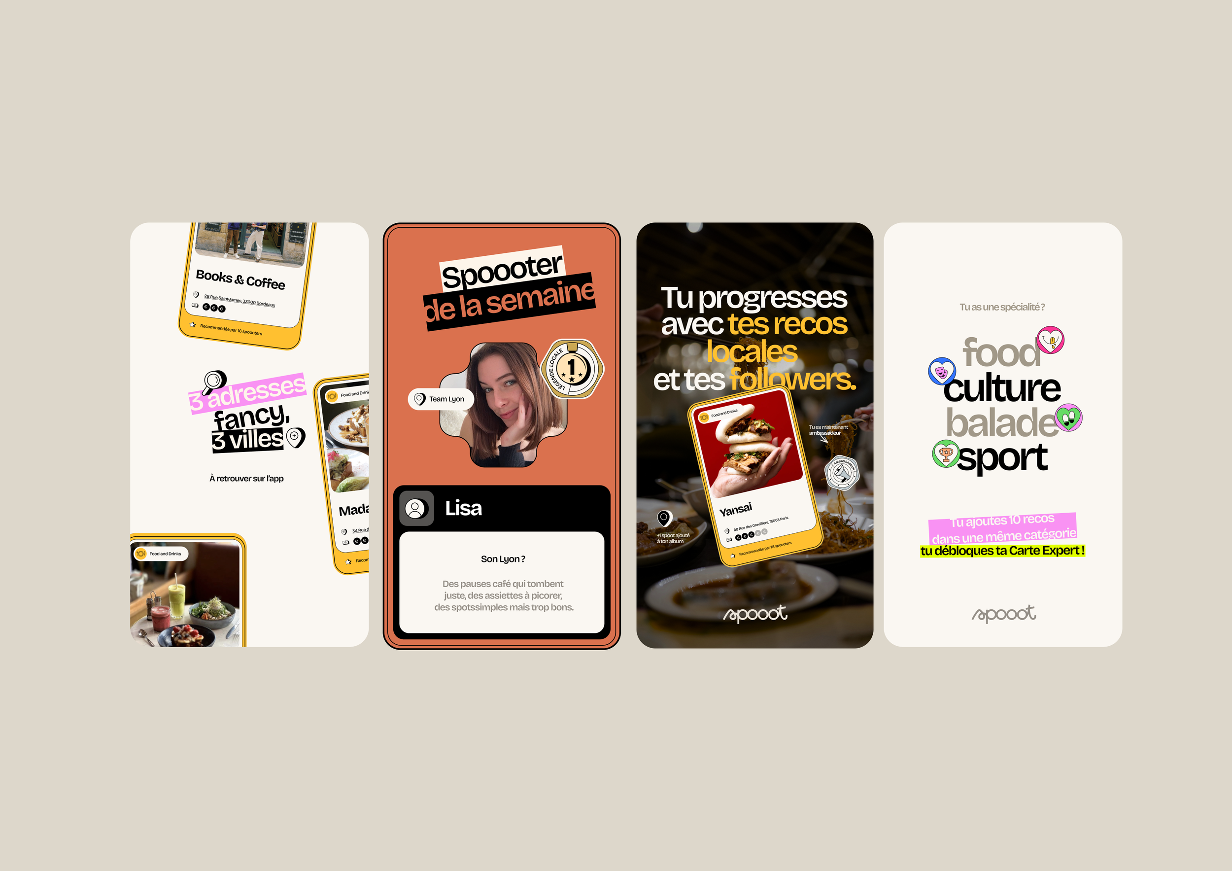
A complete gamification system
One of the project's biggest challenges was bringing the application's reward system to life.
We created an entire visual language dedicated to engagement, including:
Badges
Achievement icons
Levels
Rewards
Progress indicators
Together, these elements encourage exploration while making the user experience more rewarding and enjoyable.
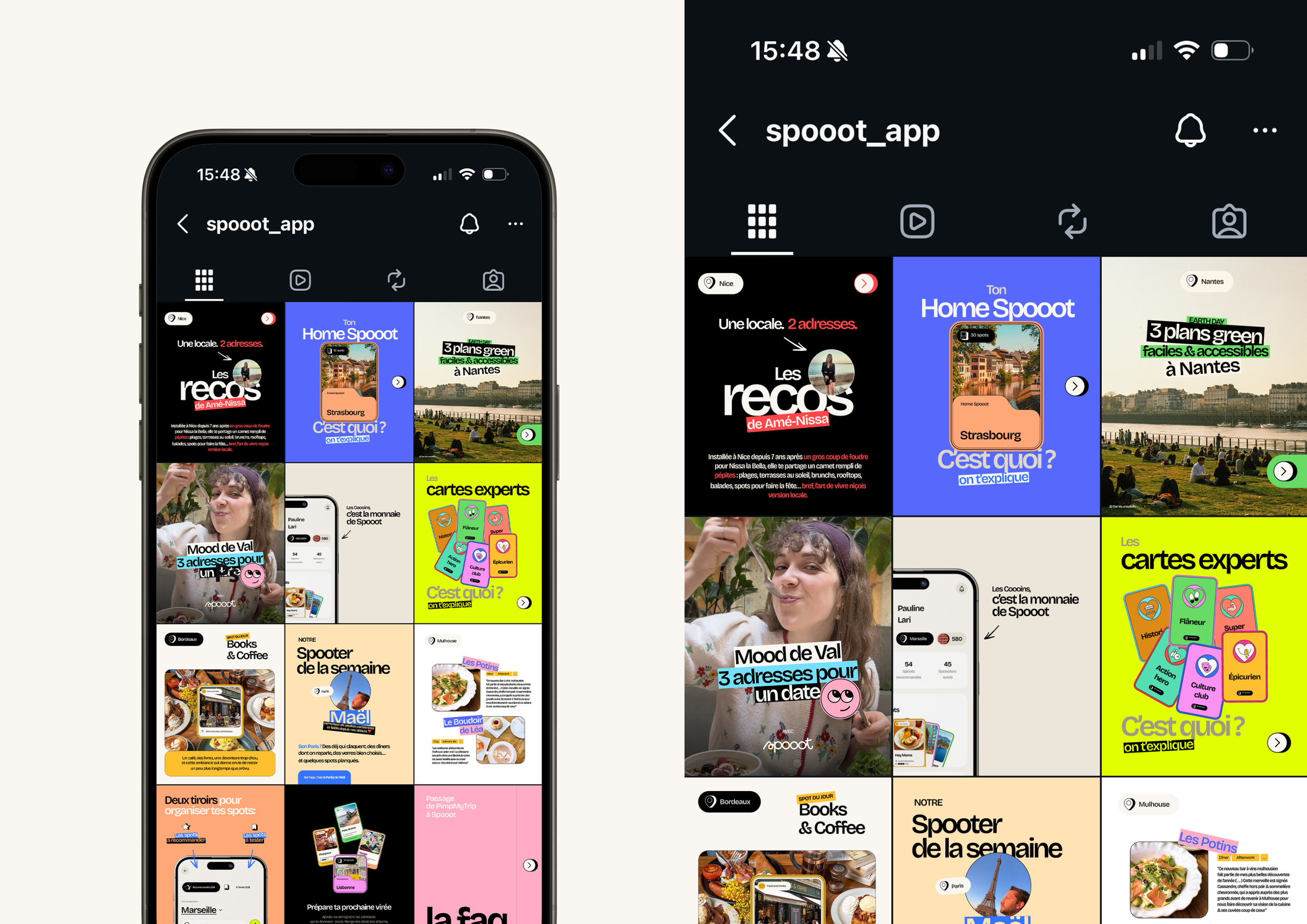
A consistent digital presence
Beyond the application itself, we also developed the art direction for Spooot's social media channels.
A flexible collection of post templates and story layouts was created to ensure consistent communication while giving the internal team a scalable system for future content.
This unified approach reinforces the connection between the product experience and the brand's digital presence.
Outcome
Today, Spooot benefits from a complete visual ecosystem designed to support both product experience and brand growth.
The project successfully:
Brings structure to a feature-rich application.
Increases user engagement through a cohesive gamification system.
Creates a distinctive and memorable visual identity.
Maintains consistency across the product and social media.
Supports the evolution from PimpMyTrip into a more ambitious and recognizable brand.
This new visual direction provides Spooot with a scalable foundation for future growth while strengthening its position in the world of travel discovery and local recommendations.
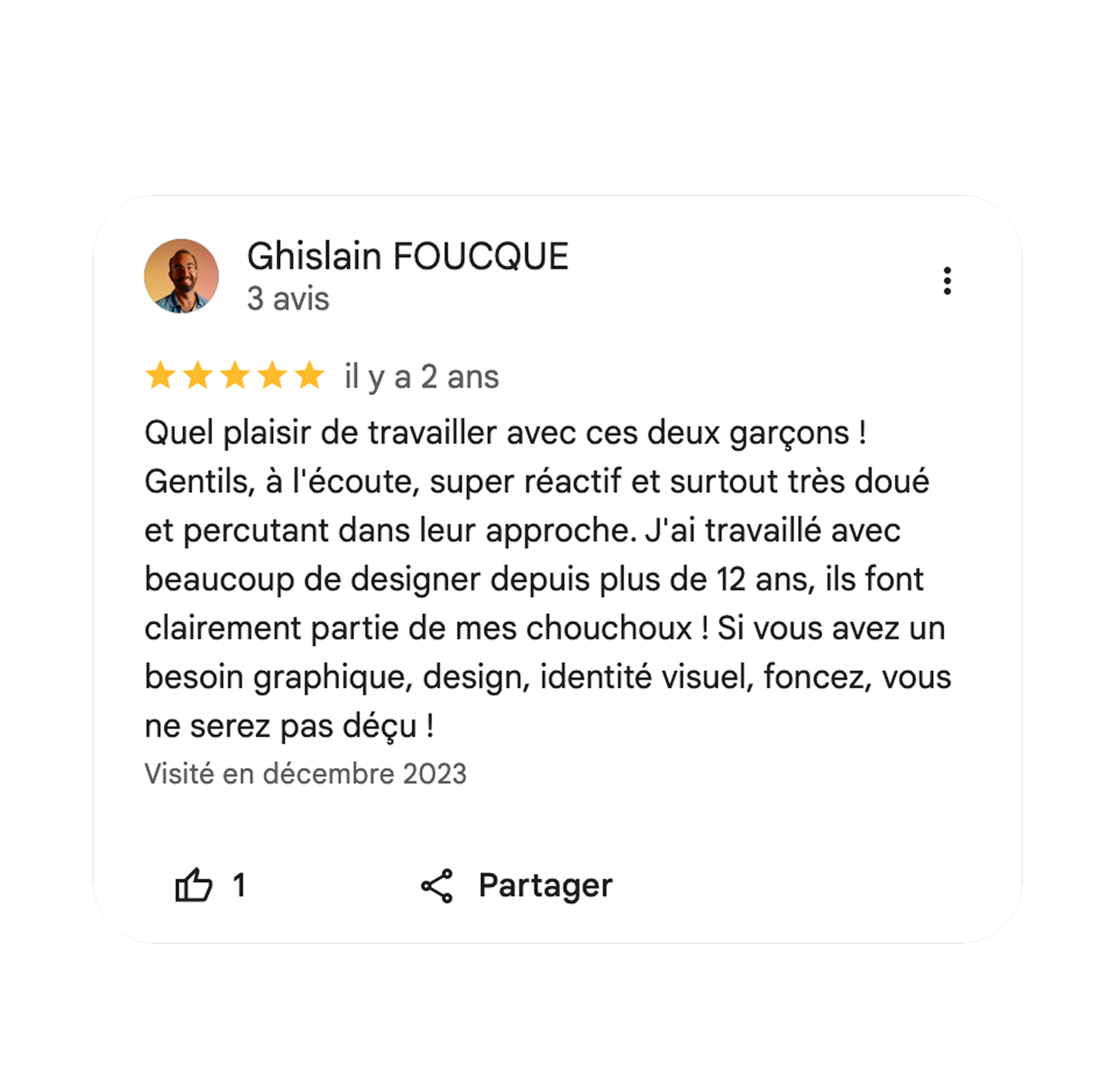
A word from our client, Ghislain