
Votre Tour du Monde is the travel platform created by Bruno Maltor, one of France's leading french travel creators . After more than a decade of inspiring millions of travellers, the platform had become a well-established media brand. As the project evolved, however, its visual identity no longer reflected the quality of its editorial content or its growing ambitions. We were invited to redesign the brand identity, creating a visual system that felt more timeless, personal and aligned with Bruno's vision of travel.
Services
Logo Design
Brand Guidelines
Visual Identity
Web Design
Industry
Travel

Typographic Art Direction

Symbol Meaning & Concept

Logo Design & Motion Identity
Challenge
The project wasn't about creating a new identity, it was about evolving an iconic one.
The challenge was to:
Modernize a brand that felt visually outdated.
Move away from the clichés commonly associated with travel branding.
Improve the logo's readability and versatility.
Align the visual identity with the quality of the platform's editorial content.
Preserve the brand recognition built over more than ten years.
Ultimately, the challenge was to shift the perception of the brand while respecting its legacy.


Responsive Logo System
Objectives
Create a visual identity capable of:
Reflecting a more personal and contemporary vision of travel.
Moving beyond traditional travel symbols such as airplanes and landmarks.
Creating a timeless, adaptable and highly legible logo.
Supporting the platform across digital channels.
Elevating Bruno Maltor's editorial universe.

Business Cards with White Ink Printing
Approach
We approached this project through the lens of simplification.
Rather than relying on literal travel imagery, we stripped the identity back to its essence, creating a visual language built on suggestion rather than representation.
Our goal was to express a more emotional and introspective vision of travel, one that leaves space for imagination and personal interpretation.

Mise en page de la charte graphique du blog voyage Votre Tour du Monde

Gold Enamel Pin
A timeless visual identity
The logo was redesigned with simplicity at its core.
Traditional travel symbols were intentionally removed in favour of a more open and symbolic approach.
Rather than telling people what travel looks like, the identity encourages everyone to project their own definition of exploration.

Création de l’interface Youtube / Bannière et système de miniatures

Digital Communication Assets

Travel Blog website design
Moving beyond industry conventions
This creative direction allowed the brand to:
Stand apart from the saturated visual language of the travel industry.
Build a more timeless identity.
Reinforce the personal nature of Bruno's storytelling.
The result is a more editorial and sophisticated positioning that reflects the maturity of the platform.

Stickers

Design du site sur mobile
Designed for the digital experience
Every typographic and graphic decision was made with digital use in mind.
The identity was designed to perform seamlessly across the website, YouTube, social media and every digital touchpoint while remaining clear, flexible and instantly recognizable.


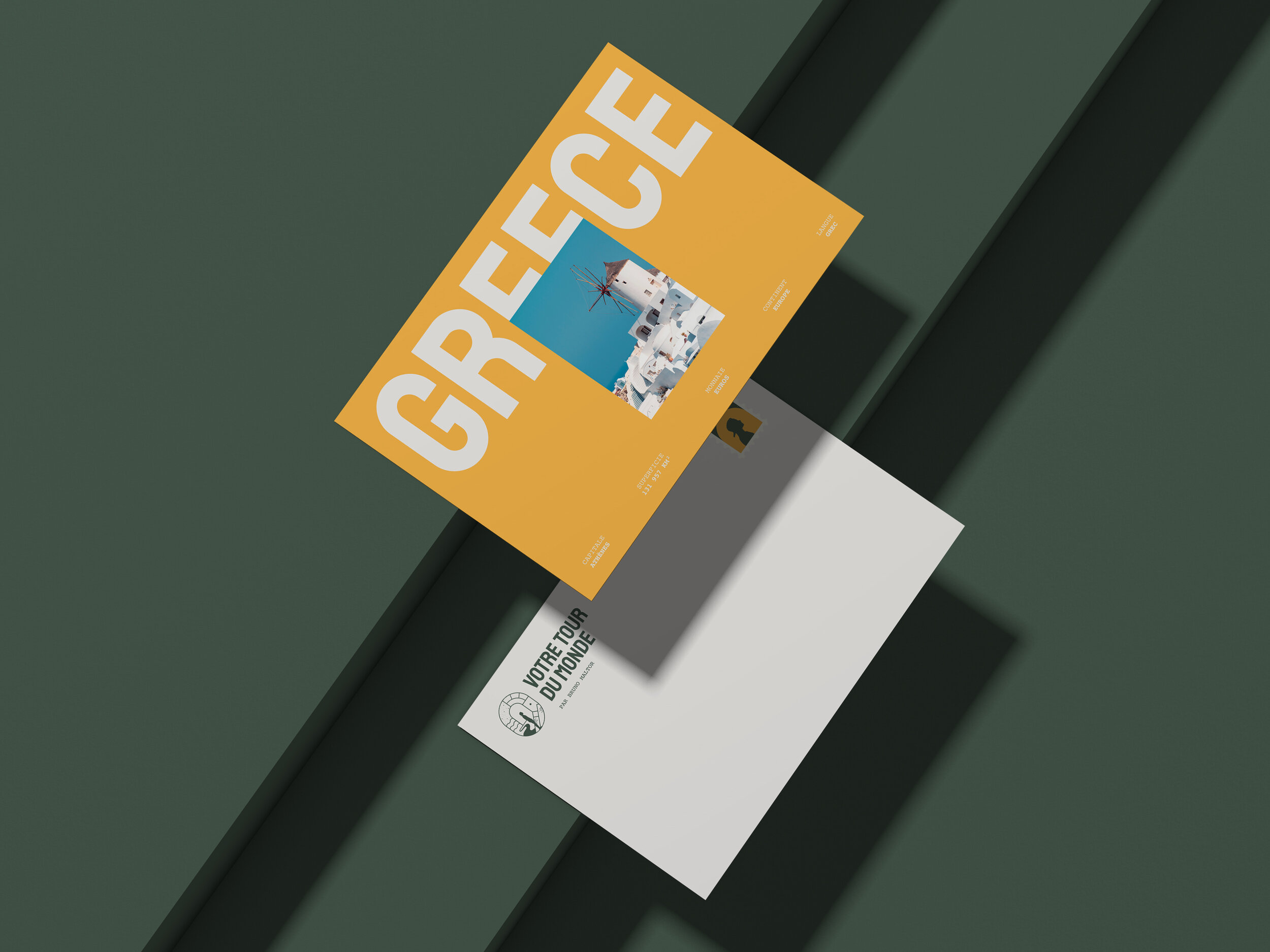
Destination-based graphic system

Outcome
Today, Votre Tour du Monde has a visual identity that better reflects both its editorial quality and its long-term ambitions.
The rebrand successfully delivers:
A clearer and more distinctive logo.
Improved adaptability across digital platforms.
A visual identity aligned with the quality of the content.
A timeless system less influenced by design trends.
The result is a brand that embraces a more personal, thoughtful and contemporary vision of travel, one that is designed to evolve alongside the platform for years to come.


Web design de la homepage
